This article is currently in the process of being translated into Polish (~9% done).
Prosty przykład TreeView
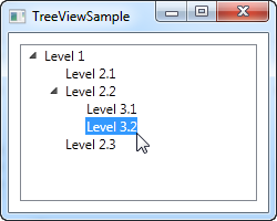
Tak jak mówiliśmy w poprzednim artykule, WPF TreeView może być użyte w bardzo prosty sposób poprzez dodanie elementów TreeViewItem w kodzie lub po prostu zadeklarować je bezpośrednio w Twoim pliku XAML. Jest to bardzo łatwe do zrobienia co widać na poniższym przykładzie:
<Window x:Class="WpfTutorialSamples.TreeView_control.TreeViewSample"
        xmlns="http://schemas.microsoft.com/winfx/2006/xaml/presentation"
        xmlns:x="http://schemas.microsoft.com/winfx/2006/xaml"
        Title="TreeViewSample" Height="200" Width="250">
    <Grid Margin="10">
		<TreeView>
			<TreeViewItem Header="Level 1" IsExpanded="True">
				<TreeViewItem Header="Level 2.1" />
				<TreeViewItem Header="Level 2.2" IsExpanded="True">
					<TreeViewItem Header="Level 3.1" />
					<TreeViewItem Header="Level 3.2" />
				</TreeViewItem>
				<TreeViewItem Header="Level 2.3" />
			</TreeViewItem>
		</TreeView>
	</Grid>
</Window>
We simply declare the TreeViewItem objects directly in the XAML, in the same structure that we want to display them in, where the first tag is a child of the TreeView control and its child objects are also child tags to its parent object. To specify the text we want displayed for each node, we use theHeader property. By default, a TreeViewItem is not expanded, but to show you the structure of the example, I have used the IsExpanded property to expand the two parent items.
TreeViewItem's with images and other controls
The Header is an interesting property, though. As you can see, I can just specify a text string and then have it rendered directly without doing anything else, but this is WPF being nice to us - internally, it wraps the text inside of a TextBlock control, instead of forcing you to do it. This shows us that we can stuff pretty much whatever we want to into the Header property instead of just a string and then have the TreeView render it - a great example of why it's so easy to customize the look of WPF controls.
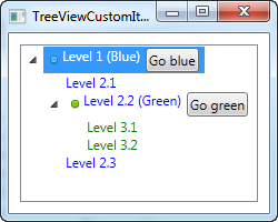
One of the common requests from people coming from WinForms or even other UI libraries is the ability to show an image next to the text label of a TreeView item. This is very easy to do with WinForms, because the TreeView is built exactly for this scenario. With the WPF TreeView, it's a bit more complex, but you're rewarded with a lot more flexibility than you could ever get from the WinForms TreeView. Here's an example of it:
<Window x:Class="WpfTutorialSamples.TreeView_control.TreeViewCustomItemsSample"
        xmlns="http://schemas.microsoft.com/winfx/2006/xaml/presentation"
        xmlns:x="http://schemas.microsoft.com/winfx/2006/xaml"
        Title="TreeViewCustomItemsSample" Height="200" Width="250">
	<Grid Margin="10">
		<TreeView>
			<TreeViewItem IsExpanded="True">
				<TreeViewItem.Header>
					<StackPanel Orientation="Horizontal">
						<Image Source="/WpfTutorialSamples;component/Images/bullet_blue.png" />
						<TextBlock Text="Level 1 (Blue)" />
					</StackPanel>
				</TreeViewItem.Header>
				<TreeViewItem>
					<TreeViewItem.Header>
						<StackPanel Orientation="Horizontal">
							<TextBlock Text="Level 2.1" Foreground="Blue" />
						</StackPanel>
					</TreeViewItem.Header>
				</TreeViewItem>
				<TreeViewItem IsExpanded="True">
					<TreeViewItem.Header>
						<StackPanel Orientation="Horizontal">
							<Image Source="/WpfTutorialSamples;component/Images/bullet_green.png" />
							<TextBlock Text="Level 2.2 (Green)" Foreground="Blue" />
						</StackPanel>
					</TreeViewItem.Header>
					<TreeViewItem>
						<TreeViewItem.Header>
							<TextBlock Text="Level 3.1" Foreground="Green" />
						</TreeViewItem.Header>
					</TreeViewItem>
					<TreeViewItem>
						<TreeViewItem.Header>
							<TextBlock Text="Level 3.2" Foreground="Green" />
						</TreeViewItem.Header>
					</TreeViewItem>
				</TreeViewItem>
				<TreeViewItem>
					<TreeViewItem.Header>
						<TextBlock Text="Level 2.3" Foreground="Blue" />
					</TreeViewItem.Header>
				</TreeViewItem>
			</TreeViewItem>
		</TreeView>
	</Grid>
</Window>
I did a whole bunch of things here, just to show you the kind of flexibility you get: I colored the child items and I added images and even buttons to the parent items. Because we're defining the entire thing with simple markup, you can do almost anything, but as you can see from the example code, it does come with a price: Huge amounts of XAML code, for a tree with just six nodes in total!
Summary
While it is entirely possible to define an entire TreeView just using markup, as we did in the above examples, it's not the best approach in most situations, and while you could do it from Code-behind instead, this would have resulted in even more lines of code. Once again the solution is data binding, which we'll look into in the next chapters.