The community is working on translating this tutorial into Belarusian, but it seems that no one has started the translation process for this article yet. If you can help us, then please click "More info".
Tab Order
If you have worked with a computer long enough to want to learn programming, you probably also know that you can use the Tab key on the keyboard to navigate through a window/dialog. This allows you to keep your hands on the keyboard when filling out a form or something similar, instead of having to use the mouse to select the next field/control.
WPF supports this behavior straight out of the box, and even better: It will automatically establish the order used when moving from one field to another, so in general, you don't have to worry about this at all. However, sometimes the design of your Window/dialog cause WPF to use a tab order that you might not agree with, for various reasons. Also, you may decide that certain controls should not be a part of the tabbing order. Allow me to illustrate this with an example:

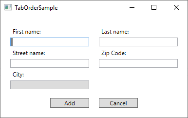
This dialog consists of a Grid, split in the middle, with StackPanel's on each side, containing labels and textboxes. The default tab order behavior is to start with the first control of the Window and then tab through each of the child controls found within it, before moving to the next control. Since the dialog consists of vertically oriented StackPanels, that would mean that we would start in the First name field and then move to the Street name field and then the City field, before moving to StackPanel number two, containing the fields for Last name and Zip code. When tabbing out of the second StackPanel, the two buttons would finally be reached.
However, for this dialog, that's not the behavior I want. Instead I want to tab from First name to Last name (so basically moving horizontally instead of vertically), and on top of that, I don't want to enter the City field when tabbing through the form, because that will be automatically filled based on the Zip code in this imaginary dialog and has therefore been made readonly. To accomplish all of this, I will use two properties: TabIndex and IsTabStop. TabIndex is used to define the order, while the IsTabStop property will force WPF to skip a control when tabbing through the Window. Here's the markup used to create the dialog:
<Window x:Class="WpfTutorialSamples.Control_concepts.TabOrderSample"
    xmlns="http://schemas.microsoft.com/winfx/2006/xaml/presentation"
    xmlns:x="http://schemas.microsoft.com/winfx/2006/xaml"
    xmlns:d="http://schemas.microsoft.com/expression/blend/2008"
    xmlns:mc="http://schemas.openxmlformats.org/markup-compatibility/2006"
    xmlns:local="clr-namespace:WpfTutorialSamples.Control_concepts"
    mc:Ignorable="d"
    Title="TabOrderSample" Height="250" Width="400">
    <Grid Margin="20">
    <Grid.ColumnDefinitions>
        <ColumnDefinition Width="*" />
        <ColumnDefinition Width="20" />
        <ColumnDefinition Width="*" />
    </Grid.ColumnDefinitions>
    <Grid.RowDefinitions>
        <RowDefinition Height="*" />
        <RowDefinition Height="Auto" />
    </Grid.RowDefinitions>
    <StackPanel>
        <Label>First name:</Label>
        <TextBox TabIndex="0" />
        <Label>Street name:</Label>
        <TextBox TabIndex="2" />
        <Label>City:</Label>
        <TextBox TabIndex="5" IsReadOnly="True" IsTabStop="False" Background="Gainsboro" />
    </StackPanel>
    <StackPanel Grid.Column="2">
        <Label>Last name:</Label>
        <TextBox TabIndex="1" />
        <Label>Zip Code:</Label>
        <TextBox TabIndex="4" />
    </StackPanel>
    <Button Grid.Row="1" HorizontalAlignment="Right" Width="80">Add</Button>
    <Button Grid.Row="1" Grid.Column="2" HorizontalAlignment="Left" Width="80">Cancel</Button>
    </Grid>
</Window>
Notice how I simply give each relevant control a number in the TabIndex property, and then use the IsTabStop for the TextBox used for the City - it's that simple to control the tab order in a dialog!
Summary
Controlling the tab order of a dialog is very important, but fortunately for us, WPF does a very good job of automatically defining a proper tab order for you. However, in some cases, it will make sense to go in and take control, using the TabIndex and IsTabStop properties, as illustrated in the example above.