The community is working on translating this tutorial into Belarusian, but it seems that no one has started the translation process for this article yet. If you can help us, then please click "More info".
The DatePicker control
Dealing with dates in general can be cumbersome. There are many ways of writing a date, depending on where in the world your user(s) are, so allowing them to enter a date freely in a TextBox is almost never a good idea. Fortunately for us, WPF comes with several controls for dealing with dates.
We already looked at one of these controls, the Calendar control, which is great if selecting the date is the primary task of your dialog. However, often you will need to collect a date along with a lot of other information, in a form with multiple input controls like TextBox's, ComboBox's and so on. For a situation like that, you need a date-input control which can blend in with the rest and fit into the layout of a form - in other words, you need the DatePicker control!
The DatePicker control will be displayed pretty much like a regular TextBox, but with a small button which will bring up a Calendar-view when clicked, allowing your user to select the date. Here's an example of how it could look:
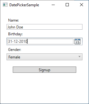
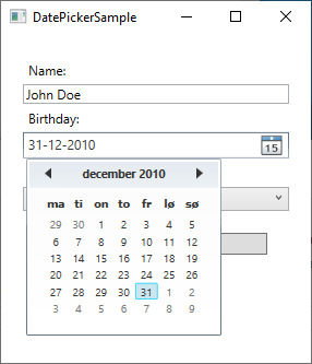
You can then write the date manually or click the small button to select the date from a calendar control:
Adding a DatePicker control
The DatePicker control works straight out of the box - just add it anywhere in your Window and you're good to go:
<DatePicker></DatePicker>Here's the full code listing used to create the example dialog above:
<Window x:Class="WpfTutorialSamples.Misc_controls.DatePickerSample"
    xmlns="http://schemas.microsoft.com/winfx/2006/xaml/presentation"
    xmlns:x="http://schemas.microsoft.com/winfx/2006/xaml"
    xmlns:d="http://schemas.microsoft.com/expression/blend/2008"
    xmlns:mc="http://schemas.openxmlformats.org/markup-compatibility/2006"
    xmlns:local="clr-namespace:WpfTutorialSamples.Misc_controls"
    mc:Ignorable="d"
    Title="DatePickerSample" Height="300" Width="300">
    <StackPanel Margin="20">
    <Label>Name:</Label>
    <TextBox />
    <Label>Birthday:</Label>
    <DatePicker></DatePicker>
    <Label>Gender:</Label>
    <ComboBox>
        <ComboBoxItem>Female</ComboBoxItem>
        <ComboBoxItem>Male</ComboBoxItem>
    </ComboBox>
    <Button Margin="20">Signup</Button>
    </StackPanel>
</Window>
DisplayDate and SelectedDate
By default, the DatePicker control will not have a date selected - that is left to the user. However, if you need to prefill the control with a date, just use the SelectedDate property, like this:
<DatePicker SelectedDate="2000-12-31"></DatePicker>The DatePicker will now have a pre-selected date, which the user can choose to override by selecting/entering another date. The SelectedDate can also be set from Code-behind, and perhaps more importantly, it can also be read from Code-behind, or you can bind it's value to your Model or another control.
Sometimes you might need to start the calendar at a specific date, without actually selecting one for the user. For that, we have the DisplayDate property. The default value is the current date, but you can easily change that:
<DatePicker Name="dp1" DisplayDate="2019-01-01" />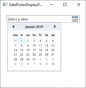
Notice how, when we use the DisplayDate property, the calendar starts at the specified date (and highlights it), but no date is actually selected (as indicated by the "Select a date" text).
SelectedDateFormat
Another interesting property is the SelectedDateFormat. The default value is Short, but if you change it to Long, it will be formatted in a slightly more verbose way:
<DatePicker SelectedDate="2000-12-31" SelectedDateFormat="Long"></DatePicker>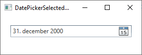
Whether the Short or the Long format is used, the actual format of the date is decided by the culture of your application. If you don't specifically define a culture for your application, the system settings are used. You will notice from the screenshots of this article that on this computer, the date format is DMY (date-month-year), but this can easily be changed by setting a specific culture. We'll discuss that elsewhere in this tutorial.
Blackout dates
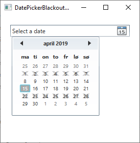
Depending on what you use the DatePicker control for, you may want to black out certain dates. This will prevent the selection of these dates, which will be visually indicated, and could be relevant e.g. in a booking application, where you want to prevent already reserved dates from being selected. The DatePicker control supports this right out of the box through the use of the BlackoutDates collection, which you can of course use from both XAML and Code-behind. Here's how to do it with XAML:
<DatePicker Name="dp1">
    <DatePicker.BlackoutDates>
    <CalendarDateRange Start="2019-04-01" End="2019-04-07" />
    <CalendarDateRange Start="2019-04-22" End="2019-04-28" />
    </DatePicker.BlackoutDates>
</DatePicker>
The result will look like this:
Doing it from Code-behind is just as easy and it has two added benefits: First of all, you can create the date range dynamically, e.g. based on the current date. You can also use the AddDatesInPast() method to automatically exclude all dates in the past. Here's an example:
dp1.BlackoutDates.AddDatesInPast();
dp1.BlackoutDates.Add(new CalendarDateRange(DateTime.Now, DateTime.Now.AddDays(7)));
With that in place, all past dates, as well as the next week, will be unavailable for selection.
Summary
The DatePicker control allows the user to specify a valid date, either by writing it in the text box or by selecting it from the built-in calendar widget. If the date is entered manually, it will be validated immediately and only allowed to remain in the text box if it's valid. This will make it much easier for you to create forms which includes dates.