The community is working on translating this tutorial into Gujarati, but it seems that no one has started the translation process for this article yet. If you can help us, then please click "More info".
The Grid - Spanning
The default Grid behavior is that each control takes up one cell, but sometimes you want a certain control to take up more rows or columns. Fortunately the Grid makes this very easy, with the Attached properties ColumnSpan and RowSpan. The default value for this property is obviously 1, but you can specify a bigger number to make the control span more rows or columns.
Here's a very simple example, where we use the ColumnSpan property:
<Window x:Class="WpfTutorialSamples.Panels.GridColRowSpan"
        xmlns="http://schemas.microsoft.com/winfx/2006/xaml/presentation"
        xmlns:x="http://schemas.microsoft.com/winfx/2006/xaml"
        Title="GridColRowSpan" Height="110" Width="300">
	<Grid>
		<Grid.ColumnDefinitions>
			<ColumnDefinition Width="1*" />
			<ColumnDefinition Width="1*" />
		</Grid.ColumnDefinitions>
		<Grid.RowDefinitions>
			<RowDefinition Height="*" />
			<RowDefinition Height="*" />
		</Grid.RowDefinitions>
		<Button>Button 1</Button>
		<Button Grid.Column="1">Button 2</Button>
		<Button Grid.Row="1" Grid.ColumnSpan="2">Button 3</Button>
	</Grid>
</Window>
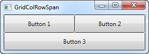
We just define two columns and two rows, all of them taking up their equal share of the place. The first two buttons just use the columns normally, but with the third button, we make it take up two columns of space on the second row, using the ColumnSpan attribute.
This is all so simple that we could have just used a combination of panels to achieve the same effect, but for just slightly more advanced cases, this is really useful. Let's try something which better shows how powerful this is:
<Window x:Class="WpfTutorialSamples.Panels.GridColRowSpanAdvanced"
        xmlns="http://schemas.microsoft.com/winfx/2006/xaml/presentation"
        xmlns:x="http://schemas.microsoft.com/winfx/2006/xaml"
        Title="GridColRowSpanAdvanced" Height="300" Width="300">
    <Grid>
		<Grid.ColumnDefinitions>
			<ColumnDefinition Width="*" />
			<ColumnDefinition Width="*" />
			<ColumnDefinition Width="*" />
		</Grid.ColumnDefinitions>
		<Grid.RowDefinitions>
			<RowDefinition Height="*" />
			<RowDefinition Height="*" />
			<RowDefinition Height="*" />
		</Grid.RowDefinitions>
		<Button Grid.ColumnSpan="2">Button 1</Button>
		<Button Grid.Column="3">Button 2</Button>
		<Button Grid.Row="1">Button 3</Button>
		<Button Grid.Column="1" Grid.Row="1" Grid.RowSpan="2" Grid.ColumnSpan="2">Button 4</Button>
		<Button Grid.Column="0" Grid.Row="2">Button 5</Button>
	</Grid>
</Window>
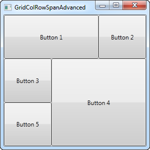
With three columns and three rows we would normally have nine cells, but in this example, we use a combination of row and column spanning to fill all the available space with just five buttons. As you can see, a control can span either extra columns, extra rows or in the case of button 4: both.
So as you can see, spanning multiple columns and/or rows in a Grid is very easy. In a later article, we will use the spanning, along with all the other Grid techniques in a more practical example.