The community is working on translating this tutorial into Hebrew, but it seems that no one has started the translation process for this article yet. If you can help us, then please click "More info".
The StackPanel control
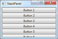
The StackPanel is very similar to the WrapPanel, but with at least one important difference: The StackPanel doesn't wrap the content. Instead it stretches it content in one direction, allowing you to stack item after item on top of each other. Let's first try a very simple example, much like we did with the WrapPanel:
<Window x:Class="WpfTutorialSamples.Panels.StackPanel"
        xmlns="http://schemas.microsoft.com/winfx/2006/xaml/presentation"
        xmlns:x="http://schemas.microsoft.com/winfx/2006/xaml"
        Title="StackPanel" Height="160" Width="300">
	<StackPanel>
		<Button>Button 1</Button>
		<Button>Button 2</Button>
		<Button>Button 3</Button>
		<Button>Button 4</Button>
		<Button>Button 5</Button>
		<Button>Button 6</Button>
	</StackPanel>
</Window>
The first thing you should notice is how the StackPanel doesn't really care whether or not there's enough room for the content. It doesn't wrap the content in any way and it doesn't automatically provide you with the ability to scroll (you can use a ScrollViewer control for that though - more on that in a later chapter).
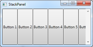
You might also notice that the default orientation of the StackPanel is Vertical, unlike the WrapPanel where the default orientation is Horizontal. But just like for the WrapPanel, this can easily be changed, using the Orientation property:
<StackPanel Orientation="Horizontal">
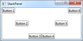
Another thing you will likely notice is that the StackPanel stretches its child control by default. On a vertically aligned StackPanel, like the one in the first example, all child controls get stretched horizontally. On a horizontally aligned StackPanel, all child controls get stretched vertically, as seen above. The StackPanel does this by setting the HorizontalAlignment or VerticalAlignment property on its child controls to Stretch, but you can easily override this if you want to. Have a look at the next example, where we use the same markup as we did in the previous example, but this time we assign values to the VerticalAlignment property for all the child controls:
<Window x:Class="WpfTutorialSamples.Panels.StackPanel"
        xmlns="http://schemas.microsoft.com/winfx/2006/xaml/presentation"
        xmlns:x="http://schemas.microsoft.com/winfx/2006/xaml"
        Title="StackPanel" Height="160" Width="300">
	<StackPanel Orientation="Horizontal">
		<Button VerticalAlignment="Top">Button 1</Button>
		<Button VerticalAlignment="Center">Button 2</Button>
		<Button VerticalAlignment="Bottom">Button 3</Button>
		<Button VerticalAlignment="Bottom">Button 4</Button>
		<Button VerticalAlignment="Center">Button 5</Button>
		<Button VerticalAlignment="Top">Button 6</Button>
	</StackPanel>
</Window>
We use the Top, Center and Bottom values to place the buttons in a nice pattern, just for kicks. The same can of course be done for a vertically aligned StackPanel, where you would use the HorizontalAlignment on the child controls:
<Window x:Class="WpfTutorialSamples.Panels.StackPanel"
        xmlns="http://schemas.microsoft.com/winfx/2006/xaml/presentation"
        xmlns:x="http://schemas.microsoft.com/winfx/2006/xaml"
        Title="StackPanel" Height="160" Width="300">
	<StackPanel Orientation="Vertical">
		<Button HorizontalAlignment="Left">Button 1</Button>
		<Button HorizontalAlignment="Center">Button 2</Button>
		<Button HorizontalAlignment="Right">Button 3</Button>
		<Button HorizontalAlignment="Right">Button 4</Button>
		<Button HorizontalAlignment="Center">Button 5</Button>
		<Button HorizontalAlignment="Left">Button 6</Button>
	</StackPanel>
</Window>
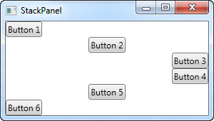
As you can see, the controls still go from top to bottom, but instead of having the same width, each control is aligned to the left, the right or center.