The community is working on translating this tutorial into Georgian, but it seems that no one has started the translation process for this article yet. If you can help us, then please click "More info".
The Grid Control
The Grid is probably the most complex of the panel types. A Grid can contain multiple rows and columns. You define a height for each of the rows and a width for each of the columns, in either an absolute amount of pixels, in a percentage of the available space or as auto, where the row or column will automatically adjust its size depending on the content. Use the Grid when the other panels doesn't do the job, e.g. when you need multiple columns and often in combination with the other panels.
In its most basic form, the Grid will simply take all of the controls you put into it, stretch them to use the maximum available space and place it on top of each other:
<Window x:Class="WpfTutorialSamples.Panels.Grid"
        xmlns="http://schemas.microsoft.com/winfx/2006/xaml/presentation"
        xmlns:x="http://schemas.microsoft.com/winfx/2006/xaml"
        Title="Grid" Height="300" Width="300">
    <Grid>
		<Button>Button 1</Button>
		<Button>Button 2</Button>
	</Grid>
</Window>
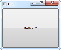
As you can see, the last control gets the top position, which in this case means that you can't even see the first button. Not terribly useful for most situations though, so let's try dividing the space, which is what the grid does so well. We do that by using ColumnDefinitions and RowDefinitions. In the first example, we'll stick to columns:
<Window x:Class="WpfTutorialSamples.Panels.Grid"
        xmlns="http://schemas.microsoft.com/winfx/2006/xaml/presentation"
        xmlns:x="http://schemas.microsoft.com/winfx/2006/xaml"
        Title="Grid" Height="300" Width="300">
    <Grid>
		<Grid.ColumnDefinitions>
			<ColumnDefinition Width="*" />
			<ColumnDefinition Width="*" />
		</Grid.ColumnDefinitions>
		<Button>Button 1</Button>
		<Button Grid.Column="1">Button 2</Button>
	</Grid>
</Window>
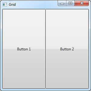
In this example, we have simply divided the available space into two columns, which will share the space equally, using a "star width" (this will be explained later). On the second button, I use a so-called Attached property to place the button in the second column (0 is the first column, 1 is the second and so on). I could have used this property on the first button as well, but it automatically gets assigned to the first column and the first row, which is exactly what we want here.
As you can see, the controls take up all the available space, which is the default behavior when the grid arranges its child controls. It does this by setting the HorizontalAlignment and VerticalAlignment on its child controls to Stretch.
In some situations you may want them to only take up the space they need though and/or control how they are placed in the Grid. The easiest way to do this is to set the HorizontalAlignment and VerticalAlignment directly on the controls you wish to manipulate. Here's a modified version of the above example:
<Window x:Class="WpfTutorialSamples.Panels.Grid"
        xmlns="http://schemas.microsoft.com/winfx/2006/xaml/presentation"
        xmlns:x="http://schemas.microsoft.com/winfx/2006/xaml"
        Title="Grid" Height="300" Width="300">
    <Grid>
		<Grid.ColumnDefinitions>
			<ColumnDefinition Width="*" />
			<ColumnDefinition Width="*" />
		</Grid.ColumnDefinitions>
		<Button VerticalAlignment="Top" HorizontalAlignment="Center">Button 1</Button>
		<Button Grid.Column="1" VerticalAlignment="Center" HorizontalAlignment="Right">Button 2</Button>
	</Grid>
</Window>
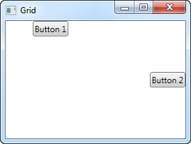
As you can see from the resulting screenshot, the first button is now placed in the top and centered. The second button is placed in the middle, aligned to the right.
Summary
The Grid is a very versatile panel, with many more possibilities than we saw in this article. We'll dig into the rest of them in the next several articles.