The community is working on translating this tutorial into Bangla, but it seems that no one has started the translation process for this article yet. If you can help us, then please click "More info".
The TextBlock control - Inline formatting
In the last article we looked at the core functionality of the TextBlock control: Displaying a simple string and wrapping it if necessary. We even used another color than the default for rendering the text, but what if you wanted to do more than just define a static color for all the text in the TextBlock?
Luckily the TextBlock control supports inline elements. These small control-like constructs all inherit from the Inline class, which means that they can be rendered inline, as a part of a larger text. As of writing, the supported elements include AnchoredBlock, Bold, Hyperlink, InlineUIContainer, Italic, LineBreak, Run, Span, and Underline. In the following examples, we'll have a look at most of them.
Bold, Italic and Underline
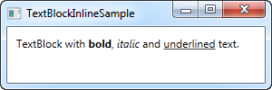
These are probably the simplest types of inline elements. The names should tell you a lot about what they do, but we'll still give you a quick example on how to use them:
<Window x:Class="WpfTutorialSamples.Basic_controls.TextBlockInlineSample"
        xmlns="http://schemas.microsoft.com/winfx/2006/xaml/presentation"
        xmlns:x="http://schemas.microsoft.com/winfx/2006/xaml"
        Title="TextBlockInlineSample" Height="100" Width="300">
    <Grid>
		<TextBlock Margin="10" TextWrapping="Wrap">
			TextBlock with <Bold>bold</Bold>, <Italic>italic</Italic> and <Underline>underlined</Underline> text.
		</TextBlock>
    </Grid>
</Window>
Much like with HTML, you just surround your text with a Bold tag to get bold text and so on. This makes it very easy to create and display diverse text in your applications.
All three of these tags are just child classes of the Span element, each setting a specific property on the Span element to create the desired effect. For instance, the Bold tag just sets the FontWeight property on the underlying Span element, the Italic element sets the FontStyle and so on.
LineBreak
Simply inserts a line break into the text. Please see the previous chapter for an example where we use the LineBreak element.
Hyperlink
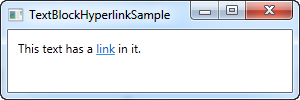
The Hyperlink element allows you to have links in your text. It's rendered with a style that suits your current Windows theme, which will usually be some sort of underlined blue text with a red hover effect and a hand mouse cursor. You can use the NavigateUri property to define the URL that you wish to navigate to. Here's an example:
<Window x:Class="WpfTutorialSamples.Basic_controls.TextBlockHyperlinkSample"
        xmlns="http://schemas.microsoft.com/winfx/2006/xaml/presentation"
        xmlns:x="http://schemas.microsoft.com/winfx/2006/xaml"
        Title="TextBlockHyperlinkSample" Height="100" Width="300">
	<Grid>
		<TextBlock Margin="10" TextWrapping="Wrap">
			This text has a <Hyperlink RequestNavigate="Hyperlink_RequestNavigate" NavigateUri="https://www.google.com">link</Hyperlink> in it.
		</TextBlock>
	</Grid>
</Window>
The Hyperlink is also used inside of WPF Page's, where it can be used to navigate between pages. In that case, you won't have to specifically handle the RequestNavigate event, like we do in the example, but for launching external URL's from a regular WPF application, we need a bit of help from this event and the Process class. We subscribe to the RequestNavigate event, which allows us to launch the linked URL in the users default browser with a simple event handler like this one in the code behind file:
private void Hyperlink_RequestNavigate(object sender, System.Windows.Navigation.RequestNavigateEventArgs e)
{
	System.Diagnostics.Process.Start(e.Uri.AbsoluteUri);
}
Run
The Run element allows you to style a string using all the available properties of the Span element, but while the Span element may contain other inline elements, a Run element may only contain plain text. This makes the Span element more flexible and therefore the logical choice in most cases.
Span
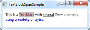
The Span element doesn't have any specific rendering by default, but allows you to set almost any kind of specific rendering, including font size, style and weight, background and foreground colors and so on. The great thing about the Span element is that it allows for other inline elements inside of it, making it easy to do even advanced combinations of text and style. In the following example, I have used many Span elements to show you some of the many possibilities when using inline Span elements:
<Window x:Class="WpfTutorialSamples.Basic_controls.TextBlockSpanSample"
        xmlns="http://schemas.microsoft.com/winfx/2006/xaml/presentation"
        xmlns:x="http://schemas.microsoft.com/winfx/2006/xaml"
        Title="TextBlockSpanSample" Height="100" Width="300">
    <Grid>
		<TextBlock Margin="10" TextWrapping="Wrap">
			This <Span FontWeight="Bold">is</Span> a
			<Span Background="Silver" Foreground="Maroon">TextBlock</Span>
			with <Span TextDecorations="Underline">several</Span>
			<Span FontStyle="Italic">Span</Span> elements,
			<Span Foreground="Blue">
				using a <Bold>variety</Bold> of <Italic>styles</Italic>
			</Span>.
		</TextBlock>
	</Grid>
</Window>
So as you can see, if none of the other elements make sense in your situation or if you just want a blank canvas when starting to format your text, the Span element is a great choice.
Formatting text from C#/Code-Behind
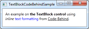
As you can see, formatting text through XAML is very easy, but in some cases, you might prefer or even need to do it from your C#/Code-Behind file. This is a bit more cumbersome, but here's an example on how you may do it:
<Window x:Class="WpfTutorialSamples.Basic_controls.TextBlockCodeBehindSample"
        xmlns="http://schemas.microsoft.com/winfx/2006/xaml/presentation"
        xmlns:x="http://schemas.microsoft.com/winfx/2006/xaml"
        Title="TextBlockCodeBehindSample" Height="100" Width="300">
    <Grid></Grid>
</Window>
using System;
using System.Windows;
using System.Windows.Controls;
using System.Windows.Documents;
using System.Windows.Media;
namespace WpfTutorialSamples.Basic_controls
{
public partial class TextBlockCodeBehindSample : Window
{
public TextBlockCodeBehindSample()
{
InitializeComponent();
TextBlock tb = new TextBlock();
tb.TextWrapping = TextWrapping.Wrap;
tb.Margin = new Thickness(10);
tb.Inlines.Add("An example on ");
tb.Inlines.Add(new Run("the TextBlock control ") { FontWeight = FontWeights.Bold });
tb.Inlines.Add("using ");
tb.Inlines.Add(new Run("inline ") { FontStyle = FontStyles.Italic });
tb.Inlines.Add(new Run("text formatting ") { Foreground = Brushes.Blue });
tb.Inlines.Add("from ");
tb.Inlines.Add(new Run("Code-Behind") { TextDecorations = TextDecorations.Underline });
tb.Inlines.Add(".");
this.Content = tb;
}
}
}
It's great to have the possibility, and it can be necessary to do it like this in some cases, but this example will probably make you appreciate XAML even more.