The community is working on translating this tutorial into Georgian, but it seems that no one has started the translation process for this article yet. If you can help us, then please click "More info".
Using the Grid: A contact form
In the last couple of chapters we went through a lot of theoretic information, each with some very theoretic examples. In this chapter we will combine what we have learned about the Grid so far, into an example that can be used in the real world: A simple contact form.
The good thing about the contact form is that it's just an example of a commonly used dialog - you can take the techniques used and apply them to almost any type of dialog that you need to create.
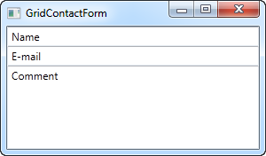
The first take on this task is very simple and will show you a very basic contact form. It uses three rows, two of them with Auto heights and the last one with star height, so it consumes the rest of the available space:
<Window x:Class="WpfTutorialSamples.Panels.GridContactForm"
        xmlns="http://schemas.microsoft.com/winfx/2006/xaml/presentation"
        xmlns:x="http://schemas.microsoft.com/winfx/2006/xaml"
        Title="GridContactForm" Height="300" Width="300">
    <Grid>
		<Grid.RowDefinitions>
			<RowDefinition Height="Auto" />
			<RowDefinition Height="Auto" />
			<RowDefinition Height="*" />
		</Grid.RowDefinitions>
		<TextBox>Name</TextBox>
		<TextBox Grid.Row="1">E-mail</TextBox>
		<TextBox Grid.Row="2" AcceptsReturn="True">Comment</TextBox>
	</Grid>
</Window>
As you can see, the last TextBox simply takes up the remaining space, while the first two only takes up the space they require. Try resizing the window and you will see the comment TextBox resize with it.
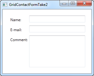
In this very simple example, there are no labels to designate what each of the fields are for. Instead, the explanatory text is inside the TextBox, but this is not generally how a Windows dialog looks. Let's try improving the look and usability a bit:
<Window x:Class="WpfTutorialSamples.Panels.GridContactFormTake2"
        xmlns="http://schemas.microsoft.com/winfx/2006/xaml/presentation"
        xmlns:x="http://schemas.microsoft.com/winfx/2006/xaml"
        Title="GridContactFormTake2" Height="300" Width="300">
	<Grid Margin="10">
		<Grid.ColumnDefinitions>
			<ColumnDefinition Width="Auto" />
			<ColumnDefinition Width="*" />
		</Grid.ColumnDefinitions>
		<Grid.RowDefinitions>
			<RowDefinition Height="Auto" />
			<RowDefinition Height="Auto" />
			<RowDefinition Height="*" />
		</Grid.RowDefinitions>
		<Label>Name: </Label>
		<TextBox Grid.Column="1" Margin="0,0,0,10" />
		<Label Grid.Row="1">E-mail: </Label>
		<TextBox Grid.Row="1" Grid.Column="1" Margin="0,0,0,10" />
		<Label Grid.Row="2">Comment: </Label>
		<TextBox Grid.Row="2" Grid.Column="1" AcceptsReturn="True" />
	</Grid>
</Window>
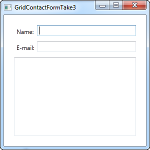
But perhaps you're in a situation where the comment field is pretty self-explanatory? In that case, let's skip the label and use ColumnSpan to get even more space for the comment TextBox:
<TextBox Grid.ColumnSpan="2" Grid.Row="2" AcceptsReturn="True" />
So as you can see, the Grid is a very powerful panel. Hopefully you can use all of these techniques when designing your own dialogs.