The community is working on translating this tutorial into Georgian, but it seems that no one has started the translation process for this article yet. If you can help us, then please click "More info".
The WPF ToolBar control
The toolbar is a row of commands, usually sitting right below the main menu of a standard Windows application. This could in fact be a simple panel with buttons on it, but by using the WPF ToolBar control, you get some extra goodies like automatic overflow handling and the possibility for the end-user to re-position your toolbars.
A WPF ToolBar is usually placed inside of a ToolBarTray control. The ToolBarTray will handle stuff like placement and sizing, and you can have multiple ToolBar controls inside of the ToolBarTray element. Let's try a pretty basic example, to see what it all looks like:
<Window x:Class="WpfTutorialSamples.Common_interface_controls.ToolbarSample"
        xmlns="http://schemas.microsoft.com/winfx/2006/xaml/presentation"
        xmlns:x="http://schemas.microsoft.com/winfx/2006/xaml"
        Title="ToolbarSample" Height="200" Width="300">
    <Window.CommandBindings>
        <CommandBinding Command="New" CanExecute="CommonCommandBinding_CanExecute" />
        <CommandBinding Command="Open" CanExecute="CommonCommandBinding_CanExecute" />
        <CommandBinding Command="Save" CanExecute="CommonCommandBinding_CanExecute" />
    </Window.CommandBindings>
    <DockPanel>
        <ToolBarTray DockPanel.Dock="Top">
            <ToolBar>
                <Button Command="New" Content="New" />
                <Button Command="Open" Content="Open" />
                <Button Command="Save" Content="Save" />
            </ToolBar>
            <ToolBar>
                <Button Command="Cut" Content="Cut" />
                <Button Command="Copy" Content="Copy" />
                <Button Command="Paste" Content="Paste" />
            </ToolBar>
        </ToolBarTray>
        <TextBox AcceptsReturn="True" />
    </DockPanel>
</Window>
using System;
using System.Windows;
using System.Windows.Input;
namespace WpfTutorialSamples.Common_interface_controls
{
public partial class ToolbarSample : Window
{
public ToolbarSample()
{
InitializeComponent();
}
private void CommonCommandBinding_CanExecute(object sender, CanExecuteRoutedEventArgs e)
{
e.CanExecute = true;
}
}
}
Notice how I use commands for all the buttons. We discussed this in the previous chapter and using commands definitely gives us some advantages. Take a look at the Menu chapter, or the articles on commands, for more information.
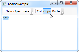
In this example, I add a ToolBarTray to the top of the screen, and inside of it, two ToolBar controls. Each contains some buttons and we use commands to give them their behavior. In Code-behind, I make sure to handle the CanExecute event of the first three buttons, since that's not done automatically by WPF, contrary to the Cut, Copy and Paste commands, which WPF is capable of fully handling for us.
Try running the example and place the cursor over the left part of one of the toolbars (the dotted area). If you click and hold your left mouse button, you can now re-position the toolbar, e.g. below the other or even make them switch place.
Images
While text on the toolbar buttons is perfectly okay, the normal approach is to have icons or at least a combination of an icon and a piece of text. Because WPF uses regular Button controls, adding icons to the toolbar items is very easy. Just have a look at this next example, where we do both:
<Window x:Class="WpfTutorialSamples.Common_interface_controls.ToolbarIconSample"
        xmlns="http://schemas.microsoft.com/winfx/2006/xaml/presentation"
        xmlns:x="http://schemas.microsoft.com/winfx/2006/xaml"
        Title="ToolbarIconSample" Height="200" Width="300">
    <DockPanel>
        <ToolBarTray DockPanel.Dock="Top">
            <ToolBar>
                <Button Command="Cut" ToolTip="Cut selection to Windows Clipboard.">
                    <Image Source="/WpfTutorialSamples;component/Images/cut.png" />
                </Button>
                <Button Command="Copy" ToolTip="Copy selection to Windows Clipboard.">
                    <Image Source="/WpfTutorialSamples;component/Images/copy.png" />
                </Button>
                <Button Command="Paste" ToolTip="Paste from Windows Clipboard.">
                    <StackPanel Orientation="Horizontal">
                        <Image Source="/WpfTutorialSamples;component/Images/paste.png" />
                        <TextBlock Margin="3,0,0,0">Paste</TextBlock>
                    </StackPanel>
                </Button>
            </ToolBar>
        </ToolBarTray>
        <TextBox AcceptsReturn="True" />
    </DockPanel>
</Window>
By specifying an Image control as the Content of the first two buttons, they will be icon based instead of text based. On the third button, I combine an Image control and a TextBlock control inside of a StackPanel, to achieve both icon and text on the button, a commonly used technique for buttons which are extra important or with a less obvious icon.
Notice how I've used the ToolTip property on each of the buttons, to add an explanatory text. This is especially important for those buttons with only an icon, because the purpose of the button might not be clear from only looking at the icon. With the ToolTip property, the user can hover the mouse over the button to get a description of what it does, as demonstrated on the screenshot.
Overflow
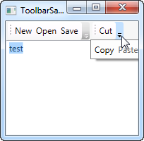
As already mentioned, a very good reason for using the ToolBar control instead of just a panel of buttons, is the automatic overflow handling. It means that if there's no longer enough room to show all of the buttons on the toolbar, WPF will put them in a menu accessible by clicking on the arrow to the right of the toolbar. You can see how it works on this screenshot, which shows the first example, but with a smaller window, thereby leaving less space for the toolbars:

WPF even allows you to decide which items are suitable for overflow hiding and which should always be visible. Usually, when designing a toolbar, some items are less important than the others and some of them you might even want to have in the overflow menu all the time, no matter if there's space enough or not.
This is where the attached property ToolBar.OverflowMode comes into play. The default value is AsNeeded, which simply means that a toolbar item is put in the overflow menu if there's not enough room for it. You may use Always or Never instead, which does exactly what the names imply: Puts the item in the overflow menu all the time or prevents the item from ever being moved to the overflow menu. Here's an example on how to assign this property:
<ToolBar>
    <Button Command="Cut" Content="Cut" ToolBar.OverflowMode="Always" />
    <Button Command="Copy" Content="Copy" ToolBar.OverflowMode="AsNeeded" />
    <Button Command="Paste" Content="Paste" ToolBar.OverflowMode="Never" />
</ToolBar>
Position
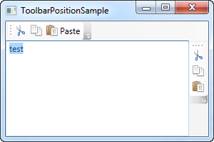
While the most common position for the toolbar is indeed in the top of the screen, toolbars can also be found in the bottom of the application window or even on the sides. The WPF ToolBar of course supports all of this, and while the bottom placed toolbar is merely a matter of docking to the bottom of the panel instead of the top, a vertical toolbar requires the use of the Orientation property of the ToolBar tray. Allow me to demonstrate with an example:
<Window x:Class="WpfTutorialSamples.Common_interface_controls.ToolbarPositionSample"
        xmlns="http://schemas.microsoft.com/winfx/2006/xaml/presentation"
        xmlns:x="http://schemas.microsoft.com/winfx/2006/xaml"
        Title="ToolbarPositionSample" Height="200" Width="300">
	<DockPanel>
		<ToolBarTray DockPanel.Dock="Top">
			<ToolBar>
				<Button Command="Cut" ToolTip="Cut selection to Windows Clipboard.">
					<Image Source="/WpfTutorialSamples;component/Images/cut.png" />
				</Button>
				<Button Command="Copy" ToolTip="Copy selection to Windows Clipboard.">
					<Image Source="/WpfTutorialSamples;component/Images/copy.png" />
				</Button>
				<Button Command="Paste" ToolTip="Paste from Windows Clipboard.">
					<StackPanel Orientation="Horizontal">
						<Image Source="/WpfTutorialSamples;component/Images/paste.png" />
						<TextBlock Margin="3,0,0,0">Paste</TextBlock>
					</StackPanel>
				</Button>
			</ToolBar>
		</ToolBarTray>
		<ToolBarTray DockPanel.Dock="Right" Orientation="Vertical">
			<ToolBar>
				<Button Command="Cut" ToolTip="Cut selection to Windows Clipboard.">
					<Image Source="/WpfTutorialSamples;component/Images/cut.png" />
				</Button>
				<Button Command="Copy" ToolTip="Copy selection to Windows Clipboard.">
					<Image Source="/WpfTutorialSamples;component/Images/copy.png" />
				</Button>
				<Button Command="Paste" ToolTip="Paste from Windows Clipboard.">
					<Image Source="/WpfTutorialSamples;component/Images/paste.png" />
				</Button>
			</ToolBar>
		</ToolBarTray>
		<TextBox AcceptsReturn="True" />
	</DockPanel>
</Window>
The trick here lies in the combination of the DockPanel.Dock property, that puts the ToolBarTray to the right of the application, and the Orientation property, that changes the orientation from horizontal to vertical. This makes it possible to place toolbars in pretty much any location that you might think of.
Custom controls on the ToolBar
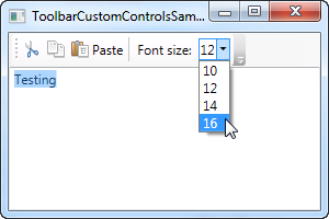
As you have seen on all of the previous examples, we use regular WPF Button controls on the toolbars. This also means that you can place pretty much any other WPF control on the toolbars, with no extra effort. Of course, some controls works better on a toolbar than others, but controls like the ComboBox and TextBox are commonly used on the toolbars in e.g. older versions of Microsoft Office, and you can do the same on your own WPF toolbars.
Another thing introduced in this example is the Separator element, which simply creates a separator between two sets of toolbar items. As you can see from the example, it's very easy to use!
<Window x:Class="WpfTutorialSamples.Common_interface_controls.ToolbarCustomControlsSample"
        xmlns="http://schemas.microsoft.com/winfx/2006/xaml/presentation"
        xmlns:x="http://schemas.microsoft.com/winfx/2006/xaml"
        Title="ToolbarCustomControlsSample" Height="200" Width="300">
	<DockPanel>
		<ToolBarTray DockPanel.Dock="Top">
			<ToolBar>
				<Button Command="Cut" ToolTip="Cut selection to Windows Clipboard.">
					<Image Source="/WpfTutorialSamples;component/Images/cut.png" />
				</Button>
				<Button Command="Copy" ToolTip="Copy selection to Windows Clipboard.">
					<Image Source="/WpfTutorialSamples;component/Images/copy.png" />
				</Button>
				<Button Command="Paste" ToolTip="Paste from Windows Clipboard.">
					<StackPanel Orientation="Horizontal">
						<Image Source="/WpfTutorialSamples;component/Images/paste.png" />
						<TextBlock Margin="3,0,0,0">Paste</TextBlock>
					</StackPanel>
				</Button>
				<Separator />
				<Label>Font size:</Label>
				<ComboBox>
					<ComboBoxItem>10</ComboBoxItem>
					<ComboBoxItem IsSelected="True">12</ComboBoxItem>
					<ComboBoxItem>14</ComboBoxItem>
					<ComboBoxItem>16</ComboBoxItem>
				</ComboBox>
			</ToolBar>
		</ToolBarTray>
		<TextBox AcceptsReturn="True" />
	</DockPanel>
</Window>
Summary
Creating interfaces with toolbars is very easy in WPF, with the flexible ToolBar control. You can do things that previously required 3rd party toolbar controls and you can even do it without much extra effort.