The community is working on translating this tutorial into Georgian, but it seems that no one has started the translation process for this article yet. If you can help us, then please click "More info".
Using the WPF TabControl
The WPF TabControl allows you to split your interface up into different areas, each accessible by clicking on the tab header, usually positioned at the top of the control. Tab controls are commonly used in Windows applications and even within Windows' own interfaces, like the properties dialog for files/folders etc.
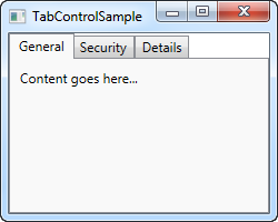
Just like with most other WPF controls, the TabControl is very easy to get started with. Here's a very basic example:
<Window x:Class="WpfTutorialSamples.Misc_controls.TabControlSample"
        xmlns="http://schemas.microsoft.com/winfx/2006/xaml/presentation"
        xmlns:x="http://schemas.microsoft.com/winfx/2006/xaml"
        Title="TabControlSample" Height="200" Width="250">
    <Grid>
        <TabControl>
            <TabItem Header="General">
                <Label Content="Content goes here..." />
            </TabItem>
            <TabItem Header="Security" />
            <TabItem Header="Details" />
        </TabControl>
    </Grid>
</Window>
As you can see, each tab is represented with a TabItem element, where the text shown on it is controlled by the Header property. The TabItem element comes from the ContentControl class, which means that you may define a single element inside of it that will be shown if the tab is active (like on the screenshot). I used a Label in this example, but if you want to place more than one control inside of the tab, just use one of the panels with child controls inside of it.
Customized headers
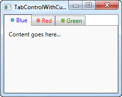
Once again, WPF proves to be extremely flexible when you want to customize the look of your tabs. Obviously the content can be rendered any way you like it, but so can the tab headers! The Header property can be filled with anything you like, which we'll take advantage of in the next example:
<Window x:Class="WpfTutorialSamples.Misc_controls.TabControlWithCustomHeadersSample"
        xmlns="http://schemas.microsoft.com/winfx/2006/xaml/presentation"
        xmlns:x="http://schemas.microsoft.com/winfx/2006/xaml"
        Title="TabControlWithCustomHeadersSample" Height="200" Width="250">
    <Grid>
        <Grid>
            <TabControl>
                <TabItem>
                    <TabItem.Header>
                        <StackPanel Orientation="Horizontal">
                            <Image Source="/WpfTutorialSamples;component/Images/bullet_blue.png" />
                            <TextBlock Text="Blue" Foreground="Blue" />
                        </StackPanel>
                    </TabItem.Header>
                    <Label Content="Content goes here..." />
                </TabItem>
                <TabItem>
                    <TabItem.Header>
                        <StackPanel Orientation="Horizontal">
                            <Image Source="/WpfTutorialSamples;component/Images/bullet_red.png" />
                            <TextBlock Text="Red" Foreground="Red" />
                        </StackPanel>
                    </TabItem.Header>
                </TabItem>
                <TabItem>
                    <TabItem.Header>
                        <StackPanel Orientation="Horizontal">
                            <Image Source="/WpfTutorialSamples;component/Images/bullet_green.png" />
                            <TextBlock Text="Green" Foreground="Green" />
                        </StackPanel>
                    </TabItem.Header>
                </TabItem>
            </TabControl>
        </Grid>
    </Grid>
</Window>
The amount of markup might be a bit overwhelming, but as you can probably see once you dig into it, it's all very simple. Each of the tabs now has a TabControl.Header element, which contains a StackPanel, which in turn contains an Image and a TextBlock control. This allows us to have an image on each of the tabs as well as customize the color of the text (we could have made it bold, italic or another size as well).
Controlling the TabControl
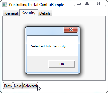
Sometimes you may wish to control which tab is selected programmatically or perhaps get some information about the selected tab. The WPF TabControl has several properties which makes this possible, including SelectedIndex and SelectedItem. In the next example, I've added a couple of buttons to the first example which allows us to control the TabControl:
<Window x:Class="WpfTutorialSamples.Misc_controls.ControllingTheTabControlSample"
        xmlns="http://schemas.microsoft.com/winfx/2006/xaml/presentation"
        xmlns:x="http://schemas.microsoft.com/winfx/2006/xaml"
        Title="ControllingTheTabControlSample" Height="300" Width="350">
    <DockPanel>
        <StackPanel Orientation="Horizontal" DockPanel.Dock="Bottom" Margin="2,5">
            <Button Name="btnPreviousTab" Click="btnPreviousTab_Click">Prev.</Button>
            <Button Name="btnNextTab" Click="btnNextTab_Click">Next</Button>
            <Button Name="btnSelectedTab" Click="btnSelectedTab_Click">Selected</Button>
        </StackPanel>
        <TabControl Name="tcSample">
            <TabItem Header="General">
                <Label Content="Content goes here..." />
            </TabItem>
            <TabItem Header="Security" />
            <TabItem Header="Details" />
        </TabControl>

    </DockPanel>
</Window>
using System;
using System.Windows;
using System.Windows.Controls;
namespace WpfTutorialSamples.Misc_controls
{
public partial class ControllingTheTabControlSample : Window
{
public ControllingTheTabControlSample()
{
InitializeComponent();
}
private void btnPreviousTab_Click(object sender, RoutedEventArgs e)
{
int newIndex = tcSample.SelectedIndex - 1;
if(newIndex < 0)
newIndex = tcSample.Items.Count - 1;
tcSample.SelectedIndex = newIndex;
}
private void btnNextTab_Click(object sender, RoutedEventArgs e)
{
int newIndex = tcSample.SelectedIndex + 1;
if(newIndex >= tcSample.Items.Count)
newIndex = 0;
tcSample.SelectedIndex = newIndex;
}
private void btnSelectedTab_Click(object sender, RoutedEventArgs e)
{
MessageBox.Show("Selected tab: " + (tcSample.SelectedItem as TabItem).Header);
}
}
}
As you can see, I've simply added a set of buttons in the lower part of the interface. The first two allows will select the previous or next tab on the control, while the last one will display information about the currently selected tab, as demonstrated on the screenshot.
The first two buttons uses the SelectedIndex property to determine where we are and then either subtracts or adds one to that value, making sure that the new index doesn't fall below or above the amount of available items. The third button uses the SelectedItem property to get a reference to the selected tab. As you can see, I have to typecast it into the TabItem class to get a hold of the header property, since the SelectedProperty is of the object type by default.
Summary
The TabControl is great when you need a clear separation in a dialog or when there's simply not enough space for all the controls you want in it. In the next couple of chapters, we'll look into some of the possibilites there are when using the TabControl for various purposes.