The community is working on translating this tutorial into Lao, but it seems that no one has started the translation process for this article yet. If you can help us, then please click "More info".
The DockPanel control
The DockPanel makes it easy to dock content in all four directions (top, bottom, left and right). This makes it a great choice in many situations, where you want to divide the window into specific areas, especially because by default, the last element inside the DockPanel, unless this feature is specifically disabled, will automatically fill the rest of the space (center).
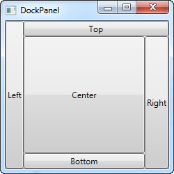
As we've seen with many of the other panels in WPF, you start taking advantage of the panel possibilities by using an attached property of it, in this case the DockPanel.Dock property, which decides in which direction you want the child control to dock to. If you don't use this, the first control(s) will be docked to the left, with the last one taking up the remaining space. Here's an example on how you use it:
<Window x:Class="WpfTutorialSamples.Panels.DockPanel"
        xmlns="http://schemas.microsoft.com/winfx/2006/xaml/presentation"
        xmlns:x="http://schemas.microsoft.com/winfx/2006/xaml"
        Title="DockPanel" Height="250" Width="250">
	<DockPanel>
		<Button DockPanel.Dock="Left">Left</Button>
		<Button DockPanel.Dock="Top">Top</Button>
		<Button DockPanel.Dock="Right">Right</Button>
		<Button DockPanel.Dock="Bottom">Bottom</Button>
		<Button>Center</Button>
	</DockPanel>
</Window>
As already mentioned, we don't assign a dock position for the last child, because it automatically centers the control, allowing it to fill the remaining space. You will also notice that the controls around the center only takes up the amount of space that they need - everything else is left for the center position. That is also why you will see the Right button take up a bit more space than the Left button - the extra character in the text simply requires more pixels.
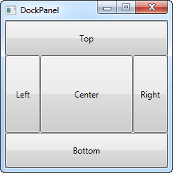
The last thing that you will likely notice, is how the space is divided. For instance, the Top button doesn't get all of the top space, because the Left button takes a part of it. The DockPanel decides which control to favor by looking at their position in the markup. In this case, the Left button gets precedence because it's placed first in the markup. Fortunately, this also means that it's very easy to change, as we'll see in the next example, where we have also evened out the space a bit by assigning widths/heights to the child controls:
<Window x:Class="WpfTutorialSamples.Panels.DockPanel"
        xmlns="http://schemas.microsoft.com/winfx/2006/xaml/presentation"
        xmlns:x="http://schemas.microsoft.com/winfx/2006/xaml"
        Title="DockPanel" Height="250" Width="250">
	<DockPanel>
		<Button DockPanel.Dock="Top" Height="50">Top</Button>
		<Button DockPanel.Dock="Bottom" Height="50">Bottom</Button>
		<Button DockPanel.Dock="Left" Width="50">Left</Button>
		<Button DockPanel.Dock="Right" Width="50">Right</Button>
		<Button>Center</Button>
	</DockPanel>
</Window>
The top and bottom controls now take precedence over the left and right controls, and they're all taking up 50 pixels in either height or width. If you make the window bigger or smaller, you will also see that this static width/height remains the same no matter what - only the center area increases or decreases in size as you resize the window.
LastChildFill
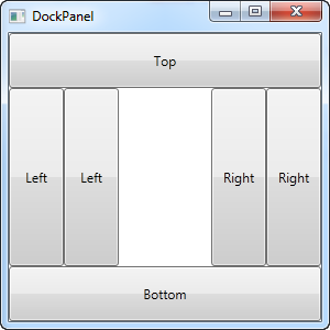
As already mentioned, the default behavior is that the last child of the DockPanel takes up the rest of the space, but this can be disabled using the LastChildFill. Here's an example where we disable it, and at the same time we'll show the ability to dock more than one control to the same side:
<Window x:Class="WpfTutorialSamples.Panels.DockPanel"
        xmlns="http://schemas.microsoft.com/winfx/2006/xaml/presentation"
        xmlns:x="http://schemas.microsoft.com/winfx/2006/xaml"
        Title="DockPanel" Height="300" Width="300">
	<DockPanel LastChildFill="False">
		<Button DockPanel.Dock="Top" Height="50">Top</Button>
		<Button DockPanel.Dock="Bottom" Height="50">Bottom</Button>
		<Button DockPanel.Dock="Left" Width="50">Left</Button>
		<Button DockPanel.Dock="Left" Width="50">Left</Button>
		<Button DockPanel.Dock="Right" Width="50">Right</Button>
		<Button DockPanel.Dock="Right" Width="50">Right</Button>
	</DockPanel>
</Window>
In this example, we dock two controls to the left and two controls to the right, and at the same time, we turn off the LastChildFill property. This leaves us with empty space in the center, which may be preferable in some cases.