The community is working on translating this tutorial into Lithuanian, but it seems that no one has started the translation process for this article yet. If you can help us, then please click "More info".
WPF text rendering
In this article, we'll be discussing why text is sometimes rendered more blurry with WPF, how this was later fixed and how you can control text rendering yourself.
As already mentioned in this tutorial, WPF does a lot more things on its own when compared to other UI frameworks like WinForms, which will use the Windows API for many, many things. This is also clear when it comes to the rendering of text - WinForms uses the GDI API from Windows, while WPF has its own text rendering implementation, to better support animations as well as the device independent nature of WPF.
Unfortunately, this led to text being rendered a bit blurry, especially in small font sizes. This was a rather big problem for WPF programmers for some time, but luckily, Microsoft made a lot of improvements in the WPF text rendering engine in .NET framework version 4.0. This means that if you're using this version or higher, your text should be almost as good as pixel perfect.
Controlling text rendering
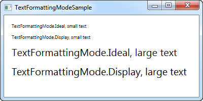
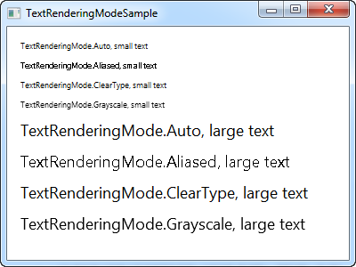
With .NET framework 4.0, Microsoft also decided to give more control of text rendering to the programmer, by introducing the TextOptions class with the TextFormattingMode and TextRenderingMode properties. This allows you to specifically decide how text should be formatted and rendered on a control level. This is probably best illustrated with an example, so have a look at the code and the screenshots below to see how you can affect text rendering with these properties.
TextFormattingMode
Using the TextFormattingMode property, you get to decide which algorithm should be used when formatting the text. You can choose between Ideal (the default value) and Display. You would normally want to leave this property untouched, since the Ideal setting will be best for most situations, but in cases where you need to render very small text, the Display setting can sometimes yield a better result. Here's an example where you can see the difference (although it's very subtle):
<Window x:Class="WpfTutorialSamples.Control_concepts.TextFormattingModeSample"
        xmlns="http://schemas.microsoft.com/winfx/2006/xaml/presentation"
        xmlns:x="http://schemas.microsoft.com/winfx/2006/xaml"
        Title="TextFormattingModeSample" Height="200" Width="400">
    <StackPanel Margin="10">
        <Label TextOptions.TextFormattingMode="Ideal" FontSize="9">TextFormattingMode.Ideal, small text</Label>
        <Label TextOptions.TextFormattingMode="Display" FontSize="9">TextFormattingMode.Display, small text</Label>
        <Label TextOptions.TextFormattingMode="Ideal" FontSize="20">TextFormattingMode.Ideal, large text</Label>
        <Label TextOptions.TextFormattingMode="Display" FontSize="20">TextFormattingMode.Display, large text</Label>
    </StackPanel>
</Window>
TextRenderingMode
The TextRenderingMode property gives you control of which antialiasing algorithm is used when rendering text. It has the biggest effect in combination with the Display setting for the TextFormattingMode property, which we'll use in this example to illustrate the differences:
<Window x:Class="WpfTutorialSamples.Control_concepts.TextRenderingModeSample"
        xmlns="http://schemas.microsoft.com/winfx/2006/xaml/presentation"
        xmlns:x="http://schemas.microsoft.com/winfx/2006/xaml"
        Title="TextRenderingModeSample" Height="300" Width="400">
    <StackPanel Margin="10" TextOptions.TextFormattingMode="Display">
        <Label TextOptions.TextRenderingMode="Auto" FontSize="9">TextRenderingMode.Auto, small text</Label>
        <Label TextOptions.TextRenderingMode="Aliased" FontSize="9">TextRenderingMode.Aliased, small text</Label>
        <Label TextOptions.TextRenderingMode="ClearType" FontSize="9">TextRenderingMode.ClearType, small text</Label>
        <Label TextOptions.TextRenderingMode="Grayscale" FontSize="9">TextRenderingMode.Grayscale, small text</Label>
        <Label TextOptions.TextRenderingMode="Auto" FontSize="18">TextRenderingMode.Auto, large text</Label>
        <Label TextOptions.TextRenderingMode="Aliased" FontSize="18">TextRenderingMode.Aliased, large text</Label>
        <Label TextOptions.TextRenderingMode="ClearType" FontSize="18">TextRenderingMode.ClearType, large text</Label>
        <Label TextOptions.TextRenderingMode="Grayscale" FontSize="18">TextRenderingMode.Grayscale, large text</Label>
    </StackPanel>
</Window>
As you can see, the resulting text differs quite a bit in how it looks and once again, you should mainly change this in special circumstances.