The community is working on translating this tutorial into Burmese, but it seems that no one has started the translation process for this article yet. If you can help us, then please click "More info".
The ComboBox control
The ComboBox control is in many ways like the ListBox control, but takes up a lot less space, because the list of items is hidden when not needed. The ComboBox control is used many places in Windows, but to make sure that everyone knows how it looks and works, we'll jump straight into a simple example:
<Window x:Class="WpfTutorialSamples.ComboBox_control.ComboBoxSample"
        xmlns="http://schemas.microsoft.com/winfx/2006/xaml/presentation"
        xmlns:x="http://schemas.microsoft.com/winfx/2006/xaml"
        Title="ComboBoxSample" Height="150" Width="200">
    <StackPanel Margin="10">
        <ComboBox>
            <ComboBoxItem>ComboBox Item #1</ComboBoxItem>
            <ComboBoxItem IsSelected="True">ComboBox Item #2</ComboBoxItem>
            <ComboBoxItem>ComboBox Item #3</ComboBoxItem>
        </ComboBox>
    </StackPanel>
</Window>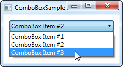
In the screenshot, I have activated the control by clicking it, causing the list of items to be displayed. As you can see from the code, the ComboBox, in its simple form, is very easy to use. All I've done here is manually add some items, making one of them the default selected item by setting the IsSelected property on it.
Custom content
In the first example we only showed text in the items, which is pretty common for the ComboBox control, but since the ComboBoxItem is a ContentControl, we can actually use pretty much anything as content. Let's try making a slightly more sophisticated list of items:
<Window x:Class="WpfTutorialSamples.ComboBox_control.ComboBoxCustomContentSample"
        xmlns="http://schemas.microsoft.com/winfx/2006/xaml/presentation"
        xmlns:x="http://schemas.microsoft.com/winfx/2006/xaml"
        Title="ComboBoxCustomContentSample" Height="150" Width="200">
    <StackPanel Margin="10">
        <ComboBox>
            <ComboBoxItem>
                <StackPanel Orientation="Horizontal">
                    <Image Source="/WpfTutorialSamples;component/Images/bullet_red.png" />
                    <TextBlock Foreground="Red">Red</TextBlock>
                </StackPanel>
            </ComboBoxItem>
            <ComboBoxItem>
                <StackPanel Orientation="Horizontal">
                    <Image Source="/WpfTutorialSamples;component/Images/bullet_green.png" />
                    <TextBlock Foreground="Green">Green</TextBlock>
                </StackPanel>
            </ComboBoxItem>
            <ComboBoxItem>
                <StackPanel Orientation="Horizontal">
                    <Image Source="/WpfTutorialSamples;component/Images/bullet_blue.png" />
                    <TextBlock Foreground="Blue">Blue</TextBlock>
                </StackPanel>
            </ComboBoxItem>
        </ComboBox>
    </StackPanel>
</Window>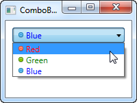
For each of the ComboBoxItem's we now add a StackPanel, in which we add an Image and a TextBlock. This gives us full control of the content as well as the text rendering, as you can see from the screenshot, where both text color and image indicates a color value.
Data binding the ComboBox
As you can see from the first examples, manually defining the items of a ComboBox control is easy using XAML, but you will likely soon run into a situation where you need the items to come from some kind of data source, like a database or just an in-memory list. Using WPF data binding and a custom template, we can easily render a list of colors, including a preview of the color:
<Window x:Class="WpfTutorialSamples.ComboBox_control.ComboBoxDataBindingSample"
        xmlns="http://schemas.microsoft.com/winfx/2006/xaml/presentation"
        xmlns:x="http://schemas.microsoft.com/winfx/2006/xaml"
        Title="ComboBoxDataBindingSample" Height="200" Width="200">
    <StackPanel Margin="10">
        <ComboBox Name="cmbColors">
            <ComboBox.ItemTemplate>
                <DataTemplate>
                    <StackPanel Orientation="Horizontal">
                        <Rectangle Fill="{Binding Name}" Width="16" Height="16" Margin="0,2,5,2" />
                        <TextBlock Text="{Binding Name}" />
                    </StackPanel>
                </DataTemplate>
            </ComboBox.ItemTemplate>
        </ComboBox>
    </StackPanel>
</Window>
using System;
using System.Collections.Generic;
using System.Windows;
using System.Windows.Media;
namespace WpfTutorialSamples.ComboBox_control
{
public partial class ComboBoxDataBindingSample : Window
{
public ComboBoxDataBindingSample()
{
InitializeComponent();
cmbColors.ItemsSource = typeof(Colors).GetProperties();
}
}
}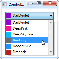
It's actually quite simple: In the Code-behind, I obtain a list of all the colors using a Reflection based approach with the Colors class. I assign it to the ItemsSource property of the ComboBox, which then renders each color using the template I have defined in the XAML part.
Each item, as defined by the ItemTemplate, consists of a StackPanel with a Rectangle and a TextBlock, each bound to the color value. This gives us a complete list of colors, with minimal effort - and it looks pretty good too, right?
IsEditable
In the first examples, the user was only able to select from our list of items, but one of the cool things about the ComboBox is that it supports the possibility of letting the user both select from a list of items or enter their own value. This is extremely useful in situations where you want to help the user by giving them a pre-defined set of options, while still giving them the option to manually enter the desired value. This is all controlled by the IsEditable property, which changes the behavior and look of the ComboBox quite a bit:
<Window x:Class="WpfTutorialSamples.ComboBox_control.ComboBoxEditableSample"
        xmlns="http://schemas.microsoft.com/winfx/2006/xaml/presentation"
        xmlns:x="http://schemas.microsoft.com/winfx/2006/xaml"
        Title="ComboBoxEditableSample" Height="150" Width="200">
    <StackPanel Margin="10">
        <ComboBox IsEditable="True">
            <ComboBoxItem>ComboBox Item #1</ComboBoxItem>
            <ComboBoxItem>ComboBox Item #2</ComboBoxItem>
            <ComboBoxItem>ComboBox Item #3</ComboBoxItem>
        </ComboBox>
    </StackPanel>
</Window>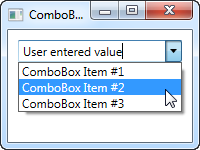
As you can see, I can enter a completely different value or pick one from the list. If picked from the list, it simply overwrites the text of the ComboBox.
As a lovely little bonus, the ComboBox will automatically try to help the user select an existing value when the user starts typing, as you can see from the next screenshot, where I just started typing "Co":
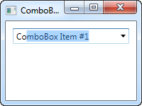
By default, the matching is not case-sensitive but you can make it so by setting the IsTextSearchCaseSensitive to True. If you don't want this auto complete behavior at all, you can disable it by setting the IsTextSearchEnabled to False.
Working with ComboBox selection
A key part of using the ComboBox control is to be able to read the user selection, and even control it with code. In the next example, I've re-used the data bound ComboBox example, but added some buttons for controlling the selection. I've also used the SelectionChanged event to capture when the selected item is changed, either by code or by the user, and act on it.
Here's the sample:
<Window x:Class="WpfTutorialSamples.ComboBox_control.ComboBoxSelectionSample"
        xmlns="http://schemas.microsoft.com/winfx/2006/xaml/presentation"
        xmlns:x="http://schemas.microsoft.com/winfx/2006/xaml"
        Title="ComboBoxSelectionSample" Height="125" Width="250">
    <StackPanel Margin="10">
        <ComboBox Name="cmbColors" SelectionChanged="cmbColors_SelectionChanged">
            <ComboBox.ItemTemplate>
                <DataTemplate>
                    <StackPanel Orientation="Horizontal">
                        <Rectangle Fill="{Binding Name}" Width="16" Height="16" Margin="0,2,5,2" />
                        <TextBlock Text="{Binding Name}" />
                    </StackPanel>
                </DataTemplate>
            </ComboBox.ItemTemplate>
        </ComboBox>
        <WrapPanel Margin="15" HorizontalAlignment="Center">
            <Button Name="btnPrevious" Click="btnPrevious_Click" Width="55">Previous</Button>
            <Button Name="btnNext" Click="btnNext_Click" Margin="5,0" Width="55">Next</Button>
            <Button Name="btnBlue" Click="btnBlue_Click" Width="55">Blue</Button>
        </WrapPanel>
    </StackPanel>
</Window>
using System;
using System.Collections.Generic;
using System.Reflection;
using System.Windows;
using System.Windows.Media;
namespace WpfTutorialSamples.ComboBox_control
{
public partial class ComboBoxSelectionSample : Window
{
public ComboBoxSelectionSample()
{
InitializeComponent();
cmbColors.ItemsSource = typeof(Colors).GetProperties();
}
private void btnPrevious_Click(object sender, RoutedEventArgs e)
{
if(cmbColors.SelectedIndex > 0)
cmbColors.SelectedIndex = cmbColors.SelectedIndex - 1;
}
private void btnNext_Click(object sender, RoutedEventArgs e)
{
if(cmbColors.SelectedIndex < cmbColors.Items.Count-1)
cmbColors.SelectedIndex = cmbColors.SelectedIndex + 1;
}
private void btnBlue_Click(object sender, RoutedEventArgs e)
{
cmbColors.SelectedItem = typeof(Colors).GetProperty("Blue");
}
private void cmbColors_SelectionChanged(object sender, System.Windows.Controls.SelectionChangedEventArgs e)
{
Color selectedColor = (Color)(cmbColors.SelectedItem as PropertyInfo).GetValue(null, null);
this.Background = new SolidColorBrush(selectedColor);
}
}
}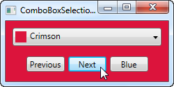
The interesting part of this example is the three event handlers for our three buttons, as well as the SelectionChanged event handler. In the first two, we select the previous or the next item by reading the SelectedIndex property and then subtracting or adding one to it. Pretty simple and easy to work with.
In the third event handler, we use the SelectedItem to select a specific item based on the value. I do a bit of extra work here (using .NET reflection), because the ComboBox is bound to a list of properties, each being a color, instead of a simple list of colors, but basically it's all about giving the value contained by one of the items to the SelectedItem property.
In the fourth and last event handler, I respond to the selected item being changed. When that happens, I read the selected color (once again using Reflection, as described above) and then use the selected color to create a new background brush for the Window. The effect can be seen on the screenshot.
If you're working with an editable ComboBox (IsEditable property set to true), you can read the Text property to know the value the user has entered or selected.