The community is working on translating this tutorial into Sinhala, but it seems that no one has started the translation process for this article yet. If you can help us, then please click "More info".
Creating & using a UserControl
User controls, in WPF represented by the UserControl class, is the concept of grouping markup and code into a reusable container, so that the same interface, with the same functionality, can be used in several different places and even across several applications.
A user control acts much like a WPF Window - an area where you can place other controls, and then a Code-behind file where you can interact with these controls. The file that contains the user control also ends with .xaml, and the Code-behind ends with .xaml.cs - just like a Window. The starting markup looks a bit different though:
<UserControl x:Class="WpfTutorialSamples.User_Controls.LimitedInputUserControl"
         xmlns="http://schemas.microsoft.com/winfx/2006/xaml/presentation"
         xmlns:x="http://schemas.microsoft.com/winfx/2006/xaml"
         xmlns:mc="http://schemas.openxmlformats.org/markup-compatibility/2006"
         xmlns:d="http://schemas.microsoft.com/expression/blend/2008"
         mc:Ignorable="d"
         d:DesignHeight="300" d:DesignWidth="300">
    <Grid>

    </Grid>
</UserControl>
Nothing too strange though - a root UserControl element instead of the Window element, and then the DesignHeight and DesignWidth properties, which controls the size of the user control in design-time (in runtime, the size will be decided by the container that holds the user control). You will notice the same thing in Code-behind, where it simply inherits UserControl instead of Window.
Creating a User Control
Add a user control to your project just like you would add another Window, by right-clicking on the project or folder name where you want to add it, as illustrated on this screenshot (things might look a bit different, depending on the version of Visual Studio you're using):

For this article, we'll be creating a useful User control with the ability to limit the amount of text in a TextBox to a specific number of characters, while showing the user how many characters have been used and how many may be used in total. This is very simple to do, and used in a lot of web applications like Twitter. It would be easy to just add this functionality to your regular Window, but since it could be useful to do in several places in your application, it makes sense to wrap it in an easily reusable UserControl.
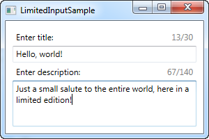
Before we dive into the code, let's have a look at the end result that we're going for:

Here's the code for the user control itself:
<UserControl x:Class="WpfTutorialSamples.User_Controls.LimitedInputUserControl"
         xmlns="http://schemas.microsoft.com/winfx/2006/xaml/presentation"
         xmlns:x="http://schemas.microsoft.com/winfx/2006/xaml"
         xmlns:mc="http://schemas.openxmlformats.org/markup-compatibility/2006"
         xmlns:d="http://schemas.microsoft.com/expression/blend/2008"
         mc:Ignorable="d"
         d:DesignHeight="300" d:DesignWidth="300">
    <Grid>
    <Grid.RowDefinitions>
        <RowDefinition Height="Auto" />
        <RowDefinition Height="*" />
    </Grid.RowDefinitions>
    <Grid.ColumnDefinitions>
        <ColumnDefinition Width="*" />
        <ColumnDefinition Width="Auto" />
    </Grid.ColumnDefinitions>
    <Label Content="{Binding Title}" />
    <Label Grid.Column="1">
        <StackPanel Orientation="Horizontal">
        <TextBlock Text="{Binding ElementName=txtLimitedInput, Path=Text.Length}" />
        <TextBlock Text="/" />
        <TextBlock Text="{Binding MaxLength}" />
        </StackPanel>
    </Label>
    <TextBox MaxLength="{Binding MaxLength}" Grid.Row="1" Grid.ColumnSpan="2" Name="txtLimitedInput" ScrollViewer.VerticalScrollBarVisibility="Auto" TextWrapping="Wrap" />
    </Grid>
</UserControl>
using System;
using System.Windows.Controls;
namespace WpfTutorialSamples.User_Controls
{
public partial class LimitedInputUserControl : UserControl
{
public LimitedInputUserControl()
{
InitializeComponent();
this.DataContext = this;
}
public string Title { get; set; }
public int MaxLength { get; set; }
}
}The markup is pretty straight forward: A Grid, with two columns and two rows. The upper part of the Grid contains two labels, one showing the title and the other one showing the stats. Each of them use data binding for all of the information needed - the Title and MaxLength comes from the Code-behind properties, which we have defined in as regular properties on a regular class.
The current character count is obtained by binding to the Text.Length property directly on the TextBox control, which uses the lower part of the user control. The result can be seen on the screenshot above. Notice that because of all these bindings, we don't need any C# code to update the labels or set the MaxLength property on the TextBox - instead, we just bind directly to the properties.
Consuming/using the User Control
With the above code in place, all we need is to consume (use) the User control within our Window. We'll do that by adding a reference to the namespace the UserControl lives in, in the top of the XAML code of your Window:
xmlns:uc="clr-namespace:WpfTutorialSamples.User_Controls"After that, we can use the uc prefix to add the control to our Window like it was any other WPF control:
<uc:LimitedInputUserControl Title="Enter title:" MaxLength="30" Height="50" />Notice how we use the Title and MaxLength properties directly in the XAML. Here's the full code sample for our window:
<Window x:Class="WpfTutorialSamples.User_Controls.LimitedInputSample"
    xmlns="http://schemas.microsoft.com/winfx/2006/xaml/presentation"
    xmlns:x="http://schemas.microsoft.com/winfx/2006/xaml"
    xmlns:uc="clr-namespace:WpfTutorialSamples.User_Controls"
    Title="LimitedInputSample" Height="200" Width="300">
    <Grid Margin="10">
    <Grid.RowDefinitions>
        <RowDefinition Height="Auto" />
        <RowDefinition Height="*" />
    </Grid.RowDefinitions>

    <uc:LimitedInputUserControl Title="Enter title:" MaxLength="30" Height="50" />
    <uc:LimitedInputUserControl Title="Enter description:" MaxLength="140" Grid.Row="1" />

    </Grid>
</Window>
With that, we can reuse this entire piece of functionality in a single line of code, as illustrated in this example where we have the limited text input control two times. As already shown, the final result looks like this:

Summary
Placing commonly used interfaces and functionality in User Controls is highly recommended, and as you can see from the above example, they are very easy to create and use.