The community is working on translating this tutorial into Yiddish, but it seems that no one has started the translation process for this article yet. If you can help us, then please click "More info".
The Slider control
The Slider control allows you to pick a numeric value by dragging a thumb along a horizontal or vertical line. You see it in a lot of user interfaces, but it can still be a bit hard to recognize from the description alone, so here's a very basic example:
<Window x:Class="WpfTutorialSamples.Misc_controls.SliderSample"
        xmlns="http://schemas.microsoft.com/winfx/2006/xaml/presentation"
        xmlns:x="http://schemas.microsoft.com/winfx/2006/xaml"
        Title="SliderSample" Height="100" Width="300">
    <StackPanel VerticalAlignment="Center" Margin="10">
        <Slider Maximum="100" />
    </StackPanel>
</Window>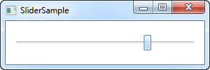
This will allow the end-user to select a value between 0 and 100 by dragging the button (referred to as the thumb) along the line.
Ticks
In the example, I have dragged the thumb beyond the middle, but it's obviously hard to see the exact value. One way to remedy this is to turn on ticks, which are small markers shown on the line to give a better indication on how far the thumb is. Here's an example:
<Window x:Class="WpfTutorialSamples.Misc_controls.SliderSample"
        xmlns="http://schemas.microsoft.com/winfx/2006/xaml/presentation"
        xmlns:x="http://schemas.microsoft.com/winfx/2006/xaml"
        Title="SliderSample" Height="100" Width="300">
    <StackPanel VerticalAlignment="Center" Margin="10">
        <Slider Maximum="100" TickPlacement="BottomRight" TickFrequency="5" />
    </StackPanel>
</Window>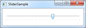
I turn on the tick markers by giving the TickPlacement property another value than None, which is the default. In my example, I want the ticks placed below the line, but you can use TopLeft or even Both as possible values, to change this.
Also notice my use of the TickFrequency property. It defaults to 1, but in an example where the range of possible values goes from 0 to 100, this will result in 100 tick markers, which will have to be fitted into the limited space. In a case like this, it makes sense to raise the TickFrequency to something that will make it look less crowded.
Snapping to ticks
If you have a look at the screenshot above, you will see that the thumb is between ticks. This makes sense, since there are five values between each tick, as specified by the TickFrequency property. Also, the value of the Slider control is in fact by default a double, meaning that the value can (and will likely) be a non-integer. We can change this by using the IsSnapToTickEnabled property, like in the below example:
<Window x:Class="WpfTutorialSamples.Misc_controls.SliderSnapToTickSample"
        xmlns="http://schemas.microsoft.com/winfx/2006/xaml/presentation"
        xmlns:x="http://schemas.microsoft.com/winfx/2006/xaml"
        Title="SliderSnapToTickSample" Height="100" Width="300">
    <StackPanel VerticalAlignment="Center" Margin="10">
        <Slider Maximum="100" TickPlacement="BottomRight" TickFrequency="10" IsSnapToTickEnabled="True" />
    </StackPanel>
</Window>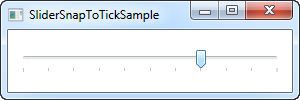
Notice that I've changed the TickFrequency to 10, and then enabled the IsSnapToTickEnabled property. This ensures that the thumb can only be placed directly on a tick value, so for this example, it can only be 0, 10, 20, 30, 40 and so on.
Slider value
So far, we've just used the Slider illustratively, but of course, the actual purpose is to read its current value and use it for something. The Slider has a Value property for that, which you can of course read from Code-behind, or even bind to.
A common scenario in using the Slider is to combine it with a TextBox, which will allow the user to see the currently selected value, as well as changing it by entering a number instead of dragging the Slider thumb. Normally, you would have to subscribe to change events on both the Slider and the TextBox and then update accordingly, but a simple binding can do all of that for us:
<Window x:Class="WpfTutorialSamples.Misc_controls.SliderBoundValueSample"
        xmlns="http://schemas.microsoft.com/winfx/2006/xaml/presentation"
        xmlns:x="http://schemas.microsoft.com/winfx/2006/xaml"
        Title="SliderBoundValueSample" Height="100" Width="300">
    <DockPanel VerticalAlignment="Center" Margin="10">
        <TextBox Text="{Binding ElementName=slValue, Path=Value, UpdateSourceTrigger=PropertyChanged}" DockPanel.Dock="Right" TextAlignment="Right" Width="40" />
        <Slider Maximum="255" TickPlacement="BottomRight" TickFrequency="5" IsSnapToTickEnabled="True" Name="slValue" />
    </DockPanel>
</Window>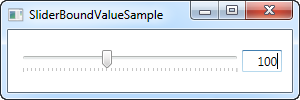
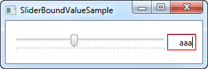
Now you can change the value by using either the Slider or by entering a value in the TextBox, and it will be immediately reflected in the other control. As an added bonus, we get simple validation as well, without any extra work, like if we try to enter a non-numeric value in the TextBox:
Responding to changed values
Of course, while bindings are very cool for a lot of purposes, you still may want to respond to changes in the Slider value from your Code-behind. Fortunately for us, the Slider comes with a ValueChanged event which will help us with that. To illustrate this, I've created a more complex sample with three sliders, where we change the Red, Green and Blue (RGB) values of a color:
<Window x:Class="WpfTutorialSamples.Misc_controls.SliderValueChangedSample"
        xmlns="http://schemas.microsoft.com/winfx/2006/xaml/presentation"
        xmlns:x="http://schemas.microsoft.com/winfx/2006/xaml"
        Title="SliderValueChangedSample" Height="200" Width="300">
    <StackPanel Margin="10" VerticalAlignment="Center">
        <DockPanel VerticalAlignment="Center" Margin="10">
            <Label DockPanel.Dock="Left" FontWeight="Bold">R:</Label>
            <TextBox Text="{Binding ElementName=slColorR, Path=Value, UpdateSourceTrigger=PropertyChanged}" DockPanel.Dock="Right" TextAlignment="Right" Width="40" />
            <Slider Maximum="255" TickPlacement="BottomRight" TickFrequency="5" IsSnapToTickEnabled="True" Name="slColorR" ValueChanged="ColorSlider_ValueChanged" />
        </DockPanel>

        <DockPanel VerticalAlignment="Center" Margin="10">
            <Label DockPanel.Dock="Left" FontWeight="Bold">G:</Label>
            <TextBox Text="{Binding ElementName=slColorG, Path=Value, UpdateSourceTrigger=PropertyChanged}" DockPanel.Dock="Right" TextAlignment="Right" Width="40" />
            <Slider Maximum="255" TickPlacement="BottomRight" TickFrequency="5" IsSnapToTickEnabled="True" Name="slColorG" ValueChanged="ColorSlider_ValueChanged" />
        </DockPanel>

        <DockPanel VerticalAlignment="Center" Margin="10">
            <Label DockPanel.Dock="Left" FontWeight="Bold">B:</Label>
            <TextBox Text="{Binding ElementName=slColorB, Path=Value, UpdateSourceTrigger=PropertyChanged}" DockPanel.Dock="Right" TextAlignment="Right" Width="40" />
            <Slider Maximum="255" TickPlacement="BottomRight" TickFrequency="5" IsSnapToTickEnabled="True" Name="slColorB" ValueChanged="ColorSlider_ValueChanged" />
        </DockPanel>
    </StackPanel>
</Window>
using System;
using System.Windows;
using System.Windows.Media;
namespace WpfTutorialSamples.Misc_controls
{
public partial class SliderValueChangedSample : Window
{
public SliderValueChangedSample()
{
InitializeComponent();
}
private void ColorSlider_ValueChanged(object sender, RoutedPropertyChangedEventArgs<double> e)
{
Color color = Color.FromRgb((byte)slColorR.Value, (byte)slColorG.Value, (byte)slColorB.Value);
this.Background = new SolidColorBrush(color);
}
}
}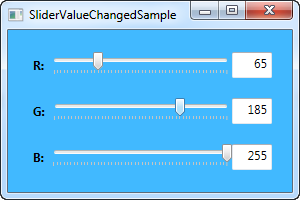
In the XAML part of the code, we have three DockPanels, each with a Label, a Slider and a TextBox control. Just like before, the Text property of the TextBox controls have been bound to the Value of the Slider.
Each slider subscribes to the same ValueChanged event, in which we create a new Color instance, based on the currently selected values and then uses this color to create a new SolidColorBrush for the Background property of the Window.
All in all, this is a pretty good example of what the Slider control can be used for.