The community is working on translating this tutorial into isiZulu, but it seems that no one has started the translation process for this article yet. If you can help us, then please click "More info".
The Image control
The WPF Image control will allow you to display images inside your applications. It's a very versatile control, with many useful options and methods, as you will learn in this article. But first, let's see the most basic example of including an image inside a Window:
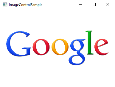
<Image Source="https://upload.wikimedia.org/wikipedia/commons/3/30/Googlelogo.png" />The result will look like this:

The Source property, which we used in this example to specify the image that should be displayed, is probably the most important property of this control, so let's dig into that subject to begin with.
The Source property
As you can see from our first example, the Source property makes it easy to specify which image should be displayed inside the Image control - in this specific example, we used a remote image, which the Image control will just automatically fetch and display as soon as it becomes visible. That's a fine example of how versatile the Image control is, but in a lot of situations, you likely want to bundle the images with your application, instead of loading it from a remote source. This can be accomplished just as easily!
As you probably know, you can add resource files to your project - they can exist inside your current Visual Studio project and be seen in the Solution Explorer just like any other WPF-related file (Windows, User Controls etc.). A relevant example of a resource file is an image, which you can simply copy into a relevant folder of your project, to have it included. It will then be compiled into your application (unless you specifically ask VS not to do that) and can then be accessed using the URL format for resources. So, if you have an image called "google.png" inside a folder called "Images", the syntax could look like this:
<Image Source="/WpfTutorialSamples;component/Images/google.png" />These URI's, often referred to as "Pack URI's", are a heavy topic with a lot more details, but for now, just notice that it's essentially made up of two parts:
- The first part (/WpfTutorialSamples;component), where the assembly name (WpfTutorialSamples in my application) is combined with the word "component"
- The second part, where the relative path of the resource is specified: /Images/google.png
Using this syntax, you can easily reference resources included in your application. To simplify things, the WPF framework will also accept a simple, relative URL - this will suffice in most cases, unless you're doing something more complicated in your application, in regards to resources. Using a simple relative URL, it would look like this:
<Image Source="/Images/google.png" />Loading images dynamically (Code-behind)
Specifying the Image Source directly in your XAML will work out for a lot of cases, but sometimes you need to load an image dynamically, e.g. based on a user choice. This is possible to do from Code-behind. Here's how you can load an image found on the user's computer, based on their selection from an OpenFileDialog:
private void BtnLoadFromFile_Click(object sender, RoutedEventArgs e)
{
    OpenFileDialog openFileDialog = new OpenFileDialog();
    if(openFileDialog.ShowDialog() == true)
    {
    Uri fileUri = new Uri(openFileDialog.FileName);
    imgDynamic.Source = new BitmapImage(fileUri);
    }
}
Notice how I create a BitmapImage instance, which I pass a Uri object to, based on the selected path from the dialog. We can use the exact same technique to load an image included in the application as a resource:
private void BtnLoadFromResource_Click(object sender, RoutedEventArgs e)
{
    Uri resourceUri = new Uri("/Images/white_bengal_tiger.jpg", UriKind.Relative);
    imgDynamic.Source = new BitmapImage(resourceUri);
}
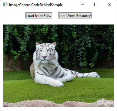
We use the same relative path as we used in one of the previous examples - just be sure to pass in the UriKind.Relative value when you create the Uri instance, so it knows that the path supplied is not an absolute path. Here's the XAML source, as well as a screenshot, of our Code-behind sample:
<Window x:Class="WpfTutorialSamples.Basic_controls.ImageControlCodeBehindSample"
    xmlns="http://schemas.microsoft.com/winfx/2006/xaml/presentation"
    xmlns:x="http://schemas.microsoft.com/winfx/2006/xaml"
    xmlns:d="http://schemas.microsoft.com/expression/blend/2008"
    xmlns:mc="http://schemas.openxmlformats.org/markup-compatibility/2006"
    xmlns:local="clr-namespace:WpfTutorialSamples.Basic_controls"
    mc:Ignorable="d"
    Title="ImageControlCodeBehindSample" Height="300" Width="400">
    <StackPanel>
    <WrapPanel Margin="10" HorizontalAlignment="Center">
        <Button Name="btnLoadFromFile" Margin="0,0,20,0" Click="BtnLoadFromFile_Click">Load from File...</Button>
        <Button Name="btnLoadFromResource" Click="BtnLoadFromResource_Click">Load from Resource</Button>
    </WrapPanel>
    <Image Name="imgDynamic" Margin="10"  />
    </StackPanel>
</Window>
The Stretch property
After the Source property, which is important for obvious reasons, I think the second most interesting property of the Image control might be the Stretch property. It controls what happens when the dimensions of the image loaded doesn't completely match the dimensions of the Image control. This will happen all the time, since the size of your Windows can be controlled by the user and unless your layout is very static, this means that the size of the Image control(s) will also change.
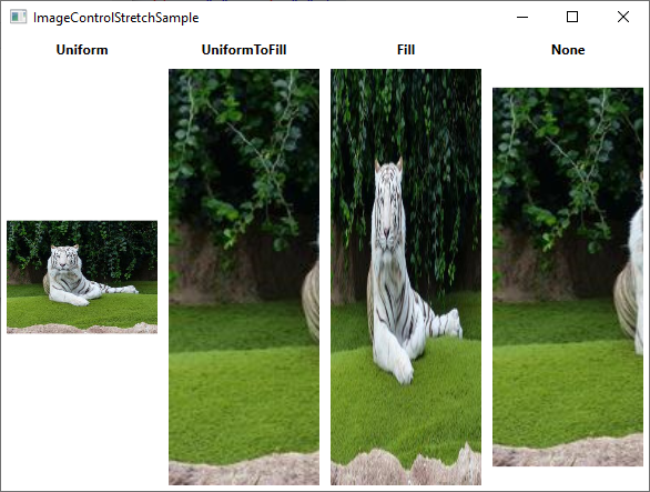
As you can see from this next example, the Stretch property can make quite a bit of difference in how an image is displayed:

<Window x:Class="WpfTutorialSamples.Basic_controls.ImageControlStretchSample"
    xmlns="http://schemas.microsoft.com/winfx/2006/xaml/presentation"
    xmlns:x="http://schemas.microsoft.com/winfx/2006/xaml"
    xmlns:d="http://schemas.microsoft.com/expression/blend/2008"
    xmlns:mc="http://schemas.openxmlformats.org/markup-compatibility/2006"
    xmlns:local="clr-namespace:WpfTutorialSamples.Basic_controls"
    mc:Ignorable="d"
    Title="ImageControlStretchSample" Height="450" Width="600">
    <Grid>
    <Grid.ColumnDefinitions>
        <ColumnDefinition Width="*" />
        <ColumnDefinition Width="*" />
        <ColumnDefinition Width="*" />
        <ColumnDefinition Width="*" />
    </Grid.ColumnDefinitions>
    <Grid.RowDefinitions>
        <RowDefinition Height="Auto" />
        <RowDefinition Height="*" />
    </Grid.RowDefinitions>
    <Label Grid.Column="0" HorizontalAlignment="Center" FontWeight="Bold">Uniform</Label>
    <Label Grid.Column="1" HorizontalAlignment="Center" FontWeight="Bold">UniformToFill</Label>
    <Label Grid.Column="2" HorizontalAlignment="Center" FontWeight="Bold">Fill</Label>
    <Label Grid.Column="3" HorizontalAlignment="Center" FontWeight="Bold">None</Label>
    <Image Source="/Images/white_bengal_tiger.jpg" Stretch="Uniform" Grid.Column="0" Grid.Row="1" Margin="5" />
    <Image Source="/Images/white_bengal_tiger.jpg" Stretch="UniformToFill" Grid.Column="1" Grid.Row="1" Margin="5" />
    <Image Source="/Images/white_bengal_tiger.jpg" Stretch="Fill" Grid.Column="2" Grid.Row="1" Margin="5" />
    <Image Source="/Images/white_bengal_tiger.jpg" Stretch="None" Grid.Column="3" Grid.Row="1" Margin="5" />
    </Grid>
</Window>
It can be a bit hard to tell, but all four Image controls display the same image, but with different values for the Stretch property. Here's how the various modes work:
- Uniform: This is the default mode. The image will be automatically scaled so that it fits within the Image area. The Aspect ratio of the image will be preserved.
- UniformToFill: The image will be scaled so that it completely fills the Image area. The Aspect ratio of the image will be preserved.
- Fill: The image will be scaled to fit the area of the Image control. Aspect ratio might NOT be preserved, because the height and width of the image are scaled independently.
- None: If the image is smaller than the Image control, nothing is done. If it's bigger than the Image control, the image will simply be cropped to fit into the Image control, meaning that only part of it will be visible.
Summary
The WPF Image control makes it easy for you to display an image in your application, whether from a remote source, an embedded resource or from the local computer, as demonstrated in this article.