The community is working on translating this tutorial into Afar, but it seems that no one has started the translation process for this article yet. If you can help us, then please click "More info".
The Label control
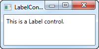
The Label control, in its most simple form, will look very much like the TextBlock which we used in another article. You will quickly notice though that instead of a Text property, the Label has a Content property. The reason for that is that the Label can host any kind of control directly inside of it, instead of just text. This content can be a string as well though, as you will see in this first and very basic example:
<Window x:Class="WpfTutorialSamples.Basic_controls.LabelControlSample"
        xmlns="http://schemas.microsoft.com/winfx/2006/xaml/presentation"
        xmlns:x="http://schemas.microsoft.com/winfx/2006/xaml"
        Title="LabelControlSample" Height="100" Width="200">
    <Grid>
		<Label Content="This is a Label control." />
	</Grid>
</Window>
Another thing you might notice is the fact that the Label, by default, has a bit of padding, allowing the text to be rendered a few pixels away from the top, left corner. This is not the case for the TextBlock control, where you will have to specify it manually.
In a simple case like this, where the content is simply a string, the Label will actually create a TextBlock internally and show your string in that.
The Label control vs. the TextBlock control
So why use a Label at all then? Well, there are a few important differences between the Label and the TextBlock. The TextBlock only allows you to render a text string, while the Label also allows you to:
- Specify a border
- Render other controls, e.g. an image
- Use templated content through the ContentTemplate property
- Use access keys to give focus to related controls
The last bullet point is actually one of the main reasons for using a Label over the TextBlock control. Whenever you just want to render simple text, you should use the TextBlock control, since it's lighter and performs better than the Label in most cases.
Label and Access keys (mnemonics)
In Windows and other operating systems as well, it's common practice that you can access controls in a dialog by holding down the [Alt] key and then pressing a character which corresponds to the control that you wish to access. The character to press will be highlighted when you hold down the [Alt] key. TextBlock controls doesn't support this functionality, but the Label does, so for control labels, the Label control is usually an excellent choice. Let's look at an example of it in action:
<Window x:Class="WpfTutorialSamples.Basic_controls.LabelControlSample"
        xmlns="http://schemas.microsoft.com/winfx/2006/xaml/presentation"
        xmlns:x="http://schemas.microsoft.com/winfx/2006/xaml"
        Title="LabelControlSample" Height="180" Width="250">
	<StackPanel Margin="10">
		<Label Content="_Name:" Target="{Binding ElementName=txtName}" />
		<TextBox Name="txtName" />
		<Label Content="_Mail:" Target="{Binding ElementName=txtMail}" />
		<TextBox Name="txtMail" />
	</StackPanel>
</Window>
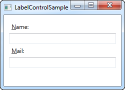
The screenshot shows our sample dialog as it looks when the Alt key is pressed. Try running it, holding down the [Alt] key and then pressing N and M. You will see how focus is moved between the two textboxes.
So, there's several new concepts here. First of all, we define the access key by placing an underscore (_) before the character. It doesn't have to be the first character, it can be before any of the characters in your label content. The common practice is to use the first character that's not already used as an access key for another control.
We use the Target property to connect the Label and the designated control. We use a standard WPF binding for this, using the ElementName property, all of which we will describe later on in this tutorial. The binding is based on the name of the control, so if you change this name, you will also have to remember to change the binding.
Using controls as Label content
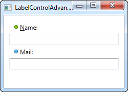
As already mentioned, the Label control allows you to host other controls, while still keeping the other benefits. Let's try an example where we have both an image and a piece of text inside the Label, while also having an access key for each of the labels:
<Window x:Class="WpfTutorialSamples.Basic_controls.LabelControlAdvancedSample"
        xmlns="http://schemas.microsoft.com/winfx/2006/xaml/presentation"
        xmlns:x="http://schemas.microsoft.com/winfx/2006/xaml"
        Title="LabelControlAdvancedSample" Height="180" Width="250">
	<StackPanel Margin="10">
		<Label Target="{Binding ElementName=txtName}">
			<StackPanel Orientation="Horizontal">
				<Image Source="http://cdn1.iconfinder.com/data/icons/fatcow/16/bullet_green.png" />
				<AccessText Text="_Name:" />
			</StackPanel>
		</Label>
		<TextBox Name="txtName" />
		<Label Target="{Binding ElementName=txtMail}">
			<StackPanel Orientation="Horizontal">
				<Image Source="http://cdn1.iconfinder.com/data/icons/fatcow/16/bullet_blue.png" />
				<AccessText Text="_Mail:" />
			</StackPanel>
		</Label>
		<TextBox Name="txtMail" />
	</StackPanel>
</Window>
This is just an extended version of the previous example - instead of a simple text string, our Label will now host both an image and a piece of text (inside the AccessText control, which allows us to still use an access key for the label). Both controls are inside a horizontal StackPanel, since the Label, just like any other ContentControl derivate, can only host one direct child control.
The Image control, described later in this tutorial, uses a remote image - this is ONLY for demonstrational purposes and is NOT a good idea for most real life applications.
Summary
In most situations, the Label control does exactly what the name implies: It acts as a text label for another control. This is the primary purpose of it. For most other cases, you should probably use a TextBlock control or one of the other text containers that WPF offers.