The community is working on translating this tutorial into Estonian, but it seems that no one has started the translation process for this article yet. If you can help us, then please click "More info".
The GroupBox control
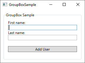
The GroupBox control will allow you to visually group a set of controls together. This could obviously be done using one of the many panels as well, but the GroupBox adds a special type of header and border, which has historically been used a lot within in the Windows operating system. Here's a screenshot of how it might look when you use the GroupBox control:

Notice the border around the controls, with the text "GroupBox Sample" placed inside the border line - this is how a GroupBox looks and acts. Using a GroupBox is as simple as adding the tag to your Window and writing something relevant in the Header property:
<GroupBox Header="GroupBox Sample">

</GroupBox>
The GroupBox can only contain a single child element, but that's no problem - just make this one control a Panel, and you are free to add multiple controls to the panel, e.g. to create a dialog like the one displayed above. Here's the full XAML code listing for my example dialog:
<Window x:Class="WpfTutorialSamples.Misc_controls.GroupBoxSample"
    xmlns="http://schemas.microsoft.com/winfx/2006/xaml/presentation"
    xmlns:x="http://schemas.microsoft.com/winfx/2006/xaml"
    xmlns:d="http://schemas.microsoft.com/expression/blend/2008"
    xmlns:mc="http://schemas.openxmlformats.org/markup-compatibility/2006"
    xmlns:local="clr-namespace:WpfTutorialSamples.Misc_controls"
    mc:Ignorable="d"
    Title="GroupBoxSample" Height="220" Width="300">
    <Grid>
    <GroupBox Header="GroupBox Sample" Margin="10" Padding="10">
        <StackPanel>
        <TextBlock>First name:</TextBlock>
        <TextBox />
        <TextBlock>Last name:</TextBlock>
        <TextBox />
        <Button Margin="0,20">Add User</Button>
        </StackPanel>
    </GroupBox>
    </Grid>
</Window>
GroupBox with custom Header
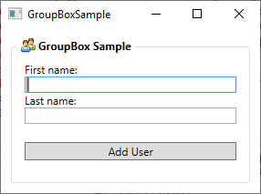
The Header of a GroupBox is normally just plain, unformatted text, but perhaps you're looking to make it a bit more fancy? No problem, because just like pretty much anything found in the WPF framework, you can just replace the text with one or several other controls. So you can just add a TextBlock control and then change the formatting, e.g. the color of the text. You can even add an image, if you want to, like I have done in this next example:

Now the Header has an image and bold text, and it's so easy to do:
<Window x:Class="WpfTutorialSamples.Misc_controls.GroupBoxSample"
    xmlns="http://schemas.microsoft.com/winfx/2006/xaml/presentation"
    xmlns:x="http://schemas.microsoft.com/winfx/2006/xaml"
    xmlns:d="http://schemas.microsoft.com/expression/blend/2008"
    xmlns:mc="http://schemas.openxmlformats.org/markup-compatibility/2006"
    xmlns:local="clr-namespace:WpfTutorialSamples.Misc_controls"
    mc:Ignorable="d"
    Title="GroupBoxSample" Height="220" Width="300">
    <Grid>
    <GroupBox Margin="10" Padding="10">
        <GroupBox.Header>
        <StackPanel Orientation="Horizontal">
            <Image Source="/WpfTutorialSamples;component/Images/group.png" Margin="3,0" />
            <TextBlock FontWeight="Bold">GroupBox Sample</TextBlock>
        </StackPanel>
        </GroupBox.Header>
        <StackPanel>
        <TextBlock>First name:</TextBlock>
        <TextBox />
        <TextBlock>Last name:</TextBlock>
        <TextBox />
        <Button Margin="0,20">Add User</Button>
        </StackPanel>
    </GroupBox>
    </Grid>
</Window>
Notice how I have simply replaced the Header property with a GroupBox.Header tag, which then hosts a StackPanel to contain an Image and a TextBlock - with that in place, you have full control of how the Header should look!
Summary
The WPF GroupBox control will make it easy for you to group related controls together, in a way that visually matches the look of especially the Microsoft Windows operating system.