The community is working on translating this tutorial into Persian, but it seems that no one has started the translation process for this article yet. If you can help us, then please click "More info".
The WrapPanel control
The WrapPanel will position each of its child controls next to the other, horizontally (default) or vertically, until there is no more room, where it will wrap to the next line and then continue. Use it when you want a vertical or horizontal list controls that automatically wraps when there's no more room.
When the WrapPanel uses the Horizontal orientation, the child controls will be given the same height, based on the tallest item. When the WrapPanel is the Vertical orientation, the child controls will be given the same width, based on the widest item.
In the first example, we'll check out a WrapPanel with the default (Horizontal) orientation:
<Window x:Class="WpfTutorialSamples.Panels.WrapPanel"
        xmlns="http://schemas.microsoft.com/winfx/2006/xaml/presentation"
        xmlns:x="http://schemas.microsoft.com/winfx/2006/xaml"
        Title="WrapPanel" Height="300" Width="300">
	<WrapPanel>
		<Button>Test button 1</Button>
		<Button>Test button 2</Button>
		<Button>Test button 3</Button>
		<Button Height="40">Test button 4</Button>
		<Button>Test button 5</Button>
		<Button>Test button 6</Button>
	</WrapPanel>
</Window>
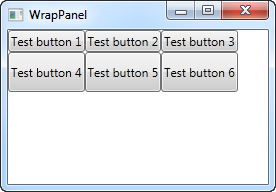
Notice how I set a specific height on one of the buttons in the second row. In the resulting screenshot, you will see that this causes the entire row of buttons to have the same height instead of the height required, as seen on the first row. You will also notice that the panel does exactly what the name implies: It wraps the content when it can't fit any more of it in. In this case, the fourth button couldn't fit in on the first line, so it automatically wraps to the next line.
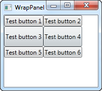
Should you make the window, and thereby the available space, smaller, you will see how the panel immediately adjusts to it:

All of this behavior is also true when you set the Orientation to Vertical. Here's the exact same example as before, but with a Vertical WrapPanel:
<Window x:Class="WpfTutorialSamples.Panels.WrapPanel"
        xmlns="http://schemas.microsoft.com/winfx/2006/xaml/presentation"
        xmlns:x="http://schemas.microsoft.com/winfx/2006/xaml"
        Title="WrapPanel" Height="120" Width="300">
	<WrapPanel Orientation="Vertical">
		<Button>Test button 1</Button>
		<Button>Test button 2</Button>
		<Button>Test button 3</Button>
		<Button Width="140">Test button 4</Button>
		<Button>Test button 5</Button>
		<Button>Test button 6</Button>
	</WrapPanel>
</Window>
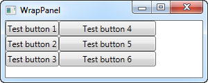
You can see how the buttons go vertical instead of horizontal, before they wrap because they reach the bottom of the window. In this case, I gave a wider width to the fourth button, and you will see that the buttons in the same column also gets the same width, just like we saw with the button height in the Horizontal example.
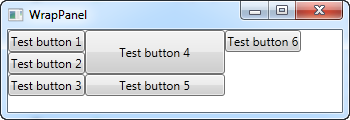
Please be aware that while the Horizontal WrapPanel will match the height in the same row and the Vertical WrapPanel will match the width in the same column, height is not matched in a Vertical WrapPanel and width is not matched in a Horizontal WrapPanel. Take a look in this example, which is the Vertical WrapPanel but where the fourth button gets a custom width AND height:
<Button Width="140" Height="44">Test button 4</Button>It will look like this:

Notice how button 5 only uses the width - it doesn't care about the height, although it causes the sixth button to be pushed to a new column.