The community is working on translating this tutorial into Persian, but it seems that no one has started the translation process for this article yet. If you can help us, then please click "More info".
The ListBox control
In the last article, we had a look at the ItemsControl, which is probably the simplest list in WPF. The ListBox control is the next control in line, which adds a bit more functionality. One of the main differences is the fact that the ListBox control actually deals with selections, allowing the end-user to select one or several items from the list and automatically giving visual feedback for it.
Here's an example of a very simple ListBox control:
<Window x:Class="WpfTutorialSamples.ListBox_control.ListBoxSample"
        xmlns="http://schemas.microsoft.com/winfx/2006/xaml/presentation"
        xmlns:x="http://schemas.microsoft.com/winfx/2006/xaml"
        Title="ListBoxSample" Height="120" Width="200">
    <Grid Margin="10">
		<ListBox>
			<ListBoxItem>ListBox Item #1</ListBoxItem>
			<ListBoxItem>ListBox Item #2</ListBoxItem>
			<ListBoxItem>ListBox Item #3</ListBoxItem>
		</ListBox>
	</Grid>
</Window>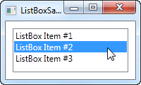
This is as simple as it gets: We declare a ListBox control, and inside of it, we declare three ListBoxItem's, each with its own text. However, since the ListBoxItem is actually a ContentControl, we can define custom content for it:
<Window x:Class="WpfTutorialSamples.ListBox_control.ListBoxSample"
        xmlns="http://schemas.microsoft.com/winfx/2006/xaml/presentation"
        xmlns:x="http://schemas.microsoft.com/winfx/2006/xaml"
        Title="ListBoxSample" Height="120" Width="200">
	<Grid Margin="10">
		<ListBox>
			<ListBoxItem>
				<StackPanel Orientation="Horizontal">
					<Image Source="/WpfTutorialSamples;component/Images/bullet_blue.png" />
					<TextBlock>ListBox Item #1</TextBlock>
				</StackPanel>
			</ListBoxItem>
			<ListBoxItem>
				<StackPanel Orientation="Horizontal">
					<Image Source="/WpfTutorialSamples;component/Images/bullet_green.png" />
					<TextBlock>ListBox Item #2</TextBlock>
				</StackPanel>
			</ListBoxItem>
			<ListBoxItem>
				<StackPanel Orientation="Horizontal">
					<Image Source="/WpfTutorialSamples;component/Images/bullet_red.png" />
					<TextBlock>ListBox Item #3</TextBlock>
				</StackPanel>
			</ListBoxItem>
		</ListBox>
	</Grid>
</Window>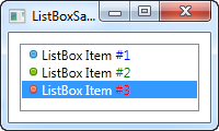
For each of the ListBoxItem's we now add a StackPanel, in which we add an Image and a TextBlock. This gives us full control of the content as well as the text rendering, as you can see from the screenshot, where different colors have been used for each of the numbers.
From the screenshot you might also notice another difference when comparing the ItemsControl to the ListBox: By default, a border is shown around the control, making it look like an actual control instead of just output.
Data binding the ListBox
Manually defining items for the ListBox makes for a fine first example, but most of the times, your ListBox controls will be filled with items from a data source using data binding. By default, if you bind a list of items to the ListBox, their ToString() method will be used to represent each item. This is rarely what you want, but fortunately, we can easily declare a template that will be used to render each item.
I have re-used the TODO based example from the ItemsControl article, where we build a cool TODO list using a simple Code-behind class and, in this case, a ListBox control for the visual representation. Here's the example:
<Window x:Class="WpfTutorialSamples.ListBox_control.ListBoxDataBindingSample"
        xmlns="http://schemas.microsoft.com/winfx/2006/xaml/presentation"
        xmlns:x="http://schemas.microsoft.com/winfx/2006/xaml"
        Title="ListBoxDataBindingSample" Height="150" Width="300">
    <Grid Margin="10">
		<ListBox Name="lbTodoList" HorizontalContentAlignment="Stretch">
			<ListBox.ItemTemplate>
				<DataTemplate>
					<Grid Margin="0,2">
						<Grid.ColumnDefinitions>
							<ColumnDefinition Width="*" />
							<ColumnDefinition Width="100" />
						</Grid.ColumnDefinitions>
						<TextBlock Text="{Binding Title}" />
						<ProgressBar Grid.Column="1" Minimum="0" Maximum="100" Value="{Binding Completion}" />
					</Grid>
				</DataTemplate>
			</ListBox.ItemTemplate>
		</ListBox>
	</Grid>
</Window>
using System;
using System.Windows;
using System.Collections.Generic;
namespace WpfTutorialSamples.ListBox_control
{
public partial class ListBoxDataBindingSample : Window
{
public ListBoxDataBindingSample()
{
InitializeComponent();
List<TodoItem> items = new List<TodoItem>();
items.Add(new TodoItem() { Title = "Complete this WPF tutorial", Completion = 45 });
items.Add(new TodoItem() { Title = "Learn C#", Completion = 80 });
items.Add(new TodoItem() { Title = "Wash the car", Completion = 0 });
lbTodoList.ItemsSource = items;
}
}
public class TodoItem
{
public string Title { get; set; }
public int Completion { get; set; }
}
}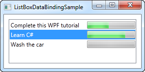
All the magic happens in the ItemTemplate that we have defined for the ListBox. In there, we specify that each ListBox item should consist of a Grid, divided into two columns, with a TextBlock showing the title in the first and a ProgressBar showing the completion status in the second column. To get the values out, we use some very simple data binding, which is all explained in the data binding part of this tutorial.
In the Code-behind file, we have declared a very simple TodoItem class to hold each of our TODO items. In the constructor of the window, we initialize a list, add three TODO items to it and then assign it to the ItemsSource of the ListBox. The combination of the ItemsSource and the ItemTemplate we specified in the XAML part, this is all WPF need to render all of the items as a TODO list.
Please notice the HorizontalContentAlignment property that I set to Stretch on the ListBox. The default content alignment for a ListBox item is Left, which means that each item only takes up as much horizontal space as it needs. The result? Well, not quite what we want:
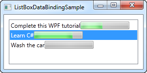
By using the Stretch alignment, each item is stretched to take up the full amount of available space, as you can see from the previous screenshot.
Working with ListBox selection
As mentioned, a key difference between the ItemsControl and the ListBox is that the ListBox handles and displays user selection for you. Therefore, a lot of ListBox question revolves around somehow working with the selection. To help with some of these questions, I have created a bigger example, showing you some selection related tricks:
<Window x:Class="WpfTutorialSamples.ListBox_control.ListBoxSelectionSample"
        xmlns="http://schemas.microsoft.com/winfx/2006/xaml/presentation"
        xmlns:x="http://schemas.microsoft.com/winfx/2006/xaml"
        Title="ListBoxSelectionSample" Height="250" Width="450">
	<DockPanel Margin="10">
		<StackPanel DockPanel.Dock="Right" Margin="10,0">
			<StackPanel.Resources>
				<Style TargetType="Button">
					<Setter Property="Margin" Value="0,0,0,5" />
				</Style>
			</StackPanel.Resources>
			<TextBlock FontWeight="Bold" Margin="0,0,0,10">ListBox selection</TextBlock>
			<Button Name="btnShowSelectedItem" Click="btnShowSelectedItem_Click">Show selected</Button>
			<Button Name="btnSelectLast" Click="btnSelectLast_Click">Select last</Button>
			<Button Name="btnSelectNext" Click="btnSelectNext_Click">Select next</Button>
			<Button Name="btnSelectCSharp" Click="btnSelectCSharp_Click">Select C#</Button>
			<Button Name="btnSelectAll" Click="btnSelectAll_Click">Select all</Button>
		</StackPanel>
		<ListBox Name="lbTodoList" HorizontalContentAlignment="Stretch" SelectionMode="Extended" SelectionChanged="lbTodoList_SelectionChanged">
			<ListBox.ItemTemplate>
				<DataTemplate>
					<Grid Margin="0,2">
						<Grid.ColumnDefinitions>
							<ColumnDefinition Width="*" />
							<ColumnDefinition Width="100" />
						</Grid.ColumnDefinitions>
						<TextBlock Text="{Binding Title}" />
						<ProgressBar Grid.Column="1" Minimum="0" Maximum="100" Value="{Binding Completion}" />
					</Grid>
				</DataTemplate>
			</ListBox.ItemTemplate>
		</ListBox>
	</DockPanel>
</Window>
using System;
using System.Windows;
using System.Collections.Generic;
namespace WpfTutorialSamples.ListBox_control
{
public partial class ListBoxSelectionSample : Window
{
public ListBoxSelectionSample()
{
InitializeComponent();
List<TodoItem> items = new List<TodoItem>();
items.Add(new TodoItem() { Title = "Complete this WPF tutorial", Completion = 45 });
items.Add(new TodoItem() { Title = "Learn C#", Completion = 80 });
items.Add(new TodoItem() { Title = "Wash the car", Completion = 0 });
lbTodoList.ItemsSource = items;
}
private void lbTodoList_SelectionChanged(object sender, System.Windows.Controls.SelectionChangedEventArgs e)
{
if(lbTodoList.SelectedItem != null)
this.Title = (lbTodoList.SelectedItem as TodoItem).Title;
}
private void btnShowSelectedItem_Click(object sender, RoutedEventArgs e)
{
foreach(object o in lbTodoList.SelectedItems)
MessageBox.Show((o as TodoItem).Title);
}
private void btnSelectLast_Click(object sender, RoutedEventArgs e)
{
lbTodoList.SelectedIndex = lbTodoList.Items.Count - 1;
}
private void btnSelectNext_Click(object sender, RoutedEventArgs e)
{
int nextIndex = 0;
if((lbTodoList.SelectedIndex >= 0) && (lbTodoList.SelectedIndex < (lbTodoList.Items.Count - 1)))
nextIndex = lbTodoList.SelectedIndex + 1;
lbTodoList.SelectedIndex = nextIndex;
}
private void btnSelectCSharp_Click(object sender, RoutedEventArgs e)
{
foreach(object o in lbTodoList.Items)
{
if((o is TodoItem) && ((o as TodoItem).Title.Contains("C#")))
{
lbTodoList.SelectedItem = o;
break;
}
}
}
private void btnSelectAll_Click(object sender, RoutedEventArgs e)
{
foreach(object o in lbTodoList.Items)
lbTodoList.SelectedItems.Add(o);
}
}
public class TodoItem
{
public string Title { get; set; }
public int Completion { get; set; }
}
}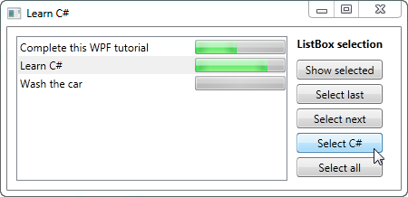
As you can see, I have defined a range of buttons to the right of the ListBox, to either get or manipulate the selection. I've also changed the SelectionMode to Extended, to allow for the selection of multiple items. This can be done either programmatically, as I do in the example, or by the end-user, by holding down [Ctrl] or [Shift] while clicking on the items.
For each of the buttons, I have defined a click handler in the Code-behind. Each action should be pretty self-explanatory and the C# code used is fairly simple, but if you're still in doubt, try running the example on your own machine and test out the various possibilities in the example.
Summary
The ListBox control is much like the ItemsControl and several of the same techniques can be used. The ListBox does offer a bit more functionality when compared to the ItemsControl, especially the selection handling. For even more functionality, like column headers, you should have a look at the ListView control, which is given a very thorough description later on in this tutorial with several articles explaining all the functionality.