The community is working on translating this tutorial into Armenian, but it seems that no one has started the translation process for this article yet. If you can help us, then please click "More info".
The ItemsControl
WPF has a wide range of controls for displaying a list of data. They come in several shapes and forms and vary in how complex they are and how much work they perform for you. The simplest variant is the ItemsControl, which is pretty much just a markup-based loop - you need to apply all the styling and templating, but in many cases, that's just what you need.
A simple ItemsControl example
Let's kick off with a very simple example, where we hand-feed the ItemsControl with a set of items. This should show you just how simple the ItemsControl is:
<Window x:Class="WpfTutorialSamples.ItemsControl.ItemsControlSample"
        xmlns="http://schemas.microsoft.com/winfx/2006/xaml/presentation"
        xmlns:x="http://schemas.microsoft.com/winfx/2006/xaml"
		xmlns:system="clr-namespace:System;assembly=mscorlib"
        Title="ItemsControlSample" Height="150" Width="200">
    <Grid Margin="10">
		<ItemsControl>
			<system:String>ItemsControl Item #1</system:String>
			<system:String>ItemsControl Item #2</system:String>
			<system:String>ItemsControl Item #3</system:String>
			<system:String>ItemsControl Item #4</system:String>
			<system:String>ItemsControl Item #5</system:String>
		</ItemsControl>
	</Grid>
</Window>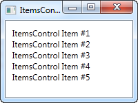
As you can see, there is nothing that shows that we're using a control for repeating the items instead of just manually adding e.g. 5 TextBlock controls - the ItemsControl is completely lookless by default. If you click on one of the items, nothing happens, because there's no concept of selected item(s) or anything like that.
ItemsControl with data binding
Of course the ItemsControl is not meant to be used with items defined in the markup, like we did in the first example. Like pretty much any other control in WPF, the ItemsControl is made for data binding, where we use a template to define how our code-behind classes should be presented to the user.
To demonstrate that, I've whipped up an example where we display a TODO list to the user, and to show you just how flexible everything gets once you define your own templates, I've used a ProgressBar control to show you the current completion percentage. First some code, then a screenshot and then an explanation of it all:
<Window x:Class="WpfTutorialSamples.ItemsControl.ItemsControlDataBindingSample"
        xmlns="http://schemas.microsoft.com/winfx/2006/xaml/presentation"
        xmlns:x="http://schemas.microsoft.com/winfx/2006/xaml"
        Title="ItemsControlDataBindingSample" Height="150" Width="300">
    <Grid Margin="10">
		<ItemsControl Name="icTodoList">
			<ItemsControl.ItemTemplate>
				<DataTemplate>
					<Grid Margin="0,0,0,5">
						<Grid.ColumnDefinitions>
							<ColumnDefinition Width="*" />
							<ColumnDefinition Width="100" />
						</Grid.ColumnDefinitions>
						<TextBlock Text="{Binding Title}" />
						<ProgressBar Grid.Column="1" Minimum="0" Maximum="100" Value="{Binding Completion}" />
					</Grid>
				</DataTemplate>
			</ItemsControl.ItemTemplate>
		</ItemsControl>
	</Grid>
</Window>
using System;
using System.Windows;
using System.Collections.Generic;
namespace WpfTutorialSamples.ItemsControl
{
public partial class ItemsControlDataBindingSample : Window
{
public ItemsControlDataBindingSample()
{
InitializeComponent();
List<TodoItem> items = new List<TodoItem>();
items.Add(new TodoItem() { Title = "Complete this WPF tutorial", Completion = 45 });
items.Add(new TodoItem() { Title = "Learn C#", Completion = 80 });
items.Add(new TodoItem() { Title = "Wash the car", Completion = 0 });
icTodoList.ItemsSource = items;
}
}
public class TodoItem
{
public string Title { get; set; }
public int Completion { get; set; }
}
}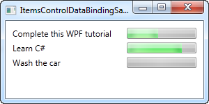
The most important part of this example is the template that we specify inside of the ItemsControl, using a DataTemplate tag inside of the ItemsControl.ItemTemplate. We add a Grid panel, to get two columns: In the first we have a TextBlock, which will show the title of the TODO item, and in the second column we have a ProgressBar control, which value we bind to the Completion property.
The template now represents a TodoItem, which we declare in the Code-behind file, where we also instantiate a number of them and add them to a list. In the end, this list is assigned to the ItemsSource property of our ItemsControl, which then does the rest of the job for us. Each item in the list is displayed by using our template, as you can see from the resulting screenshot.
The ItemsPanelTemplate property
In the above examples, all items are rendered from top to bottom, with each item taking up the full row. This happens because the ItemsControl throw all of our items into a vertically aligned StackPanel by default. It's very easy to change though, since the ItemsControl allows you to change which panel type is used to hold all the items. Here's an example:
<Window x:Class="WpfTutorialSamples.ItemsControl.ItemsControlPanelSample"
        xmlns="http://schemas.microsoft.com/winfx/2006/xaml/presentation"
        xmlns:x="http://schemas.microsoft.com/winfx/2006/xaml"
		xmlns:system="clr-namespace:System;assembly=mscorlib"
        Title="ItemsControlPanelSample" Height="150" Width="250">
	<Grid Margin="10">
		<ItemsControl>
			<ItemsControl.ItemsPanel>
				<ItemsPanelTemplate>
					<WrapPanel />
				</ItemsPanelTemplate>
			</ItemsControl.ItemsPanel>
			<ItemsControl.ItemTemplate>
				<DataTemplate>
					<Button Content="{Binding}" Margin="0,0,5,5" />
				</DataTemplate>
			</ItemsControl.ItemTemplate>
			<system:String>Item #1</system:String>
			<system:String>Item #2</system:String>
			<system:String>Item #3</system:String>
			<system:String>Item #4</system:String>
			<system:String>Item #5</system:String>
		</ItemsControl>
	</Grid>
</Window>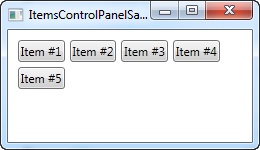
We specify that the ItemsControl should use a WrapPanel as its template by declaring one in the ItemsPanelTemplate property and just for fun, we throw in an ItemTemplate that causes the strings to be rendered as buttons. You can use any of the WPF panels, but some are more useful than others.
Another good example is the UniformGrid panel, where we can define a number of columns and then have our items neatly shown in equally-wide columns:
<Window x:Class="WpfTutorialSamples.ItemsControl.ItemsControlPanelSample"
        xmlns="http://schemas.microsoft.com/winfx/2006/xaml/presentation"
        xmlns:x="http://schemas.microsoft.com/winfx/2006/xaml"
		xmlns:system="clr-namespace:System;assembly=mscorlib"
        Title="ItemsControlPanelSample" Height="150" Width="250">
	<Grid Margin="10">
		<ItemsControl>
			<ItemsControl.ItemsPanel>
				<ItemsPanelTemplate>
					<UniformGrid Columns="2" />
				</ItemsPanelTemplate>
			</ItemsControl.ItemsPanel>
			<ItemsControl.ItemTemplate>
				<DataTemplate>
					<Button Content="{Binding}" Margin="0,0,5,5" />
				</DataTemplate>
			</ItemsControl.ItemTemplate>
			<system:String>Item #1</system:String>
			<system:String>Item #2</system:String>
			<system:String>Item #3</system:String>
			<system:String>Item #4</system:String>
			<system:String>Item #5</system:String>
		</ItemsControl>
	</Grid>
</Window>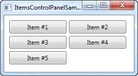
ItemsControl with scrollbars
Once you start using the ItemsControl, you might run into a very common problem: By default, the ItemsControl doesn't have any scrollbars, which means that if the content doesn't fit, it's just clipped. This can be seen by taking our first example from this article and resizing the window:
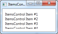
WPF makes this very easy to solve though. There are a number of possible solutions, for instance you can alter the template used by the ItemsControl to include a ScrollViewer control, but the easiest solution is to simply throw a ScrollViewer around the ItemsControl. Here's an example:
<Window x:Class="WpfTutorialSamples.ItemsControl.ItemsControlSample"
        xmlns="http://schemas.microsoft.com/winfx/2006/xaml/presentation"
        xmlns:x="http://schemas.microsoft.com/winfx/2006/xaml"
		xmlns:system="clr-namespace:System;assembly=mscorlib"
        Title="ItemsControlSample" Height="150" Width="200">
	<Grid Margin="10">
		<ScrollViewer VerticalScrollBarVisibility="Auto" HorizontalScrollBarVisibility="Auto">
			<ItemsControl>
				<system:String>ItemsControl Item #1</system:String>
				<system:String>ItemsControl Item #2</system:String>
				<system:String>ItemsControl Item #3</system:String>
				<system:String>ItemsControl Item #4</system:String>
				<system:String>ItemsControl Item #5</system:String>
			</ItemsControl>
		</ScrollViewer>
	</Grid>
</Window>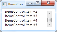
I set the two visibility options to Auto, to make them only visible when needed. As you can see from the screenshot, you can now scroll through the list of items.
Summary
The ItemsControl is great when you want full control of how your data is displayed, and when you don't need any of your content to be selectable. If you want the user to be able to select items from the list, then you're better off with one of the other controls, e.g. the ListBox or the ListView. They will be described in upcoming chapters.