The community is working on translating this tutorial into Malay, but it seems that no one has started the translation process for this article yet. If you can help us, then please click "More info".
The Calendar control
WPF comes with a control for displaying a full calendar right out of the box. It's so simple that you only have to drop it inside your window for a full calendar view, like this:
<Window x:Class="WpfTutorialSamples.Misc_controls.CalendarControlSample"
    xmlns="http://schemas.microsoft.com/winfx/2006/xaml/presentation"
    xmlns:x="http://schemas.microsoft.com/winfx/2006/xaml"
    Title="CalendarControlSample" Height="250" Width="300">
    <Grid>
    <Calendar />
    </Grid>
</Window>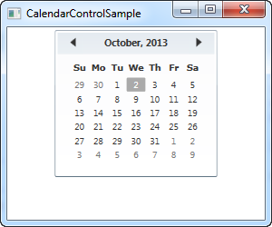
Notice how you now get a full list of the dates within the selected month, including the possibility to jump to previous and next months using the arrows in the top of the control. Unless you set a specific date, the current month will be shown and the current date will be marked as selected.
Calendar size
You will probably notice from our first example that the Calendar doesn't take up all the available space. In fact, even if you give it a large width and height, the actual calendar part will still only take up the amount of space you see on the screenshot, and if you set either of the values very low, the calendar will only be partially visible.
This fixed size behavior is not very typical WPF, where things usually stretch to fill out available space, and it can be a bit annoying to work with if you have a designated amount of space available for the calendar which you want it to fill out. Fortunately for us, everything in WPF is scalable but in the case of the Calendar control, it needs a bit of help. We'll use the Viewbox control for this purpose:
<Window x:Class="WpfTutorialSamples.Misc_controls.CalendarViewboxSample"
    xmlns="http://schemas.microsoft.com/winfx/2006/xaml/presentation"
    xmlns:x="http://schemas.microsoft.com/winfx/2006/xaml"
    Title="CalendarViewboxSample" Height="350" Width="300">
    <Viewbox>
    <Calendar />
    </Viewbox>
</Window>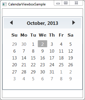
Notice how the Calendar control now scales up to the point where it uses all the available space in the width. The scaling is performed on all parts of the control, including font sizes and border widths.
You will probably also notice that the Calendar control doesn't use up all the available height space. This is noticeable because the window is higher than it is wide and by default, the Viewbox will stretch while maintaining the original aspect ratio. You can easily make it stretch to fill all space in both directions though - simply change the Stretch property from its default Uniform value to Fill:
<Window x:Class="WpfTutorialSamples.Misc_controls.CalendarViewboxSample"
    xmlns="http://schemas.microsoft.com/winfx/2006/xaml/presentation"
    xmlns:x="http://schemas.microsoft.com/winfx/2006/xaml"
    Title="CalendarViewboxSample" Height="350" Width="300">
    <Viewbox Stretch="Fill" StretchDirection="UpOnly">
    <Calendar />
    </Viewbox>
</Window>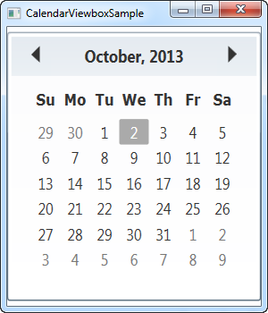
Now it takes up all the available space, in both directions. This is generally not preferable though, since most controls, and this one in particular, will look strange if it gets an abnormal set of dimensions, e.g. 800 pixels high and 300 pixels wide. A Stretch mode set to Uniform (or left out, as it is the default) is usually the way to go.
I would recommend including the StretchDirection property though, as seen in this example. It allows us to specify that the contents should only be scaled up or down, which can be useful. For instance, the Calendar control becomes quite useless below a certain size, where you can no longer see what it is, and to avoid that, you can set the StretchDirection to UpOnly - the Calendar control will then no longer be scaled below its default size.
Setting the initial view using DisplayDate
The Calendar control will by default show the current month, but you can change this by using the DisplayDate property. Simply set it to a date within the month you wish to start with and it will be reflected in the control:
<Window x:Class="WpfTutorialSamples.Misc_controls.CalendarDisplayDateSample"
    xmlns="http://schemas.microsoft.com/winfx/2006/xaml/presentation"
    xmlns:x="http://schemas.microsoft.com/winfx/2006/xaml"
    Title="CalendarDisplayDateSample" Height="300" Width="300">
    <Viewbox>
    <Calendar DisplayDate="01.01.2014" />
    </Viewbox>
</Window>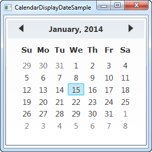
Calendar SelectionMode
The SelectionMode property is interesting. By changing it from its default value, SingleDate, you can select multiple dates or ranges of dates. Here's an example:
<Window x:Class="WpfTutorialSamples.Misc_controls.CalendarSelectionModeSample"
    xmlns="http://schemas.microsoft.com/winfx/2006/xaml/presentation"
    xmlns:x="http://schemas.microsoft.com/winfx/2006/xaml"
    Title="CalendarSelectionModeSample" Height="300" Width="300">
    <Viewbox>
    <Calendar SelectionMode="SingleRange" />
    </Viewbox>
</Window>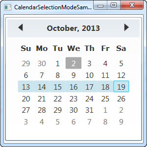
In the SingleRange SelectionMode, you can select an entire range of dates, either by holding down the left mouse button and dragging from one date to another or by holding down the Ctrl or Shift keys while clicking several dates, much like multi selection works in all parts of Windows. On the screenshot, I've selected an entire week, from Sunday to Monday, but you can just as easily select dates in the middle of the week and ranges which expands a single week.
SingleRange mode only allows a single range of dates to be selected though, much like the name suggests. This means that you can't select two dates which are not next to each other, and you can't select more than one range. If you want this, you should switch to MultipleRange selection:
<Calendar SelectionMode="MultipleRange" />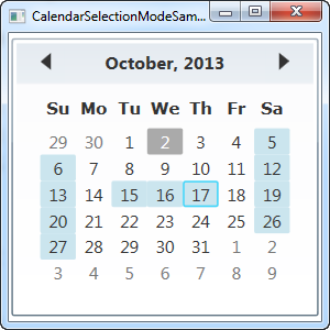
With this property, there are really no limits to the dates you can select. In this case, I've selected all the Saturdays, all the Sundays and a couple of week days in between.
Of course, if you don't want the ability to select one or several dates, you can set the SelectionMode to None.
Now let's discuss how we can work with the selected date(s) of the Calendar control.
Working with the selected date
The SelectedDate property is all you need if you're only allowing single selections (see the above explanation on selection modes). It allows you to both set and get a currently selected date, from Code-behind as well as through a data binding.
Here's an example where we set the selected date to tomorrow from Code-behind and then use a data binding to read out the selected date to a TextBox control:
<Window x:Class="WpfTutorialSamples.Misc_controls.CalendarSelectionSample"
    xmlns="http://schemas.microsoft.com/winfx/2006/xaml/presentation"
    xmlns:x="http://schemas.microsoft.com/winfx/2006/xaml"
    Title="CalendarSelectionSample" Height="280" Width="220">
    <StackPanel Margin="10">
    <Calendar Name="cldSample" SelectionMode="MultipleRange" SelectedDate="10.10.2013" />
    <Label>Selected date:</Label>
    <TextBox Text="{Binding ElementName=cldSample, Path=SelectedDate, StringFormat=d, UpdateSourceTrigger=PropertyChanged}" />
    </StackPanel>
</Window>
using System;
using System.Windows;
namespace WpfTutorialSamples.Misc_controls
{
public partial class CalendarSelectionSample : Window
{
public CalendarSelectionSample()
{
InitializeComponent();
cldSample.SelectedDate = DateTime.Now.AddDays(1);
}
}
}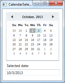
In Code-behind, we simply set the SelectedDate property to the current date plus one day, meaning tomorrow. The user can then change this selection by clicking in the Calendar control, and through the data binding established in Text property of the TextBox, this change will automatically be reflected there.
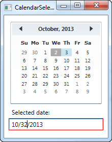
As an added bonus, through the magic of data binding, you can also change the value from the TextBox - just input a valid date and the change will be immediately reflected in the Calendar control. Should you enter a bad date, the automatic binding validation notifies you of the problem:
Working with multiple selected dates
If you allow more than one selected date at the time, you won't find the SelectedDate property that useful. Instead, you should use the SelectedDates, which is a collection of currently selected dates in the Calendar control. This property can be accessed from Code-behind or used with a binding, like we do here:
<Window x:Class="WpfTutorialSamples.Misc_controls.CalendarSelectedDatesSample"
    xmlns="http://schemas.microsoft.com/winfx/2006/xaml/presentation"
    xmlns:x="http://schemas.microsoft.com/winfx/2006/xaml"
    Title="CalendarSelectedDatesSample" Height="420" Width="220">
    <StackPanel Margin="10">
    <Calendar Name="cldSample" SelectionMode="MultipleRange" />
    <Label>Selected dates:</Label>
    <ListBox ItemsSource="{Binding ElementName=cldSample, Path=SelectedDates}" MinHeight="150" />
    </StackPanel>
</Window>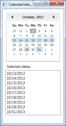
With a simple binding like that, we're now able to display a list of the currently selected dates.
If you want to react to dates being changed from Code-behind, you can subscribe to the SelectedDatesChanged event of the Calendar control.
Blackout dates
Depending on what you use the Calendar control for, you may want to black out certain dates. This could be relevant e.g. in a booking application, where you want to prevent already reserved dates from being selected. The Calendar control supports this right out of the box through the use of the BlackoutDates collection, which you can of course use from both XAML and Code-behind:
<Window x:Class="WpfTutorialSamples.Misc_controls.CalendarBlockedoutDatesSample"
    xmlns="http://schemas.microsoft.com/winfx/2006/xaml/presentation"
    xmlns:x="http://schemas.microsoft.com/winfx/2006/xaml"
    Title="CalendarBlockedoutDatesSample" Height="300" Width="300">
    <Viewbox>
    <Calendar Name="cldSample" SelectionMode="MultipleRange">
        <Calendar.BlackoutDates>
        <CalendarDateRange Start="10.13.2013" End="10.19.2013" />
        <CalendarDateRange Start="10.27.2013" End="10.31.2013" />
        </Calendar.BlackoutDates>
    </Calendar>
    </Viewbox>
</Window>
using System;
using System.Windows;
using System.Windows.Controls;
namespace WpfTutorialSamples.Misc_controls
{
public partial class CalendarBlockedoutDatesSample : Window
{
public CalendarBlockedoutDatesSample()
{
InitializeComponent();
cldSample.BlackoutDates.AddDatesInPast();
cldSample.BlackoutDates.Add(new CalendarDateRange(DateTime.Today, DateTime.Today.AddDays(1)));
}
}
}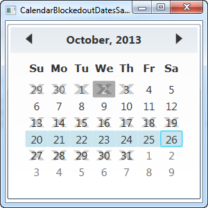
In this example, I demonstrate both ways of adding blacked out dates - through XAML and through Code-behind. Both ways works by adding instances of CalendarDateRange to the BlackedoutDates collection.
In XAML, I'm hardcoding the date ranges (mostly to show you it can be done that way too), while I do something a bit more clever in Code-behind, by first adding all past dates to the collection with a single call to the AddDatesInPast() method and then adding a range consisting of today and tomorrow.
DisplayMode - showing months or years
The DisplayMode property can change the Calendar control from a place where you can select a date to a place where you can select a month or even a year. This is done through the DisplayMode property, which defaults to Month, which we've used in all the previous examples. Here's how it looks if we change it:
<Window x:Class="WpfTutorialSamples.Misc_controls.CalendarDisplayModeSample"
    xmlns="http://schemas.microsoft.com/winfx/2006/xaml/presentation"
    xmlns:x="http://schemas.microsoft.com/winfx/2006/xaml"
    Title="CalendarDisplayModeSample" Height="300" Width="300">
    <Viewbox>
    <Calendar DisplayMode="Year" />
    </Viewbox>
</Window>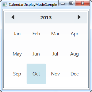
By setting the DisplayMode to Year, we can now select a month of a given year. You can change the year in the top, by using the arrows.
The Calendar control also allows for selecting an entire year, by using the Decade value for the DisplayMode property:
<Calendar DisplayMode="Decade" />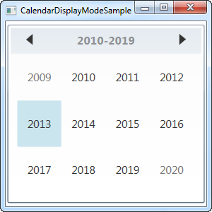
Summary
As you can see, the Calendar control is a very versatile control with lots of options and functionality, requiring only a minimum of configuration to use. If you're building an application with any sort of date-related functionality, you will probably be able to use the Calendar control, one way or another.