The community is working on translating this tutorial into Afrikaans, but it seems that no one has started the translation process for this article yet. If you can help us, then please click "More info".
WPF TabControl: Styling the TabItems
In one of the previous articles, we discovered how easy it was to customize the tab headers of the WPF TabControl, for instance to add an image or color the text. However, if you wish to go beyond that and directly influence how the tab looks, including shape and borders, you need to override the control template of the TabItem element, and while this is not as straight forward as most other areas of WPF, it's still manageable.
So, if you would like to get full control of how the tabs of your TabControl looks, check out the next example:
<Window x:Class="WpfTutorialSamples.Misc_controls.StyledTabItemsSample"
        xmlns="http://schemas.microsoft.com/winfx/2006/xaml/presentation"
        xmlns:x="http://schemas.microsoft.com/winfx/2006/xaml"
        Title="StyledTabItemsSample" Height="150" Width="250">
    <Grid>
        <TabControl Margin="10" BorderThickness="0" Background="LightGray">
            <TabControl.Resources>
                <Style TargetType="TabItem">
                    <Setter Property="Template">
                        <Setter.Value>
                            <ControlTemplate TargetType="TabItem">
                                <Grid Name="Panel">
                                    <ContentPresenter x:Name="ContentSite"
                                        VerticalAlignment="Center"
                                        HorizontalAlignment="Center"
                                        ContentSource="Header"
                                        Margin="10,2"/>
                                </Grid>
                                <ControlTemplate.Triggers>
                                    <Trigger Property="IsSelected" Value="True">
                                        <Setter TargetName="Panel" Property="Background" Value="LightSkyBlue" />
                                    </Trigger>
                                    <Trigger Property="IsSelected" Value="False">
                                        <Setter TargetName="Panel" Property="Background" Value="White" />
                                    </Trigger>
                                </ControlTemplate.Triggers>
                            </ControlTemplate>
                        </Setter.Value>
                    </Setter>
                </Style>
            </TabControl.Resources>
            <TabItem Header="General">
                <Label Content="Content goes here..." />
            </TabItem>
            <TabItem Header="Security" />
            <TabItem Header="Details" />
        </TabControl>
    </Grid>
</Window>
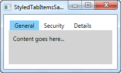
As you can see, this makes the TabControl looks a bit Windows 8'ish, with no borders and a less subtle color to mark the selected tab and no background for the unselected tabs. All of this is accomplished by changing the ControlTemplate, using a Style. By adding a ContentPresenter control, we specify where the content of the TabItem should be placed. We also have a couple of triggers, which controls the background color of the tabs based on the IsSelected property.
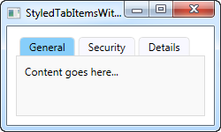
In case you want a less subtle look, it's as easy as changing the template. For instance, you might want a border, but with round corners and a gradient background - no problem! Check out this next example, where we accomplish just that:
<Window x:Class="WpfTutorialSamples.Misc_controls.StyledTabItemsWithBorderSample"
        xmlns="http://schemas.microsoft.com/winfx/2006/xaml/presentation"
        xmlns:x="http://schemas.microsoft.com/winfx/2006/xaml"
        Title="StyledTabItemsWithBorderSample" Height="150" Width="250">
    <Grid>
        <TabControl Margin="10" BorderBrush="Gainsboro">
            <TabControl.Resources>
                <Style TargetType="TabItem">
                    <Setter Property="Template">
                        <Setter.Value>
                            <ControlTemplate TargetType="TabItem">
                                <Border Name="Border" BorderThickness="1,1,1,0" BorderBrush="Gainsboro" CornerRadius="4,4,0,0" Margin="2,0">
                                    <ContentPresenter x:Name="ContentSite"
                                        VerticalAlignment="Center"
                                        HorizontalAlignment="Center"
                                        ContentSource="Header"
                                        Margin="10,2"/>
                                </Border>
                                <ControlTemplate.Triggers>
                                    <Trigger Property="IsSelected" Value="True">
                                        <Setter TargetName="Border" Property="Background" Value="LightSkyBlue" />
                                    </Trigger>
                                    <Trigger Property="IsSelected" Value="False">
                                        <Setter TargetName="Border" Property="Background" Value="GhostWhite" />
                                    </Trigger>
                                </ControlTemplate.Triggers>
                            </ControlTemplate>
                        </Setter.Value>
                    </Setter>
                </Style>
            </TabControl.Resources>
            <TabItem Header="General">
                <Label Content="Content goes here..." />
            </TabItem>
            <TabItem Header="Security" />
            <TabItem Header="Details" />
        </TabControl>
    </Grid>
</Window>
As you can see, I pretty much just added a Border control around the ContentPresenter to achieve this changed look. Hopefully this should demonstrate just how easy it is to get custom styled tabs and how many possibilities there are in this technique.