The community is working on translating this tutorial into Persian, but it seems that no one has started the translation process for this article yet. If you can help us, then please click "More info".
A simple ListView example
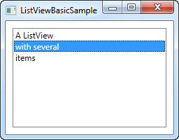
The WPF ListView control is very bare minimum in its most simple form. In fact, it will look a whole lot like the WPF ListBox, until you start adding specialized views to it. That's not so strange, since a ListView inherits directly from the ListBox control. So, a default ListView is actually just a ListBox, with a different selection mode (more on that later).
Let's try creating a ListView in its most simple form:
<Window x:Class="WpfTutorialSamples.ListView_control.ListViewBasicSample"
        xmlns="http://schemas.microsoft.com/winfx/2006/xaml/presentation"
        xmlns:x="http://schemas.microsoft.com/winfx/2006/xaml"
        Title="ListViewBasicSample" Height="200" Width="200">
    <Grid>
		<ListView Margin="10">
			<ListViewItem>A ListView</ListViewItem>
			<ListViewItem IsSelected="True">with several</ListViewItem>
			<ListViewItem>items</ListViewItem>
		</ListView>
	</Grid>
</Window>
This is pretty much as simple as it gets, using manually specified ListViewItem to fill the list and with nothing but a text label representing each item - a bare minimum WPF ListView control.
ListViewItem with an image
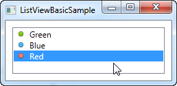
Because of the look-less nature of WPF, specifying an image for a ListViewItem isn't just about assigning an image ID or key to a property. Instead, you take full control of it and specify the controls needed to render both image and text in the ListViewItem. Here's an example:
<Window x:Class="WpfTutorialSamples.ListView_control.ListViewBasicSample"
        xmlns="http://schemas.microsoft.com/winfx/2006/xaml/presentation"
        xmlns:x="http://schemas.microsoft.com/winfx/2006/xaml"
        Title="ListViewBasicSample" Height="200" Width="200">
    <Grid>
		<ListView Margin="10">
			<ListViewItem>
				<StackPanel Orientation="Horizontal">
					<Image Source="/WpfTutorialSamples;component/Images/bullet_green.png" Margin="0,0,5,0" />
					<TextBlock>Green</TextBlock>
				</StackPanel>
			</ListViewItem>
			<ListViewItem>
				<StackPanel Orientation="Horizontal">
					<Image Source="/WpfTutorialSamples;component/Images/bullet_blue.png" Margin="0,0,5,0" />
					<TextBlock>Blue</TextBlock>
				</StackPanel>
			</ListViewItem>
			<ListViewItem IsSelected="True">
				<StackPanel Orientation="Horizontal">
					<Image Source="/WpfTutorialSamples;component/Images/bullet_red.png" Margin="0,0,5,0" />
					<TextBlock>Red</TextBlock>
				</StackPanel>
			</ListViewItem>
		</ListView>
	</Grid>
</Window>
What we do here is very simple. Because the ListViewItem derives from the ContentControl class, we can specify a WPF control as its content. In this case, we use a StackPanel, which has an Image and a TextBlock as its child controls.
Summary
As you can see, building a ListView manually in XAML is very simple, but in most cases, your ListView data will come from some sort of data source, which should be rendered in the ListView at runtime. We will look into doing just that in the next chapter.