The community is working on translating this tutorial into Armenian, but it seems that no one has started the translation process for this article yet. If you can help us, then please click "More info".
In this article series, we're building a complete Snake game from scratch. It makes sense to start with the Introduction and then work your way through the articles one by one, to get the full understanding.
If you want to get the complete source code for the game at once, to get started modifying and learning from it right now, consider downloading all our samples!
Improving SnakeWPF: Making it look more like a game
During the last several articles, we've built a cool Snake game in WPF. We have implemented all the game-mechanics and the result is a fully functional game. However, there are definitely a lot of improvements that could be made, because the current implementation is very bare-minimum. So, in the next articles, I will be making several improvements to our SnakeWPF game - in this article, I will be focusing on making our game look more like an actual game!
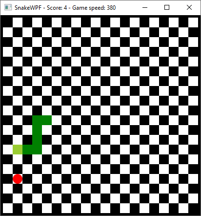
As it looks now, with it's default Windows-style border/title bar, our implementation doesn't look much like a game. However, we have previously needed the title bar to display score/speed information, and as a nice bonus, we automatically got the default Windows buttons for minimizing/maximizing/closing the Window:

At this point, I would like to completely remove the default Windows title bar and instead implement our own top status bar, which should show the current score and speed, as well as a customized close button. All of it should match the current look of the game. Fortunately for us, this is quite easy to accomplish with WPF.
Adding a custom title bar
The first step is to add a couple of properties and a new event to the Window declaration. It should now look like this:
<Window x:Class="WpfTutorialSamples.Games.SnakeWPFSample"
    xmlns="http://schemas.microsoft.com/winfx/2006/xaml/presentation"
    xmlns:x="http://schemas.microsoft.com/winfx/2006/xaml"
    xmlns:d="http://schemas.microsoft.com/expression/blend/2008"
    xmlns:mc="http://schemas.openxmlformats.org/markup-compatibility/2006"
    xmlns:local="clr-namespace:WpfTutorialSamples.Games"
    mc:Ignorable="d"
    Title="SnakeWPF - Score: 0" SizeToContent="WidthAndHeight" ContentRendered="Window_ContentRendered" KeyUp="Window_KeyUp"
    ResizeMode="NoResize" WindowStyle="None" Background="Black" MouseDown="Window_MouseDown">
The changes are all in the last line. We set the ResizeMode to NoResize and the WindowStyle to None. This will completely remove the title bar as well as any default borders around the Window - that's no problem for us though, because the main area of our game already has a 5 px black border.
You will also notice that I have subscribed to a new event - the MouseDown event. The reason is that since we lose the default title bar, there's no longer any way for the user to drag the game from one point of the screen to another. Fortunately for us, it's easy to re-create this behavior, e.g. on our own, custom title bar. However, since it doesn't look like the regular title bar, the user might be confused about where to drag, so I decided simply to make the entire window surface draggable. So, in your Code-behind, define the Window_MouseDown event handler like this:
private void Window_MouseDown(object sender, MouseButtonEventArgs e)
{
    this.DragMove();
}
With that in place, your window can be dragged around no matter where you use the mouse. The next step is to add our custom title bar, which should display the score and speed, as well as a close button. The inner part of the Window XAML should now look like this:
<DockPanel Background="Black">
    <Grid DockPanel.Dock="Top" Name="pnlTitleBar">
    <Grid.ColumnDefinitions>
        <ColumnDefinition Width="*" />
        <ColumnDefinition Width="*" />
        <ColumnDefinition Width="Auto" />
    </Grid.ColumnDefinitions>

    <Grid.Resources>
        <Style TargetType="TextBlock">
        <Setter Property="FontFamily" Value="Consolas" />
        <Setter Property="Foreground" Value="White" />
        <Setter Property="FontSize" Value="24" />
        <Setter Property="FontWeight" Value="Bold" />
        </Style>
    </Grid.Resources>

    <WrapPanel Margin="10,0,0,0">
        <TextBlock>Score:</TextBlock>
        <TextBlock Name="tbStatusScore">0</TextBlock>
    </WrapPanel>
    <WrapPanel Grid.Column="1">
        <TextBlock>Speed:</TextBlock>
        <TextBlock Name="tbStatusSpeed">0</TextBlock>
    </WrapPanel>
    <Button Grid.Column="2" DockPanel.Dock="Right" Background="Transparent" Foreground="White" FontWeight="Bold" FontSize="20" BorderThickness="0" Name="btnClose" Click="BtnClose_Click" Padding="10,0">X</Button>
    </Grid>
    <Border BorderBrush="Black" BorderThickness="5">
    <Canvas Name="GameArea" ClipToBounds="True" Width="400" Height="400">

    </Canvas>
    </Border>
</DockPanel>
And don't forget to define the BtnClose_Click event handler:
private void BtnClose_Click(object sender, RoutedEventArgs e)
{
    this.Close();
}
We previously implemented a method called UpdateGameStatus(), which updated the Title property of the Window - this method should be changed to use the new TextBlock's:
private void UpdateGameStatus()
{
    this.tbStatusScore.Text = currentScore.ToString();
    this.tbStatusSpeed.Text = gameTickTimer.Interval.TotalMilliseconds.ToString();
}
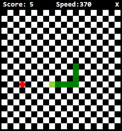
I will tell you all about what we just did, but first, let's check out how the game looks now:

It looks quite a bit cooler, right? But let's discuss what we just did: As you can see, the original Border control with the GameArea Canvas inside of it has now been surrounded by a DockPanel. This makes it easy for us to attach our new title bar, in the form of a Grid panel, to the top of the Window.
The Grid uses several cool WPF techniques which have been discussed elsewhere in this tutorial: We use ColumnDefinition's to divide the area into two equally sized areas (for the score and speed), plus an auto-sized third column for the close button. You will also notice that we use WPF Style's to apply the same visual look to all the TextBlock controls - the same custom font, font size, color and weight are applied to all of them, thanks to a Style defined in the Grid, targeting TextBlock controls.
Also notice how easy it is to customize the Button control used for closing the window, to completely match the rest of the look and feel of the game, simply by using the standard properties - WPF is so flexible!
Summary
In this article, we have made our SnakeWPF implementation look a lot more like a game, by removing the standard Windows-look and applying our own custom title bar. In upcoming articles, we'll make even more improvements!