The community is working on translating this tutorial into Lao, but it seems that no one has started the translation process for this article yet. If you can help us, then please click "More info".
The Grid - Units
So far we have mostly used the star width/height, which specifies that a row or a column should take up a certain percentage of the combined space. However, there are two other ways of specifying the width or height of a column or a row: Absolute units and the Auto width/height. Let's try creating a Grid where we mix these:
<Window x:Class="WpfTutorialSamples.Panels.GridUnits"
        xmlns="http://schemas.microsoft.com/winfx/2006/xaml/presentation"
        xmlns:x="http://schemas.microsoft.com/winfx/2006/xaml"
        Title="GridUnits" Height="200" Width="400">
	<Grid>
		<Grid.ColumnDefinitions>
			<ColumnDefinition Width="1*" />
			<ColumnDefinition Width="Auto" />
			<ColumnDefinition Width="100" />
		</Grid.ColumnDefinitions>
		<Button>Button 1</Button>
		<Button Grid.Column="1">Button 2 with long text</Button>
		<Button Grid.Column="2">Button 3</Button>
	</Grid>
</Window>
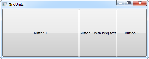
In this example, the first button has a star width, the second one has its width set to Auto and the last one has a static width of 100 pixels.
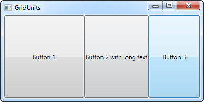
The result can be seen on the screenshot, where the second button only takes exactly the amount of space it needs to render its longer text, the third button takes exactly the 100 pixels it was promised and the first button, with the variable width, takes the rest.
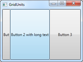
In a Grid where one or several columns (or rows) have a variable (star) width, they automatically get to share the width/height not already used by the columns/rows which uses an absolute or Auto width/height. This becomes more obvious when we resize the window:


On the first screenshot, you will see that the Grid reserves the space for the last two buttons, even though it means that the first one doesn't get all the space it needs to render properly. On the second screenshot, you will see the last two buttons keeping the exact same amount of space, leaving the surplus space to the first button.
This can be a very useful technique when designing a wide range of dialogs. For instance, consider a simple contact form where the user enters a name, an e-mail address and a comment. The first two fields will usually have a fixed height, while the last one might as well take up as much space as possible, leaving room to type a longer comment. In one of the next chapters, we will try building a contact form, using the grid and rows and columns of different heights and widths.