The community is working on translating this tutorial into Malayalam, but it seems that no one has started the translation process for this article yet. If you can help us, then please click "More info".
The Border control
The Border control is a Decorator control that you may use to draw a border, a background, or even both, around another element. Since the WPF panels don't support drawing a border around its edges, the Border control can help you achieve just that, simply by surrounding e.g. a Panel with the Border control.
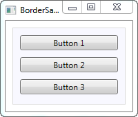
A simple example on using the Border as described above could look like this:
<Window x:Class="WpfTutorialSamples.Misc_controls.BorderSample"
        xmlns="http://schemas.microsoft.com/winfx/2006/xaml/presentation"
        xmlns:x="http://schemas.microsoft.com/winfx/2006/xaml"
        Title="BorderSample" Height="170" Width="200">
    <Grid Margin="10">
		<Border Background="GhostWhite" BorderBrush="Gainsboro" BorderThickness="1">
			<StackPanel Margin="10">
				<Button>Button 1</Button>
				<Button Margin="0,10">Button 2</Button>
				<Button>Button 3</Button>
			</StackPanel>
		</Border>
	</Grid>
</Window>
The Border is completely lookless until you define either a background or a border brush and thickness, so that's what I've done here, using the Background, BorderBrush and BorderThickness properties.
Border with round corners
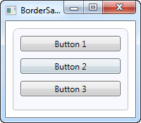
One of the features I really appreciate about the Border is the fact that it's so easy to get round corners. Just look at this slightly modified example, where the corners are now rounded:
<Window x:Class="WpfTutorialSamples.Misc_controls.BorderSample"
        xmlns="http://schemas.microsoft.com/winfx/2006/xaml/presentation"
        xmlns:x="http://schemas.microsoft.com/winfx/2006/xaml"
        Title="BorderSample" Height="175" Width="200">
    <Grid Margin="10">
		<Border Background="GhostWhite" BorderBrush="Silver" BorderThickness="1" CornerRadius="8,8,3,3">
			<StackPanel Margin="10">
				<Button>Button 1</Button>
				<Button Margin="0,10">Button 2</Button>
				<Button>Button 3</Button>
			</StackPanel>
		</Border>
	</Grid>
</Window>
All I've done is adding the CornerRadius property. It can be specified with a single value, which will be used for all four corners, or like I did in the example here, where I specify separate values for the top right and left followed by the bottom right and left.
Border color/thickness
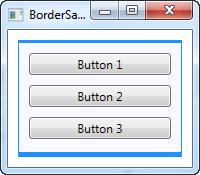
The above border is very discrete, but this can easily be changed by regulating the color and/or thickness. Because the BorderThickness property is of the Thickness type, you can even manipulate each of the border widths individually or by giving a value for the left and right and one for the top and bottom borders.
<Window x:Class="WpfTutorialSamples.Misc_controls.BorderSample"
        xmlns="http://schemas.microsoft.com/winfx/2006/xaml/presentation"
        xmlns:x="http://schemas.microsoft.com/winfx/2006/xaml"
        Title="BorderSample" Height="175" Width="200">
    <Grid Margin="10">
		<Border Background="GhostWhite" BorderBrush="DodgerBlue" BorderThickness="1,3,1,5">
			<StackPanel Margin="10">
				<Button>Button 1</Button>
				<Button Margin="0,10">Button 2</Button>
				<Button>Button 3</Button>
			</StackPanel>
		</Border>
	</Grid>
</Window>
Border background
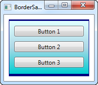
The Background property is of the type Brush, which opens up a lot of cool possibilities. As seen in the initial examples, it's very easy to just use a simple color as the background, but you can actually use gradients as well, and it's not even that hard to do:
<Window x:Class="WpfTutorialSamples.Misc_controls.BorderSample"
        xmlns="http://schemas.microsoft.com/winfx/2006/xaml/presentation"
        xmlns:x="http://schemas.microsoft.com/winfx/2006/xaml"
        Title="BorderSample" Height="175" Width="200">
    <Grid Margin="10">
		<Border BorderBrush="Navy" BorderThickness="1,3,1,5">
			<Border.Background>
				<LinearGradientBrush StartPoint="0.5,0" EndPoint="0.5,1">
					<GradientStop Color="LightCyan" Offset="0.0" />
					<GradientStop Color="LightBlue" Offset="0.5" />
					<GradientStop Color="DarkTurquoise" Offset="1.0" />
				</LinearGradientBrush>
			</Border.Background>
			<StackPanel Margin="10">
				<Button>Button 1</Button>
				<Button Margin="0,10">Button 2</Button>
				<Button>Button 3</Button>
			</StackPanel>
		</Border>
	</Grid>
</Window>
In this case, I've specified a LinearGradientBrush to be used for the background of the Border and then a more fitting border color. The LinearGradientBrush might not have the most obvious syntax, so I will explain that in a later chapter, including other brush types, but for now, you can try my example and change the values to see the result.