This article is currently in the process of being translated into Serbian (~31% done).
The TextBlock control
TextBlock nije kontrola, kao takva, pošto nije nasleđena iz klase Control, ali se koristi slično kao druge kontrole u WPF formatu, pa ćemo je, radi jednostavnosti, zvati kontrola.
TextBlock kontrola jedna je od osnovnih kontrola u WPF, ali ipak veoma korisna. Omogućava Vam da postavite tekst na ekran, slično kao Label kontrola, ali na jednostavniji način i sa manje resursa. Opšteprihvaćen stav je da je Label za kraći tekst, u jednoj liniji (ali može sadržati npr. sliku), dok TextBlock radi sasvim lepo i sa tekstom u više linija, ali može sadržati samo tekst (string). I Label i TextBlock nude svoje jedinstvene prednosti, pa to koju ćete od ove dve kontrole koristiti zavisi od situacije.
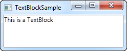
Kontrolu TextBlock već koristimo u "Hello, WPF!" članku, ali za sada, hajde da pogledamo TextBlock u najjednostavnijem obliku.
<Window x:Class="WpfTutorialSamples.Basic_controls.TextBlockSample"
        xmlns="http://schemas.microsoft.com/winfx/2006/xaml/presentation"
        xmlns:x="http://schemas.microsoft.com/winfx/2006/xaml"
        Title="TextBlockSample" Height="100" Width="200">
    <Grid>
		<TextBlock>This is a TextBlock</TextBlock>
    </Grid>
</Window>
Videćete kako je ovo jednostavno. I ako ste pročitali prethodna poglavlja, ovde neće biti ništa novo. Tekst između TextBlock tagova je u stvari prečica za podešavanje Text osobine TextBlocka-a.
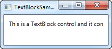
U sledećem primeru, pokušajmo sa dužim tekstom, da pokažemo kako se TextBlock snalazi sa tim. Takođe smo dodali malo margine, da bi stvari izgledale malo bolje.
<Window x:Class="WpfTutorialSamples.Basic_controls.TextBlockSample"
        xmlns="http://schemas.microsoft.com/winfx/2006/xaml/presentation"
        xmlns:x="http://schemas.microsoft.com/winfx/2006/xaml"
        Title="TextBlockSample" Height="100" Width="200">
    <Grid>
		<TextBlock Margin="10">This is a TextBlock control and it comes with a very long text</TextBlock>
    </Grid>
</Window>
Rad sa dugim stringovima
As you will soon realize from the screenshot, the TextBlock is perfectly capable of dealing with long, multiline texts, but it will not do anything by default. In this case the text is too long to be rendered inside the window, so WPF renders as much of the text as possible and then just stops.
Fortunately, there are several ways of dealing with this. In the next example I'll show you all of them, and then I'll explain each of them afterwards:
<Window x:Class="WpfTutorialSamples.Basic_controls.TextBlockSample"
        xmlns="http://schemas.microsoft.com/winfx/2006/xaml/presentation"
        xmlns:x="http://schemas.microsoft.com/winfx/2006/xaml"
        Title="TextBlockSample" Height="200" Width="250">
    <StackPanel>
		<TextBlock Margin="10" Foreground="Red">
			This is a TextBlock control<LineBreak />
			with multiple lines of text.
		</TextBlock>
		<TextBlock Margin="10" TextTrimming="CharacterEllipsis" Foreground="Green">
			This is a TextBlock control with text that may not be rendered completely, which will be indicated with an ellipsis.
		</TextBlock>
		<TextBlock Margin="10" TextWrapping="Wrap" Foreground="Blue">
			This is a TextBlock control with automatically wrapped text, using the TextWrapping property.
		</TextBlock>
	</StackPanel>
</Window>
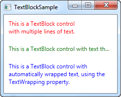
So, we have three TextBlock controls, each with a different color (using the Foreground property) for an easier overview. They all handle the fact that their text content is too long in different ways:
The red TextBlock uses a LineBreak tag to manually break the line at a designated location. This gives you absolute control over where you want the text to break onto a new line, but it's not very flexible for most situations. If the user makes the window bigger, the text will still wrap at the same position, even though there may now be room enough to fit the entire text onto one line.
The green TextBlock uses the TextTrimming property with the value CharacterEllipsis to make the TextBlock show an ellipsis (...) when it can't fit any more text into the control. This is a common way of showing that there's more text, but not enough room to show it. This is great when you have text that might be too long but you absolutely don't want it to use more than one line. As an alternative to CharacterEllipsis you may use WordEllipsis, which will trim the text at the end of the last possible word instead of the last possible character, preventing that a word is only shown in part.
The blue TextBlock uses the TextWrapping property with the value Wrap, to make the TextBlock wrap to the next line whenever it can't fit anymore text into the previous line. Contrary to the first TextBlock, where we manually define where to wrap the text, this happens completely automatic and even better: It's also automatically adjusted as soon as the TextBlock get more or less space available. Try making the window in the example bigger or smaller and you will see how the wrapping is updated to match the situation.
This was all about dealing with simple strings in the TextBlock. In the next chapter, we'll look into some of the more advanced functionality of the TextBlock, which allows us to create text of various styles within the TextBlock and much more.