The community is working on translating this tutorial into English, but it seems that no one has started the translation process for this article yet. If you can help us, then please click "More info".
The TextBlock control
TextBlock is not a control, per se, since it doesn't inherit from the Control class, but it's used much like any other control in the WPF framework, so we'll call it a control to keep things simple.
The TextBlock control is one of the most fundamental controls in WPF, yet it's very useful. It allows you to put text on the screen, much like a Label control does, but in a simpler and less resource demanding way. A common understanding is that a Label is for short, one-line texts (but may include e.g. an image), while the TextBlock works very well for multiline strings as well, but can only contain text (strings). Both the Label and the TextBlock offers their own unique advantages, so what you should use very much depends on the situation.
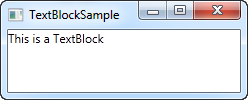
We already used a TextBlock control in the "Hello, WPF!" article, but for now, let's have a look at the TextBlock in its simplest form:
<Window x:Class="WpfTutorialSamples.Basic_controls.TextBlockSample"
        xmlns="http://schemas.microsoft.com/winfx/2006/xaml/presentation"
        xmlns:x="http://schemas.microsoft.com/winfx/2006/xaml"
        Title="TextBlockSample" Height="100" Width="200">
    <Grid>
		<TextBlock>This is a TextBlock</TextBlock>
    </Grid>
</Window>
That's as simple as it comes and if you have read the previous chapters of this tutorial, then there should be nothing new here. The text between the TextBlock is simply a shortcut for setting the Text property of the TextBlock.
For the next example, let's try a longer text to show how the TextBlock deals with that. I've also added a bit of margin, to make it look just a bit better:
<Window x:Class="WpfTutorialSamples.Basic_controls.TextBlockSample"
        xmlns="http://schemas.microsoft.com/winfx/2006/xaml/presentation"
        xmlns:x="http://schemas.microsoft.com/winfx/2006/xaml"
        Title="TextBlockSample" Height="100" Width="200">
    <Grid>
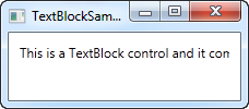
		<TextBlock Margin="10">This is a TextBlock control and it comes with a very long text</TextBlock>
    </Grid>
</Window>
Dealing with long strings
As you will soon realize from the screenshot, the TextBlock is perfectly capable of dealing with long, multiline texts, but it will not do anything by default. In this case the text is too long to be rendered inside the window, so WPF renders as much of the text as possible and then just stops.
Fortunately, there are several ways of dealing with this. In the next example I'll show you all of them, and then I'll explain each of them afterwards:
<Window x:Class="WpfTutorialSamples.Basic_controls.TextBlockSample"
        xmlns="http://schemas.microsoft.com/winfx/2006/xaml/presentation"
        xmlns:x="http://schemas.microsoft.com/winfx/2006/xaml"
        Title="TextBlockSample" Height="200" Width="250">
    <StackPanel>
		<TextBlock Margin="10" Foreground="Red">
			This is a TextBlock control<LineBreak />
			with multiple lines of text.
		</TextBlock>
		<TextBlock Margin="10" TextTrimming="CharacterEllipsis" Foreground="Green">
			This is a TextBlock control with text that may not be rendered completely, which will be indicated with an ellipsis.
		</TextBlock>
		<TextBlock Margin="10" TextWrapping="Wrap" Foreground="Blue">
			This is a TextBlock control with automatically wrapped text, using the TextWrapping property.
		</TextBlock>
	</StackPanel>
</Window>
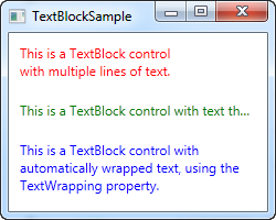
So, we have three TextBlock controls, each with a different color (using the Foreground property) for an easier overview. They all handle the fact that their text content is too long in different ways:
The red TextBlock uses a LineBreak tag to manually break the line at a designated location. This gives you absolute control over where you want the text to break onto a new line, but it's not very flexible for most situations. If the user makes the window bigger, the text will still wrap at the same position, even though there may now be room enough to fit the entire text onto one line.
The green TextBlock uses the TextTrimming property with the value CharacterEllipsis to make the TextBlock show an ellipsis (...) when it can't fit any more text into the control. This is a common way of showing that there's more text, but not enough room to show it. This is great when you have text that might be too long but you absolutely don't want it to use more than one line. As an alternative to CharacterEllipsis you may use WordEllipsis, which will trim the text at the end of the last possible word instead of the last possible character, preventing that a word is only shown in part.
The blue TextBlock uses the TextWrapping property with the value Wrap, to make the TextBlock wrap to the next line whenever it can't fit anymore text into the previous line. Contrary to the first TextBlock, where we manually define where to wrap the text, this happens completely automatic and even better: It's also automatically adjusted as soon as the TextBlock get more or less space available. Try making the window in the example bigger or smaller and you will see how the wrapping is updated to match the situation.
This was all about dealing with simple strings in the TextBlock. In the next chapter, we'll look into some of the more advanced functionality of the TextBlock, which allows us to create text of various styles within the TextBlock and much more.