This article is currently in the process of being translated into Croatian (~3% done).
The Border control
The Border control is a Decorator control that you may use to draw a border, a background, or even both, around another element. Since the WPF panels don't support drawing a border around its edges, the Border control can help you achieve just that, simply by surrounding e.g. a Panel with the Border control.
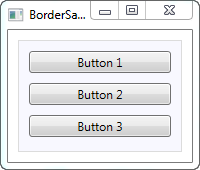
Jednostavan primjer korištenja Bordera, kako je opisano ranije, bi mogao izgledati ovako:
<Window x:Class="WpfTutorialSamples.Misc_controls.BorderSample"
        xmlns="http://schemas.microsoft.com/winfx/2006/xaml/presentation"
        xmlns:x="http://schemas.microsoft.com/winfx/2006/xaml"
        Title="BorderSample" Height="170" Width="200">
    <Grid Margin="10">
		<Border Background="GhostWhite" BorderBrush="Gainsboro" BorderThickness="1">
			<StackPanel Margin="10">
				<Button>Button 1</Button>
				<Button Margin="0,10">Button 2</Button>
				<Button>Button 3</Button>
			</StackPanel>
		</Border>
	</Grid>
</Window>
The Border is completely lookless until you define either a background or a border brush and thickness, so that's what I've done here, using the Background, BorderBrush and BorderThickness properties.
Border with round corners
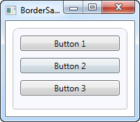
One of the features I really appreciate about the Border is the fact that it's so easy to get round corners. Just look at this slightly modified example, where the corners are now rounded:
<Window x:Class="WpfTutorialSamples.Misc_controls.BorderSample"
        xmlns="http://schemas.microsoft.com/winfx/2006/xaml/presentation"
        xmlns:x="http://schemas.microsoft.com/winfx/2006/xaml"
        Title="BorderSample" Height="175" Width="200">
    <Grid Margin="10">
		<Border Background="GhostWhite" BorderBrush="Silver" BorderThickness="1" CornerRadius="8,8,3,3">
			<StackPanel Margin="10">
				<Button>Button 1</Button>
				<Button Margin="0,10">Button 2</Button>
				<Button>Button 3</Button>
			</StackPanel>
		</Border>
	</Grid>
</Window>
All I've done is adding the CornerRadius property. It can be specified with a single value, which will be used for all four corners, or like I did in the example here, where I specify separate values for the top right and left followed by the bottom right and left.
Border color/thickness
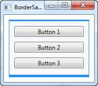
The above border is very discrete, but this can easily be changed by regulating the color and/or thickness. Because the BorderThickness property is of the Thickness type, you can even manipulate each of the border widths individually or by giving a value for the left and right and one for the top and bottom borders.
<Window x:Class="WpfTutorialSamples.Misc_controls.BorderSample"
        xmlns="http://schemas.microsoft.com/winfx/2006/xaml/presentation"
        xmlns:x="http://schemas.microsoft.com/winfx/2006/xaml"
        Title="BorderSample" Height="175" Width="200">
    <Grid Margin="10">
		<Border Background="GhostWhite" BorderBrush="DodgerBlue" BorderThickness="1,3,1,5">
			<StackPanel Margin="10">
				<Button>Button 1</Button>
				<Button Margin="0,10">Button 2</Button>
				<Button>Button 3</Button>
			</StackPanel>
		</Border>
	</Grid>
</Window>
Border background
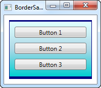
The Background property is of the type Brush, which opens up a lot of cool possibilities. As seen in the initial examples, it's very easy to just use a simple color as the background, but you can actually use gradients as well, and it's not even that hard to do:
<Window x:Class="WpfTutorialSamples.Misc_controls.BorderSample"
        xmlns="http://schemas.microsoft.com/winfx/2006/xaml/presentation"
        xmlns:x="http://schemas.microsoft.com/winfx/2006/xaml"
        Title="BorderSample" Height="175" Width="200">
    <Grid Margin="10">
		<Border BorderBrush="Navy" BorderThickness="1,3,1,5">
			<Border.Background>
				<LinearGradientBrush StartPoint="0.5,0" EndPoint="0.5,1">
					<GradientStop Color="LightCyan" Offset="0.0" />
					<GradientStop Color="LightBlue" Offset="0.5" />
					<GradientStop Color="DarkTurquoise" Offset="1.0" />
				</LinearGradientBrush>
			</Border.Background>
			<StackPanel Margin="10">
				<Button>Button 1</Button>
				<Button Margin="0,10">Button 2</Button>
				<Button>Button 3</Button>
			</StackPanel>
		</Border>
	</Grid>
</Window>
In this case, I've specified a LinearGradientBrush to be used for the background of the Border and then a more fitting border color. The LinearGradientBrush might not have the most obvious syntax, so I will explain that in a later chapter, including other brush types, but for now, you can try my example and change the values to see the result.