The Canvas control
The Canvas is probably the simplest Panel of them all. It doesn't really do anything by default, it just allows you to put controls in it and then position them yourself using explicit coordinates.
If you have ever used another UI library like WinForms, this will probably make you feel right at home, but while it can be tempting to have absolute control of all the child controls, this also means that the Panel won't do anything for you once the user starts resizing your window, if you localize absolutely positioned text or if the content is scaled.
More about that later, let's get into a simple example. This one is mostly about showing you just how little the Canvas does by default:
<Window x:Class="WpfTutorialSamples.Panels.Canvas"
        xmlns="http://schemas.microsoft.com/winfx/2006/xaml/presentation"
        xmlns:x="http://schemas.microsoft.com/winfx/2006/xaml"
        Title="Canvas" Height="200" Width="200">
	<Canvas>
		<Button>Button 1</Button>
		<Button>Button 2</Button>
	</Canvas>
</Window>
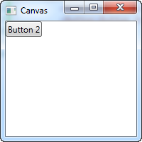
As you can see, even though we have two buttons, they are both placed in the exact same place, so only the last one is visible. The Canvas does absolutely nothing until you start giving coordinates to the child controls. This is done using the Left, Right, Top and Bottom attached properties from the Canvas control.
These properties allow you to specify the position relative to the four edges of the Canvas. By default, they are all set to NaN (Not a Number), which will make the Canvas place them in the upper left corner, but as mentioned, you can easily change this:
<Window x:Class="WpfTutorialSamples.Panels.Canvas"
        xmlns="http://schemas.microsoft.com/winfx/2006/xaml/presentation"
        xmlns:x="http://schemas.microsoft.com/winfx/2006/xaml"
        Title="Canvas" Height="200" Width="200">
	<Canvas>
		<Button Canvas.Left="10">Top left</Button>
		<Button Canvas.Right="10">Top right</Button>
		<Button Canvas.Left="10" Canvas.Bottom="10">Bottom left</Button>
		<Button Canvas.Right="10" Canvas.Bottom="10">Bottom right</Button>
	</Canvas>
</Window>
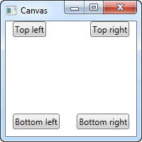
Notice how I only set the property or properties that I need. For the first two buttons, I only wish to specify a value for the X axis, so I use the Left and Right properties to push the buttons towards the center, from each direction.
For the bottom buttons, I use both Left/Right and Bottom to push them towards the center in both directions. You will usually specify either a Top or a Bottom value and/or a Left or a Right value.
As mentioned, since the Canvas gives you complete control of positions, it won't really care whether or not there's enough room for all your controls or if one is on top of another. This makes it a bad choice for pretty much any kind of dialog design, but the Canvas is, as the name implies, great for at least one thing: Painting. WPF has a bunch of controls that you can place inside a Canvas, to make nice illustrations.
Z-Index
In the next example, we'll use a couple of the shape related controls of WPF to illustrate another very important concept when using the Canvas: Z-Index. Normally, if two controls within a Canvas overlaps, the one defined last in the markup will take precedence and overlap the other(s). However, by using the attached ZIndex property on the Panel class, this can easily be changed.
First, an example where we don't use z-index at all:
<Window x:Class="WpfTutorialSamples.Panels.CanvasZIndex"
        xmlns="http://schemas.microsoft.com/winfx/2006/xaml/presentation"
        xmlns:x="http://schemas.microsoft.com/winfx/2006/xaml"
        Title="CanvasZIndex" Height="275" Width="260">
    <Canvas>
        <Ellipse Fill="Gainsboro" Canvas.Left="25" Canvas.Top="25" Width="200" Height="200" />
        <Rectangle Fill="LightBlue" Canvas.Left="25" Canvas.Top="25" Width="50" Height="50" />
        <Rectangle Fill="LightCoral" Canvas.Left="50" Canvas.Top="50" Width="50" Height="50" />
        <Rectangle Fill="LightCyan" Canvas.Left="75" Canvas.Top="75" Width="50" Height="50" />
    </Canvas>
</Window>
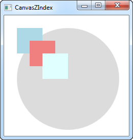
Notice that because each of the rectangles are defined after the circle, they all overlap the circle, and each of them will overlap the previously defined one. Let's try changing that:
<Window x:Class="WpfTutorialSamples.Panels.CanvasZIndex"
        xmlns="http://schemas.microsoft.com/winfx/2006/xaml/presentation"
        xmlns:x="http://schemas.microsoft.com/winfx/2006/xaml"
        Title="CanvasZIndex" Height="275" Width="260">
    <Canvas>
        <Ellipse Panel.ZIndex="2" Fill="Gainsboro" Canvas.Left="25" Canvas.Top="25" Width="200" Height="200" />
        <Rectangle Panel.ZIndex="3" Fill="LightBlue" Canvas.Left="25" Canvas.Top="25" Width="50" Height="50" />
        <Rectangle Panel.ZIndex="2" Fill="LightCoral" Canvas.Left="50" Canvas.Top="50" Width="50" Height="50" />
        <Rectangle Panel.ZIndex="4" Fill="LightCyan" Canvas.Left="75" Canvas.Top="75" Width="50" Height="50" />
    </Canvas>
</Window>
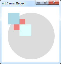
The default ZIndex value is 0, but we assign a new one to each of the shapes. The rule is that the element with the higher z-index overlaps the ones with the lower values. If two values are identical, the last defined element "wins". As you can see from the screenshot, changing the ZIndex property gives quite another look.