This article is currently in the process of being translated into Romanian (~34% done).
Controlul Buton
Nici un framework GUI nu ar fi complet fără un control Buton, binențeles că WPF va avea unul frumos, și precum celelalte controlale din framework este foarte flexibil și vă va permite să îndepliniți tot ce vă doriți. Vom începe cu niște exemple de bază.
Un buton simplu
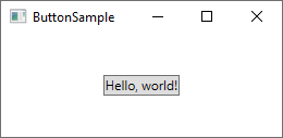
Precum multe alte controale WPF, un buton poate fi afișat pur și simplu prin adăugarea unui tag „Button” ferestrei tale. Dacă puneți text între tag-uri (sau alt control), se va comporta ca și conținutul unui buton:
<Button>Hello, world!</Button>
Nu-i așa că este simplu? Binențeles, butonul încă nu face nimic, dar dacă treci cu mouse-ul pe deasupra lui observați că are un frumos efect hover, din prima. Dar hai să faceți butonul să facă ceva, înscriindu-i evenimentul Click (mai multe informații despre acest articol atunci când înscriem evenimente în XAML):
<Button Click="HelloWorldButton_Click">Hello, World!</Button>În codul din spate vă trebuie o metodă cu același nume pentru a se ocupa de click:
private void HelloWorldButton_Click(object sender, RoutedEventArgs e)
{
    MessageBox.Show("Hello, world!");
}
Acum aveți un buton standard și atunci când faceți click pe el, se va afișa un mesaj!
Conținut formatat
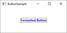
Intern, textul simplu din continutul butonului este transformat intr-un control TextBlock, ceea ce inseamna ca poti controla aceleasi aspecte ale formatarii textului. Vei gasi cateva proprietati aferente controlului Button pentru a face asta, incluzand, dar nu limitat, Foreground, Background, FontWeight si altele. In alte cuvinte, este foarte usor sa schimbi formatarea unui text de pe un Button.
<Button Background="Beige" Foreground="Blue" FontWeight="Bold">Formatted Button</Button>
Prin setarea acestor proprietati direct pe un buton, esti limitat la aplicarea aceluiasi format pentru tot continutul, dar, daca nu e deajuns, citeste in continuare pentru o formatare mai avansata.
Buttons with advanced content
We have already talked about this several times, but one of the very cool things about WPF is the ability to replace simple text inside a control with other WPF controls. This also means that you don't have to limit your buttons to simple text, formatted in the same way - you can just add several text controls with different formatting. The WPF Button only supports one direct child control, but you can just make that a Panel, which will then host as many controls as you need to. You can use this to create buttons with various types of formatting:
<Button>
    <StackPanel Orientation="Horizontal">
    <TextBlock>Formatted </TextBlock>
    <TextBlock Foreground="Blue" FontWeight="Bold" Margin="2,0">Button</TextBlock>
    <TextBlock Foreground="Gray" FontStyle="Italic">[Various]</TextBlock>
    </StackPanel>
</Button>
But of course, you are not limited to just text - you can put whatever you want inside your buttons, which leads us to a subject that I know many people will ask for. Buttons with images!
Buttons with Images (ImageButton)
In many UI frameworks, you will find a regular Button and then one or several other variants, which will offer extra features. One of the most commonly used variants is the ImageButton, which, as the name implies, is a Button which will usually allow you to include an image before the text. But in WPF, there's no need for a separate control to accomplish this - as you just saw, we can put several controls inside a Button, so you can just as easily add an Image control to it, like this:
<Button Padding="5">
    <StackPanel Orientation="Horizontal">
    <Image Source="/WpfTutorialSamples;component/Images/help.png" />
    <TextBlock Margin="5,0">Help</TextBlock>
    </StackPanel>
</Button>
It's really that simple to create an ImageButton in WPF, and you are of course free to move things around, e.g. if you want the image after the text instead of before etc.
Button Padding
You may have noticed that buttons in the WPF framework doesn't come with any padding by default. This means that the text is very close to the borders, which might look a little bit strange, because most buttons found elsewhere (web, other applications etc.) do have at least some padding in the sides. No worries, because the Button comes with a Padding property:
<Button Padding="5,2">Hello, World!</Button>This will apply a padding of 5 pixels on the sides, and 2 pixels in the top and bottom. But having to apply padding to all of your buttons might get a bit tiresome at a certain point, so here's a small tip: You can apply the padding globally, either across the entire application or just this specific Window, using a Style (more on styles later). Here's an example where we apply it to the Window, using the Window.Resources property:
<Window.Resources>
    <Style TargetType="{x:Type Button}">
    <Setter Property="Padding" Value="5,2"/>
    </Style>
</Window.Resources>
This padding will now be applied to all your buttons, but you can of course override it by specifically defining the Padding property on a Button. Here's how all the buttons of this example look with the common padding:

Summary
As you can see from this article, using buttons in the WPF framework is very easy and you can customize this important control almost endlessly.