The community is working on translating this tutorial into Bulgarian, but it seems that no one has started the translation process for this article yet. If you can help us, then please click "More info".
Trigger, DataTrigger & EventTrigger
So far, we worked with styles by setting a static value for a specific property. However, using triggers, you can change the value of a given property, once a certain condition changes. Triggers come in multiple flavors: Property triggers, event triggers and data triggers. They allow you to do stuff that would normally be done in code-behind completely in markup instead, which is all a part of the ongoing process of separating style and code.
Property trigger
The most common trigger is the property trigger, which in markup is simply defined with a <Trigger> element. It watches a specific property on the owner control and when that property has a value that matches the specified value, properties can change. In theory this might sound a bit complicated, but it's actually quite simple once we turn theory into an example:
<Window x:Class="WpfTutorialSamples.Styles.StyleTriggersSample"
        xmlns="http://schemas.microsoft.com/winfx/2006/xaml/presentation"
        xmlns:x="http://schemas.microsoft.com/winfx/2006/xaml"
        Title="StyleTriggersSample" Height="100" Width="300">
    <Grid>
        <TextBlock Text="Hello, styled world!" FontSize="28" HorizontalAlignment="Center" VerticalAlignment="Center">
            <TextBlock.Style>
                <Style TargetType="TextBlock">
                    <Setter Property="Foreground" Value="Blue"></Setter>
                    <Style.Triggers>
                        <Trigger Property="IsMouseOver" Value="True">
                            <Setter Property="Foreground" Value="Red" />
                            <Setter Property="TextDecorations" Value="Underline" />
                        </Trigger>
                    </Style.Triggers>
                </Style>
            </TextBlock.Style>
        </TextBlock>
    </Grid>
</Window>
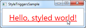
In this style, we set the Foreground property to blue, to make it look like a hyperlink. We then add a trigger, which listens to theIsMouseOver property - once this property changes to True, we apply two setters: We change the Foreground to red and then we make it underlined. This is a great example on how easy it is to use triggers to apply design changes, completely without any code-behind code.
We define a local style for this specific TextBlock, but as shown in the previous articles, the style could have been globally defined as well, if we wanted it to apply to all TextBlock controls in the application.
Data triggers
Data triggers, represented by the <DataTrigger> element, are used for properties that are not necessarily dependency properties. They work by creating a binding to a regular property, which is then monitored for changes. This also opens up for binding your trigger to a property on a different control. For instance, consider the following example:
<Window x:Class="WpfTutorialSamples.Styles.StyleDataTriggerSample"
        xmlns="http://schemas.microsoft.com/winfx/2006/xaml/presentation"
        xmlns:x="http://schemas.microsoft.com/winfx/2006/xaml"
        Title="StyleDataTriggerSample" Height="200" Width="200">
    <StackPanel HorizontalAlignment="Center" VerticalAlignment="Center">
        <CheckBox Name="cbSample" Content="Hello, world?" />
        <TextBlock HorizontalAlignment="Center" Margin="0,20,0,0" FontSize="48">
            <TextBlock.Style>
                <Style TargetType="TextBlock">
                    <Setter Property="Text" Value="No" />
                    <Setter Property="Foreground" Value="Red" />
                    <Style.Triggers>
                        <DataTrigger Binding="{Binding ElementName=cbSample, Path=IsChecked}" Value="True">
                            <Setter Property="Text" Value="Yes!" />
                            <Setter Property="Foreground" Value="Green" />
                        </DataTrigger>
                    </Style.Triggers>
                </Style>
            </TextBlock.Style>
        </TextBlock>
    </StackPanel>
</Window>
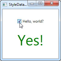
In this example, we have a CheckBox and a TextBlock. Using a DataTrigger, we bind the TextBlock to the IsChecked property of the CheckBox. We then supply a default style, where the text is "No" and the foreground color is red, and then, using a DataTrigger, we supply a style for when the IsChecked property of the CheckBox is changed to True, in which case we make it green with a text saying "Yes!" (as seen on the screenshot).
Event triggers
Event triggers, represented by the <EventTrigger> element, are mostly used to trigger an animation, in response to an event being called. We haven't discussed animations yet, but to demonstrate how an event trigger works, we'll use them anyway. Have a look on the chapter about animations for more details. Here's the example:
<Window x:Class="WpfTutorialSamples.Styles.StyleEventTriggerSample"
        xmlns="http://schemas.microsoft.com/winfx/2006/xaml/presentation"
        xmlns:x="http://schemas.microsoft.com/winfx/2006/xaml"
        Title="StyleEventTriggerSample" Height="100" Width="300">
    <Grid>
        <TextBlock Name="lblStyled" Text="Hello, styled world!" FontSize="18" HorizontalAlignment="Center" VerticalAlignment="Center">
            <TextBlock.Style>
                <Style TargetType="TextBlock">
                    <Style.Triggers>
                        <EventTrigger RoutedEvent="MouseEnter">
                            <EventTrigger.Actions>
                                <BeginStoryboard>
                                    <Storyboard>
                                        <DoubleAnimation Duration="0:0:0.300" Storyboard.TargetProperty="FontSize" To="28" />
                                    </Storyboard>
                                </BeginStoryboard>
                            </EventTrigger.Actions>
                        </EventTrigger>
                        <EventTrigger RoutedEvent="MouseLeave">
                            <EventTrigger.Actions>
                                <BeginStoryboard>
                                    <Storyboard>
                                        <DoubleAnimation Duration="0:0:0.800" Storyboard.TargetProperty="FontSize" To="18" />
                                    </Storyboard>
                                </BeginStoryboard>
                            </EventTrigger.Actions>
                        </EventTrigger>
                    </Style.Triggers>
                </Style>
            </TextBlock.Style>
        </TextBlock>
    </Grid>
</Window>
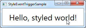
The markup might look a bit overwhelming, but if you run this sample and look at the result, you'll see that we've actually accomplished a pretty cool animation, going both ways, in ~20 lines of XAML. As you can see, I use an EventTrigger to subscribe to two events: MouseEnter and MouseLeave. When the mouse enters, I make a smooth and animated transition to a FontSize of 28 pixels in 300 milliseconds. When the mouse leaves, I change the FontSize back to 18 pixels but I do it a bit slower, just because it looks kind of cool.
Summary
WPF styles make it easy to get a consistent look, and with triggers, this look becomes dynamic. Styles are great in your application, but they're even better when used in control templates etc. You can read more about that elsewhere in this tutorial.
In the next article, we'll look at multi triggers, which allow us to apply styles based on multiple properties.