This article is currently in the process of being translated into Indonesian (~17% done).
Kontrol ToolTips
Tooltips, infotips, atau hints - berbagai jenis nama, namun memiliki konsep yang sama, yaitu kemampuan untuk mendapatkan informasi tambahan mengenai kontrol tertentu atau link dengan mengarahkan mouse ke arah kontrol tersebut. WPF sebelumnya juga telah mendukung konsep ini, dan dengan menggunakan properti ToolTip ditemukan pada kelas FrameworkElement, yang hampir semua kontrol WPF diturunkan dari kelas tersebut.
menentukan tooltip untuk sebuah kontrol sangat mudah, seperti yang dilihat berikut :
<Window x:Class="WpfTutorialSamples.Control_concepts.ToolTipsSimpleSample"
        xmlns="http://schemas.microsoft.com/winfx/2006/xaml/presentation"
        xmlns:x="http://schemas.microsoft.com/winfx/2006/xaml"
        Title="ToolTipsSimpleSample" Height="150" Width="400">
    <Grid VerticalAlignment="Center" HorizontalAlignment="Center">

        <Button ToolTip="Click here and something will happen!">Click here!</Button>

    </Grid>
</Window>
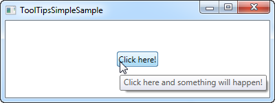
As you can see on the screenshots, this results in a floating box with the specified string, once the mouse hovers over the button. This is what most UI frameworks offers - the display of a text string and nothing more.
However, in WPF, the ToolTip property is actually not a string type, but instead an object type, meaning that we can put whatever we want in there. This opens up for some pretty cool possibilities, where we can provide the user with much richer and more helpful tooltips. For instance, consider this example and compare it to the first one:
<Window x:Class="WpfTutorialSamples.Control_concepts.ToolTipsAdvancedSample"
        xmlns="http://schemas.microsoft.com/winfx/2006/xaml/presentation"
        xmlns:x="http://schemas.microsoft.com/winfx/2006/xaml"
        Title="ToolTipsAdvancedSample" Height="200" Width="400" UseLayoutRounding="True">
    <DockPanel>
        <ToolBar DockPanel.Dock="Top">
            <Button ToolTip="Create a new file">
                <Button.Content>
                    <Image Source="/WpfTutorialSamples;component/Images/page_white.png" Width="16" Height="16" />
                </Button.Content>
            </Button>
            <Button>
                <Button.Content>
                    <Image Source="/WpfTutorialSamples;component/Images/folder.png" Width="16" Height="16" />
                </Button.Content>
                <Button.ToolTip>
                    <StackPanel>
                        <TextBlock FontWeight="Bold" FontSize="14" Margin="0,0,0,5">Open file</TextBlock>
                        <TextBlock>
                        Search your computer or local network
                        <LineBreak />
                        for a file and open it for editing.
                        </TextBlock>
                        <Border BorderBrush="Silver" BorderThickness="0,1,0,0" Margin="0,8" />
                        <WrapPanel>
                            <Image Source="/WpfTutorialSamples;component/Images/help.png" Margin="0,0,5,0" />
                            <TextBlock FontStyle="Italic">Press F1 for more help</TextBlock>
                        </WrapPanel>
                    </StackPanel>
                </Button.ToolTip>
            </Button>
        </ToolBar>

        <TextBox>
            Editor area...
        </TextBox>
    </DockPanel>
</Window>
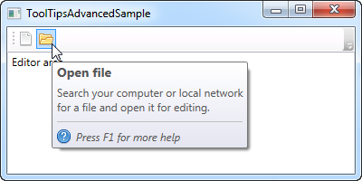
Notice how this example uses a simple string tooltip for the first button and then a much more advanced one for the second button. In the advanced case, we use a panel as the root control and then we're free to add controls to that as we please. The result is pretty cool, with a header, a description text and a hint that you can press F1 for more help, including a help icon.
Advanced options
The ToolTipService class has a bunch of interesting properties that will affect the behavior of your tooltips. You set them directly on the control that has the tooltip, for instance like here, where we extend the time a tooltip is shown using the ShowDuration property (we set it to 5.000 milliseconds or 5 seconds):
<Button ToolTip="Create a new file" ToolTipService.ShowDuration="5000" Content="Open" />You can also control whether or not the popup should have a shadow, using the HasDropShadow property, or whether tooltips should be displayed for disabled controls as well, using the ShowOnDisabled property. There are several other interesting properties, so for a complete list, please consult the documentation: http://msdn.microsoft.com/en-us/library/system.windows.controls.tooltipservice.aspx
Summary
Tooltips can be a great help for the user, and in WPF, they are both easy to use and extremely flexible. Combine the fact that you can completely control the design and content of the tooltip, with properties from the ToolTipService class, to create more user friendly inline help in your applications.