The community is working on translating this tutorial into Kannada, but it seems that no one has started the translation process for this article yet. If you can help us, then please click "More info".
The CheckBox control
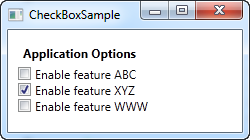
The CheckBox control allows the end-user to toggle an option on or off, usually reflecting a Boolean value in the Code-behind. Let's jump straight into an example, in case you're not sure how a CheckBox looks:
<Window x:Class="WpfTutorialSamples.Basic_controls.CheckBoxSample"
        xmlns="http://schemas.microsoft.com/winfx/2006/xaml/presentation"
        xmlns:x="http://schemas.microsoft.com/winfx/2006/xaml"
        Title="CheckBoxSample" Height="140" Width="250">
    <StackPanel Margin="10">
		<Label FontWeight="Bold">Application Options</Label>
		<CheckBox>Enable feature ABC</CheckBox>
		<CheckBox IsChecked="True">Enable feature XYZ</CheckBox>
		<CheckBox>Enable feature WWW</CheckBox>
	</StackPanel>
</Window>
As you can see, the CheckBox is very easy to use. On the second CheckBox, I use the IsChecked property to have it checked by default, but other than that, no properties are needed to use it. The IsChecked property should also be used from Code-behind if you want to check whether a certain CheckBox is checked or not.
Custom content
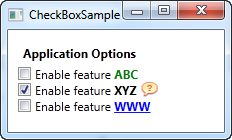
The CheckBox control inherits from the ContentControl class, which means that it can take custom content and display next to it. If you just specify a piece of text, like I did in the example above, WPF will put it inside a TextBlock control and display it, but this is just a shortcut to make things easier for you. You can use any type of control inside of it, as we'll see in the next example:
<Window x:Class="WpfTutorialSamples.Basic_controls.CheckBoxSample"
        xmlns="http://schemas.microsoft.com/winfx/2006/xaml/presentation"
        xmlns:x="http://schemas.microsoft.com/winfx/2006/xaml"
        Title="CheckBoxSample" Height="140" Width="250">
    <StackPanel Margin="10">
		<Label FontWeight="Bold">Application Options</Label>
		<CheckBox>
			<TextBlock>
				Enable feature <Run Foreground="Green" FontWeight="Bold">ABC</Run>
			</TextBlock>
		</CheckBox>
		<CheckBox IsChecked="True">
			<WrapPanel>
				<TextBlock>
					Enable feature <Run FontWeight="Bold">XYZ</Run>
				</TextBlock>
				<Image Source="/WpfTutorialSamples;component/Images/question.png" Width="16" Height="16" Margin="5,0" />
			</WrapPanel>
		</CheckBox>
		<CheckBox>
			<TextBlock>
				Enable feature <Run Foreground="Blue" TextDecorations="Underline" FontWeight="Bold">WWW</Run>
			</TextBlock>
		</CheckBox>
	</StackPanel>
</Window>
As you can see from the sample markup, you can do pretty much whatever you want with the content. On all three check boxes, I do something differently with the text, and on the middle one I even throw in an Image control. By specifying a control as the content, instead of just text, we get much more control of the appearance, and the cool thing is that no matter which part of the content you click on, it will activate the CheckBox and toggle it on or off.
The IsThreeState property
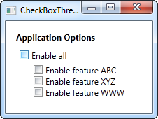
As mentioned, the CheckBox usually corresponds to a boolean value, which means that it only has two states: true or false (on or off). However, since a boolean data type might be nullable, effectively allowing for a third option (true, false or null), the CheckBox control can also support this case. By setting the IsThreeState property to true, the CheckBox will get a third state called "the indeterminate state".
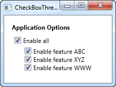
A common usage for this is to have a "Enable all" CheckBox, which can control a set of child checkboxes, as well as show their collective state. Our example shows how you may create a list of features that can be toggled on and off, with a common "Enable all" CheckBox in the top:
<Window x:Class="WpfTutorialSamples.Basic_controls.CheckBoxThreeStateSample"
        xmlns="http://schemas.microsoft.com/winfx/2006/xaml/presentation"
        xmlns:x="http://schemas.microsoft.com/winfx/2006/xaml"
        Title="CheckBoxThreeStateSample" Height="170" Width="300">
	<StackPanel Margin="10">
		<Label FontWeight="Bold">Application Options</Label>
		<StackPanel Margin="10,5">
			<CheckBox IsThreeState="True" Name="cbAllFeatures" Checked="cbAllFeatures_CheckedChanged" Unchecked="cbAllFeatures_CheckedChanged">Enable all</CheckBox>
			<StackPanel Margin="20,5">
				<CheckBox Name="cbFeatureAbc" Checked="cbFeature_CheckedChanged" Unchecked="cbFeature_CheckedChanged">Enable feature ABC</CheckBox>
				<CheckBox Name="cbFeatureXyz" IsChecked="True" Checked="cbFeature_CheckedChanged" Unchecked="cbFeature_CheckedChanged">Enable feature XYZ</CheckBox>
				<CheckBox Name="cbFeatureWww" Checked="cbFeature_CheckedChanged" Unchecked="cbFeature_CheckedChanged">Enable feature WWW</CheckBox>
			</StackPanel>
		</StackPanel>
	</StackPanel>
</Window>
using System;
using System.Windows;
namespace WpfTutorialSamples.Basic_controls
{
public partial class CheckBoxThreeStateSample : Window
{
public CheckBoxThreeStateSample()
{
InitializeComponent();
}
private void cbAllFeatures_CheckedChanged(object sender, RoutedEventArgs e)
{
bool newVal = (cbAllFeatures.IsChecked == true);
cbFeatureAbc.IsChecked = newVal;
cbFeatureXyz.IsChecked = newVal;
cbFeatureWww.IsChecked = newVal;
}
private void cbFeature_CheckedChanged(object sender, RoutedEventArgs e)
{
cbAllFeatures.IsChecked = null;
if((cbFeatureAbc.IsChecked == true) && (cbFeatureXyz.IsChecked == true) && (cbFeatureWww.IsChecked == true))
cbAllFeatures.IsChecked = true;
if((cbFeatureAbc.IsChecked == false) && (cbFeatureXyz.IsChecked == false) && (cbFeatureWww.IsChecked == false))
cbAllFeatures.IsChecked = false;
}
}
}


This example works from two different angles: If you check or uncheck the "Enable all" CheckBox, then all of the child check boxes, each representing an application feature in our example, is either checked or unchecked. It also works the other way around though, where checking or unchecking a child CheckBox affects the "Enable all" CheckBox state: If they are all checked or unchecked, then the "Enable all" CheckBox gets the same state - otherwise the value will be left with a null, which forces the CheckBox into the indeterminate state.
All of this behavior can be seen on the screenshots above, and is achieved by subscribing to the Checked and Unchecked events of the CheckBox controls. In a real world example, you would likely bind the values instead, but this example shows the basics of using the IsThreeState property to create a "Toggle all" effect.