This article is currently in the process of being translated into Korean (~7% done).
ListView grouping
이미 말했듯이, WPF ListView는 매우 유연합니다. Grouping은 이것이 기본적으로 지원하는 기능이며 사용이 매우 쉽고 커스터마이징이 매우 편리합니다. 첫번째 예제를 봅시다. 우리는 WPF의 표준 trick들을 사용해서 외형을 세부적으로 사용자 정의할 수 있습니다.
이 기사에서는, 이전 기사로부터 샘플코드를 인용할 것이며 grouping을 지원하는 방식으로 확장할 것입니다. 아래 코드를 참조하세요
<Window x:Class="WpfTutorialSamples.ListView_control.ListViewGroupSample"
        xmlns="http://schemas.microsoft.com/winfx/2006/xaml/presentation"
        xmlns:x="http://schemas.microsoft.com/winfx/2006/xaml"
        Title="ListViewGroupSample" Height="300" Width="300">
    <Grid Margin="10">
        <ListView Name="lvUsers">
            <ListView.View>
                <GridView>
                    <GridViewColumn Header="Name" Width="120" DisplayMemberBinding="{Binding Name}" />
                    <GridViewColumn Header="Age" Width="50" DisplayMemberBinding="{Binding Age}" />
                </GridView>
            </ListView.View>

            <ListView.GroupStyle>
                <GroupStyle>
                    <GroupStyle.HeaderTemplate>
                        <DataTemplate>
                            <TextBlock FontWeight="Bold" FontSize="14" Text="{Binding Name}"/>
                        </DataTemplate>
                    </GroupStyle.HeaderTemplate>
                </GroupStyle>
            </ListView.GroupStyle>
        </ListView>
    </Grid>
</Window>
using System;
using System.Collections.Generic;
using System.Windows;
using System.Windows.Data;
namespace WpfTutorialSamples.ListView_control
{
public partial class ListViewGroupSample : Window
{
public ListViewGroupSample()
{
InitializeComponent();
List<User> items = new List<User>();
items.Add(new User() { Name = "John Doe", Age = 42, Sex = SexType.Male });
items.Add(new User() { Name = "Jane Doe", Age = 39, Sex = SexType.Female });
items.Add(new User() { Name = "Sammy Doe", Age = 13, Sex = SexType.Male });
lvUsers.ItemsSource = items;
CollectionView view = (CollectionView)CollectionViewSource.GetDefaultView(lvUsers.ItemsSource);
PropertyGroupDescription groupDescription = new PropertyGroupDescription("Sex");
view.GroupDescriptions.Add(groupDescription);
}
}
public enum SexType { Male, Female };
public class User
{
public string Name { get; set; }
public int Age { get; set; }
public string Mail { get; set; }
public SexType Sex { get; set; }
}
}
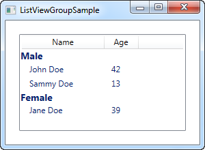
In XAML, I have added a GroupStyle to the ListView, in which I define a template for the header of each group. It consists of a TextBlock control, where I've used a slightly larger and bold text to show that it's a group - as we'll see later on, this can of course be customized a lot more. The TextBlock Text property is bound to a Name property, but please be aware that this is not the Name property on the data object (in this case the User class). Instead, it is the name of the group, as assigned by WPF, based on the property we use to divide the objects into groups.
In Code-behind, we do the same as we did before: We create a list and add some User objects to it and then we bind the list to the ListView - nothing new there, except for the new Sex property that I've added, which tells whether the user is male or female.
After assigning an ItemsSource, we use this to get a CollectionView that the ListView creates for us. This specialized View instance contains a lot of possibilities, including the ability to group the items. We use this by adding a so-called PropertyGroupDescription to the GroupDescriptions of the view. This basically tells WPF to group by a specific property on the data objects, in this case the Sex property.
Customizing the group header
The above example was great for showing the basics of ListView grouping, but the look was a tad boring, so let's exploit the fact that WPF lets us define our own templates and spice things up. A common request is to be able to collapse and expand the group, and while WPF doesn't provide this behavior by default, it's somewhat easy to implement yourself. We'll do it by completely re-templating the group container.
It might look a bit cumbersome, but the principles used are somewhat simple and you will see them in other situations when you customize the WPF controls. Here's the code:
<Window x:Class="WpfTutorialSamples.ListView_control.ListViewCollapseExpandGroupSample"
        xmlns="http://schemas.microsoft.com/winfx/2006/xaml/presentation"
        xmlns:x="http://schemas.microsoft.com/winfx/2006/xaml"
        Title="ListViewCollapseExpandGroupSample" Height="300" Width="300">
    <Grid Margin="10">
        <ListView Name="lvUsers">
            <ListView.View>
                <GridView>
                    <GridViewColumn Header="Name" Width="120" DisplayMemberBinding="{Binding Name}" />
                    <GridViewColumn Header="Age" Width="50" DisplayMemberBinding="{Binding Age}" />
                </GridView>
            </ListView.View>

            <ListView.GroupStyle>
                <GroupStyle>
                    <GroupStyle.ContainerStyle>
                        <Style TargetType="{x:Type GroupItem}">
                            <Setter Property="Template">
                                <Setter.Value>
                                    <ControlTemplate>
                                        <Expander IsExpanded="True">
                                            <Expander.Header>
                                                <StackPanel Orientation="Horizontal">
                                                    <TextBlock Text="{Binding Name}" FontWeight="Bold" Foreground="Gray" FontSize="22" VerticalAlignment="Bottom" />
                                                    <TextBlock Text="{Binding ItemCount}" FontSize="22" Foreground="Green" FontWeight="Bold" FontStyle="Italic" Margin="10,0,0,0" VerticalAlignment="Bottom" />
                                                    <TextBlock Text=" item(s)" FontSize="22" Foreground="Silver" FontStyle="Italic" VerticalAlignment="Bottom" />
                                                </StackPanel>
                                            </Expander.Header>
                                            <ItemsPresenter />
                                        </Expander>
                                    </ControlTemplate>
                                </Setter.Value>
                            </Setter>
                        </Style>
                    </GroupStyle.ContainerStyle>
                </GroupStyle>
            </ListView.GroupStyle>
        </ListView>
    </Grid>
</Window>
The Code-behind is exactly the same as used in the first example - feel free to scroll up and grab it.

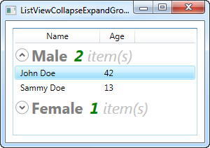
Now our groups look a bit more exciting, and they even include an expander button, that will toggle the visibility of the group items when you click it (that's why the single female user is not visible on the screenshot - I collapsed that particular group). By using the ItemCount property that the group exposes, we can even show how many items each group currently consists of.
As you can see, it requires a bit more markup than we're used to, but this example also goes a bit beyond what we usually do, so that seems fair. When you read through the code, you will quickly realize that many of the lines are just common elements like style and template.
Summary
Adding grouping to the WPF ListView is very simple - all you need is a GroupStyle with a HeaderTemplate, to tell the ListView how to render a group, and a few lines of Code-behind code to tell WPF which property to group by. As you can see from the last example, the group is even very customizable, allowing you to create some really cool views, without too much work.