The GridSplitter
As you saw in the previous articles, the Grid panel makes it very easy to divide up the available space into individual cells. Using column and row definitions, you can easily decide how much space each row or column should take up, but what if you want to allow the user to change this? This is where the GridSplitter control comes into play.
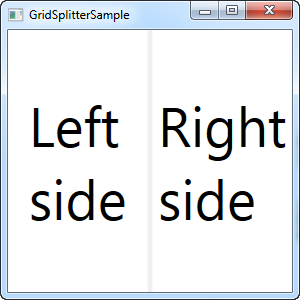
The GridSplitter is used simply by adding it to a column or a row in a Grid, with the proper amount of space for it, e.g. 5 pixels. It will then allow the user to drag it from side to side or up and down, while changing the size of the column or row on each of the sides of it. Here's an example:
<Window x:Class="WpfTutorialSamples.Panels.GridSplitterSample"
        xmlns="http://schemas.microsoft.com/winfx/2006/xaml/presentation"
        xmlns:x="http://schemas.microsoft.com/winfx/2006/xaml"
        Title="GridSplitterSample" Height="300" Width="300">
    <Grid>
        <Grid.ColumnDefinitions>
            <ColumnDefinition Width="*" />
            <ColumnDefinition Width="5" />
            <ColumnDefinition Width="*" />
        </Grid.ColumnDefinitions>
        <TextBlock FontSize="55" HorizontalAlignment="Center" VerticalAlignment="Center" TextWrapping="Wrap">Left side</TextBlock>
        <GridSplitter Grid.Column="1" Width="5" HorizontalAlignment="Stretch" />
        <TextBlock Grid.Column="2" FontSize="55" HorizontalAlignment="Center" VerticalAlignment="Center" TextWrapping="Wrap">Right side</TextBlock>
    </Grid>
</Window>

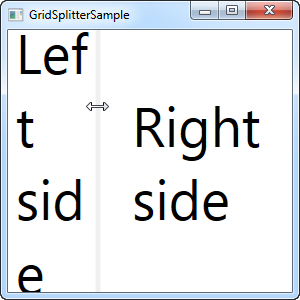
As you can see, I've simply created a Grid with two equally wide columns, with a 5 pixel column in the middle. Each of the sides are just a TextBlock control to illustrate the point. As you can see from the screenshots, the GridSplitter is rendered as a dividing line between the two columns and as soon as the mouse is over it, the cursor is changed to reflect that it can be resized.
Horizontal GridSplitter
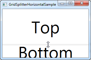
The GridSplitter is very easy to use and of course it supports horizontal splits as well. In fact, you hardly have to change anything to make it work horizontally instead of vertically, as the next example will show:
<Window x:Class="WpfTutorialSamples.Panels.GridSplitterHorizontalSample"
        xmlns="http://schemas.microsoft.com/winfx/2006/xaml/presentation"
        xmlns:x="http://schemas.microsoft.com/winfx/2006/xaml"
        Title="GridSplitterHorizontalSample" Height="300" Width="300">
    <Grid>
        <Grid.RowDefinitions>
            <RowDefinition Height="*" />
            <RowDefinition Height="5" />
            <RowDefinition Height="*" />
        </Grid.RowDefinitions>
        <TextBlock FontSize="55" HorizontalAlignment="Center" VerticalAlignment="Center" TextWrapping="Wrap">Top</TextBlock>
        <GridSplitter Grid.Row="1" Height="5" HorizontalAlignment="Stretch" />
        <TextBlock Grid.Row="2" FontSize="55" HorizontalAlignment="Center" VerticalAlignment="Center" TextWrapping="Wrap">Bottom</TextBlock>
    </Grid>
</Window>
As you can see, I simply changed the columns into rows and on the GridSplitter, I defined a Height instead of a Width. The GridSplitter figures out the rest on its own, but in case it doesn't, you can use the ResizeDirection property on it to force it into either Rows or Columns mode.