The community is working on translating this tutorial into Bulgarian, but it seems that no one has started the translation process for this article yet. If you can help us, then please click "More info".
The Button control
No GUI framework would be complete without a Button control, so of course WPF has a nice one included, and just like the rest of the framework controls, it's very flexible and will allow you to accomplish almost anything. But let's start out with some basic examples.
A simple Button
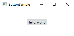
Just like many other WPF controls, a Button can be displayed simply by adding a Button tag to your Window. If you put text between the tags (or another control), it will act as the content of the Button:
<Button>Hello, world!</Button>
Pretty simple, right? Of course, the Button doesn't actually do anything yet, but if you point to it, you will find that it comes with a nice hover effect right out of the box. But let's make the Button do something, by subscribing to its Click event (more information about this process can be found in the article on subscribing to events in XAML):
<Button Click="HelloWorldButton_Click">Hello, World!</Button>In Code-behind, you will need a matching method to handle the click:
private void HelloWorldButton_Click(object sender, RoutedEventArgs e)
{
    MessageBox.Show("Hello, world!");
}
You now have a very basic button and when you click on it, a message will be displayed!
Formatted content
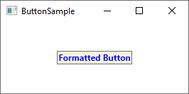
Internally, simple text inside the Content of the Button is turned into a TextBlock control, which also means that you can control the same aspects of the text formatting. You will find several properties on the Button control for doing this, including (but not limited to) Foreground, Background, FontWeight and so on. In other words, it's very easy to change the formatting of the text inside a Button control:
<Button Background="Beige" Foreground="Blue" FontWeight="Bold">Formatted Button</Button>
By setting these properties directly on the Button, you are of course limited to applying the same formatting for all of the content, but if that's not good enough, just read on for even more advanced content formatting.
Buttons with advanced content
We have already talked about this several times, but one of the very cool things about WPF is the ability to replace simple text inside a control with other WPF controls. This also means that you don't have to limit your buttons to simple text, formatted in the same way - you can just add several text controls with different formatting. The WPF Button only supports one direct child control, but you can just make that a Panel, which will then host as many controls as you need to. You can use this to create buttons with various types of formatting:
<Button>
    <StackPanel Orientation="Horizontal">
    <TextBlock>Formatted </TextBlock>
    <TextBlock Foreground="Blue" FontWeight="Bold" Margin="2,0">Button</TextBlock>
    <TextBlock Foreground="Gray" FontStyle="Italic">[Various]</TextBlock>
    </StackPanel>
</Button>
But of course, you are not limited to just text - you can put whatever you want inside your buttons, which leads us to a subject that I know many people will ask for. Buttons with images!
Buttons with Images (ImageButton)
In many UI frameworks, you will find a regular Button and then one or several other variants, which will offer extra features. One of the most commonly used variants is the ImageButton, which, as the name implies, is a Button which will usually allow you to include an image before the text. But in WPF, there's no need for a separate control to accomplish this - as you just saw, we can put several controls inside a Button, so you can just as easily add an Image control to it, like this:
<Button Padding="5">
    <StackPanel Orientation="Horizontal">
    <Image Source="/WpfTutorialSamples;component/Images/help.png" />
    <TextBlock Margin="5,0">Help</TextBlock>
    </StackPanel>
</Button>
It's really that simple to create an ImageButton in WPF, and you are of course free to move things around, e.g. if you want the image after the text instead of before etc.
Button Padding
You may have noticed that buttons in the WPF framework doesn't come with any padding by default. This means that the text is very close to the borders, which might look a little bit strange, because most buttons found elsewhere (web, other applications etc.) do have at least some padding in the sides. No worries, because the Button comes with a Padding property:
<Button Padding="5,2">Hello, World!</Button>This will apply a padding of 5 pixels on the sides, and 2 pixels in the top and bottom. But having to apply padding to all of your buttons might get a bit tiresome at a certain point, so here's a small tip: You can apply the padding globally, either across the entire application or just this specific Window, using a Style (more on styles later). Here's an example where we apply it to the Window, using the Window.Resources property:
<Window.Resources>
    <Style TargetType="{x:Type Button}">
    <Setter Property="Padding" Value="5,2"/>
    </Style>
</Window.Resources>
This padding will now be applied to all your buttons, but you can of course override it by specifically defining the Padding property on a Button. Here's how all the buttons of this example look with the common padding:

Summary
As you can see from this article, using buttons in the WPF framework is very easy and you can customize this important control almost endlessly.