The community is working on translating this tutorial into Catalan, but it seems that no one has started the translation process for this article yet. If you can help us, then please click "More info".
The Expander control
The Expander control will provide you with the ability to hide/show a piece of content. This would usually be a piece of text, but thanks to the flexibility of WPF, it can be used for any type of mixed content like texts, images and even other WPF controls. To see what I'm talking about, here's an example:
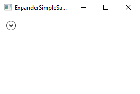
Notice the arrow part - as soon as you click it, the Expander control will expand and reveal its content:
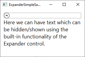
The code for it is of course very simple:
<Expander>
    <TextBlock TextWrapping="Wrap" FontSize="18">
    Here we can have text which can be hidden/shown using the built-in functionality of the Expander control.
    </TextBlock>
</Expander>
By default, the Expander is NOT expanded and therefore looks like it does on the first screenshot. The user can expand it by clicking it or you can make it initially expanded by using the IsExpanded property:
<Expander IsExpanded="True">You can of course also read this property at runtime, if you need to know about the current state of the Expander control.
Advanced content
The Content of the Expander can only be one control, like in our first example where we use a TextBlock control, but nothing prevents you from making this e.g. a Panel, which can then hold as many child controls as you want it to. This allows you to host rich content inside your Expander, from text and images to e.g. a ListView or any other WPF control.
Here's an example of more advanced content, where we use several panels, text and an image and even a TextBox control:
<Expander Margin="10">
    <StackPanel Margin="10">
    <DockPanel>
        <Image Source="/WpfTutorialSamples;component/Images/question32.png" Width="32" Height="32" DockPanel.Dock="Right" Margin="10"></Image>
        <TextBlock TextWrapping="Wrap" FontSize="18">
            Did you know that WPF is really awesome? Just enter your e-mail address below and we'll send you updates:
        </TextBlock>
    </DockPanel>
    <TextBox Margin="10">john@doe.org</TextBox>
    </StackPanel>
</Expander>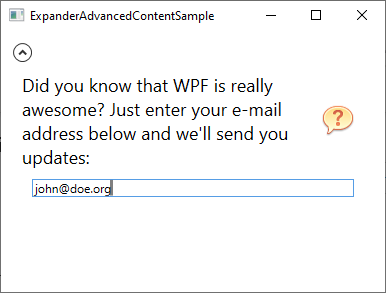
ExpandDirection
By default, the Expander control will occupy all available space inside its container control and then expand in accordance with the value of the ExpandDirection property, which is set to Down as default. You can see this indicated on the screenshots above because the arrow is placed in top of the control and it points up or down based on whether the control has been expanded or not.
If you change the value of the ExpandDirection property, it will affect how the Expander control acts and looks. For instance, if you change the value to Right, the arrow will be placed on the left side and point to the left/right instead of up/down. Here's an example:
<Expander Margin="10" ExpandDirection="Right">
    <TextBlock TextWrapping="Wrap" FontSize="18">
        Here we can have text which can be hidden/shown using the built-in functionality of the Expander control.
    </TextBlock>
</Expander>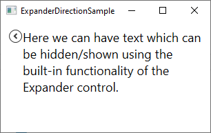
You can of course set this property to Up or Left as well - if you do so, the button will be placed at the bottom or to the right.
Custom header
In all the examples so far, the Expander control is almost look-less, except for the button which is used to show/hide the content - it's drawn as a circular button with an arrow inside. You can easily customize the header-area of the control though, using the Header property. Here's an example where we use this property to add an explanatory text next to the button:
<Expander Margin="10" Header="Click to show/hide content...">
    <TextBlock TextWrapping="Wrap" FontSize="18">
        Here we can have text which can be hidden/shown using the built-in functionality of the Expander control.
    </TextBlock>
</Expander>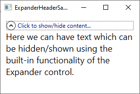
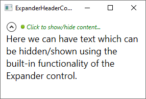
But you don't have to settle for a simple piece of text - the Header property will allow you to add controls to it, to create an even more customized look:
<Expander Margin="10">
    <Expander.Header>
    <DockPanel VerticalAlignment="Stretch">
        <Image Source="/WpfTutorialSamples;component/Images/bullet_green.png" Height="16" DockPanel.Dock="Left" />
        <TextBlock FontStyle="Italic" Foreground="Green">Click to show/hide content...</TextBlock>
    </DockPanel>
    </Expander.Header>
    <TextBlock TextWrapping="Wrap" FontSize="18">
        Here we can have text which can be hidden/shown using the built-in functionality of the Expander control.
    </TextBlock>
</Expander>
Notice how I simply add a Panel as the content of the Header property and inside of that, I can do whatever I want, like adding an Image and a TextBlock control with custom formatting:
Summary
The Expander control is a great little helper when you need the ability to hide/show content on demand, and much like any other control in the WPF framework, it's both easy to use and easy to customize.