The community is working on translating this tutorial into Uzbek, but it seems that no one has started the translation process for this article yet. If you can help us, then please click "More info".
The WPF StatusBar control
With the top of the application window usually occupied by the main menu and/or toolbars, described in previous chapters, the bottom part of the window is usually the home of the status bar. The status bar is used to show various information about the current state of the application, like cursor position, word count, progress of tasks and so on. Fortunately for us, WPF comes with a nice StatusBar control, making it very easy to add status bar functionality to your applications.
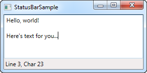
Let's start off with a very basic example:
<Window x:Class="WpfTutorialSamples.Common_interface_controls.StatusBarSample"
        xmlns="http://schemas.microsoft.com/winfx/2006/xaml/presentation"
        xmlns:x="http://schemas.microsoft.com/winfx/2006/xaml"
        Title="StatusBarSample" Height="150" Width="300">
	<DockPanel>
		<StatusBar DockPanel.Dock="Bottom">
			<StatusBarItem>
				<TextBlock Name="lblCursorPosition" />
			</StatusBarItem>
		</StatusBar>
		<TextBox AcceptsReturn="True" Name="txtEditor" SelectionChanged="txtEditor_SelectionChanged" />
	</DockPanel>
</Window>
using System;
using System.Windows;
namespace WpfTutorialSamples.Common_interface_controls
{
public partial class StatusBarSample : Window
{
public StatusBarSample()
{
InitializeComponent();
}
private void txtEditor_SelectionChanged(object sender, RoutedEventArgs e)
{
int row = txtEditor.GetLineIndexFromCharacterIndex(txtEditor.CaretIndex);
int col = txtEditor.CaretIndex - txtEditor.GetCharacterIndexFromLineIndex(row);
lblCursorPosition.Text = "Line " + (row + 1) + ", Char " + (col + 1);
}
}
}
It's all very simple - a TextBlock control that shows the current cursor position, just like in pretty much any other application that allows you to edit text. In this very basic form, the StatusBar could just as easily have been a panel with a set of controls on it, but the real advantage of the StatusBar comes when we need to divide it into several areas of information.
Advanced StatusBar example
Let's try a more advanced example of using the StatusBar. The first thing we want to do is to make the StatusBar use another panel for the layout. By default, it uses the DockPanel, but when we want a more complex layout, with columns that adjusts its width in a certain way and aligned content, the Grid is a much better choice.
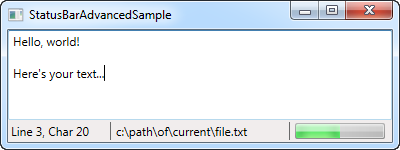
We'll divide the Grid into three areas, with the left and right one having a fixed width and the middle column automatically taking up the remaining space. We'll also add columns in between for Separator controls. Here's how it looks now:
<Window x:Class="WpfTutorialSamples.Common_interface_controls.StatusBarAdvancedSample"
        xmlns="http://schemas.microsoft.com/winfx/2006/xaml/presentation"
        xmlns:x="http://schemas.microsoft.com/winfx/2006/xaml"
        Title="StatusBarAdvancedSample" Height="150" Width="400">
    <DockPanel>
        <StatusBar DockPanel.Dock="Bottom">
            <StatusBar.ItemsPanel>
                <ItemsPanelTemplate>
                    <Grid>
                        <Grid.ColumnDefinitions>
                            <ColumnDefinition Width="100" />
                            <ColumnDefinition Width="Auto" />
                            <ColumnDefinition Width="*" />
                            <ColumnDefinition Width="Auto" />
                            <ColumnDefinition Width="100" />
                        </Grid.ColumnDefinitions>
                    </Grid>
                </ItemsPanelTemplate>
            </StatusBar.ItemsPanel>
            <StatusBarItem>
                <TextBlock Name="lblCursorPosition" />
            </StatusBarItem>
            <Separator Grid.Column="1" />
            <StatusBarItem Grid.Column="2">
                <TextBlock Text="c:\path\of\current\file.txt" />
            </StatusBarItem>
            <Separator Grid.Column="3" />
            <StatusBarItem Grid.Column="4">
                <ProgressBar Value="50" Width="90" Height="16" />
            </StatusBarItem>
        </StatusBar>
        <TextBox AcceptsReturn="True" Name="txtEditor" SelectionChanged="txtEditor_SelectionChanged" />
    </DockPanel>
</Window>
using System;
using System.Windows;
namespace WpfTutorialSamples.Common_interface_controls
{
public partial class StatusBarAdvancedSample : Window
{
public StatusBarAdvancedSample()
{
InitializeComponent();
}
private void txtEditor_SelectionChanged(object sender, RoutedEventArgs e)
{
int row = txtEditor.GetLineIndexFromCharacterIndex(txtEditor.CaretIndex);
int col = txtEditor.CaretIndex - txtEditor.GetCharacterIndexFromLineIndex(row);
lblCursorPosition.Text = "Line " + (row + 1) + ", Char " + (col + 1);
}
}
}
As you can see, I've added a bit of sample information, like the fake filename in the middle column and the progress bar to the right, showing a static value for now. You could easily make this work for real though, and it gives a pretty good idea on what you can do with the StatusBar control.
Summary
Once again, WPF makes it easy to get standard Windows functionality, in this case the StatusBar, integrated into your applications.
You can even place other controls than the ones used in these examples, like buttons, combo boxes and so on, but please be aware that since the StatusBar doesn't apply any special rendering to these controls when hosting them, it might not look as you would expect it to for controls in a status bar. This can be handled with custom styling if you need it though, a subject discussed elsewhere in this tutorial.