The community is working on translating this tutorial into Dutch, but it seems that no one has started the translation process for this article yet. If you can help us, then please click "More info".
Geavanceerde FlowDocument-inhoud
As I already mentioned, the text presentation capabilities of WPF and the FlowDocument is very rich - you can do almost anything, and this includes stuff like lists, images and even tables. So far, we've used very basic examples of FlowDocument content, but in this article, we'll finally do a more comprehensive example.
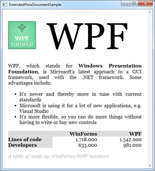
The XAML code for the next example might look a bit overwhelming, but notice how simple it actually is - just like HTML, you can format text simply by placing them in styled paragraphs. Now have a look at the XAML. A screenshot of the result will follow directly after it:
<Window x:Class="WpfTutorialSamples.Rich_text_controls.ExtendedFlowDocumentSample"
        xmlns="http://schemas.microsoft.com/winfx/2006/xaml/presentation"
        xmlns:x="http://schemas.microsoft.com/winfx/2006/xaml"
        Title="ExtendedFlowDocumentSample" Height="550" Width="500">
    <Grid>
        <FlowDocumentScrollViewer>
            <FlowDocument>
                <Paragraph>
                    <Image Source="http://www.wpf-tutorial.com/images/logo.png" Width="90" Height="90" Margin="0,0,30,0" />
                    <Run FontSize="120">WPF</Run>
                </Paragraph>

                <Paragraph>
                    WPF, which stands for
                    <Bold>Windows Presentation Foundation</Bold>,
                    is Microsoft's latest approach to a GUI framework, used with the .NET framework.
                    Some advantages include:
                </Paragraph>

                <List>
                    <ListItem>
                        <Paragraph>
                            It's newer and thereby more in tune with current standards
                        </Paragraph>
                    </ListItem>
                    <ListItem>
                        <Paragraph>
                            Microsoft is using it for a lot of new applications, e.g. Visual Studio
                        </Paragraph>
                    </ListItem>
                    <ListItem>
                        <Paragraph>
                            It's more flexible, so you can do more things without having to write or buy new controls
                        </Paragraph>
                    </ListItem>
                </List>

                <Table CellSpacing="0">
                    <TableRowGroup>
                        <TableRow Background="Gainsboro" FontWeight="Bold">
                            <TableCell></TableCell>
                            <TableCell>
                                <Paragraph TextAlignment="Right">WinForms</Paragraph>
                            </TableCell>
                            <TableCell>
                                <Paragraph TextAlignment="Right">WPF</Paragraph>
                            </TableCell>
                        </TableRow>
                    </TableRowGroup>

                    <TableRowGroup>
                        <TableRow>
                            <TableCell Background="Gainsboro" FontWeight="Bold">
                                <Paragraph>Lines of code</Paragraph>
                            </TableCell>
                            <TableCell>
                                <Paragraph TextAlignment="Right">1.718.000</Paragraph>
                            </TableCell>
                            <TableCell>
                                <Paragraph TextAlignment="Right">1.542.000</Paragraph>
                            </TableCell>
                        </TableRow>
                    </TableRowGroup>
                    <TableRowGroup>
                        <TableRow>
                            <TableCell Background="Gainsboro" FontWeight="Bold">
                                <Paragraph>Developers</Paragraph>
                            </TableCell>
                            <TableCell>
                                <Paragraph TextAlignment="Right">633.000</Paragraph>
                            </TableCell>
                            <TableCell>
                                <Paragraph TextAlignment="Right">981.000</Paragraph>
                            </TableCell>
                        </TableRow>
                    </TableRowGroup>
                </Table>
                <Paragraph Foreground="Silver" FontStyle="Italic">A table of made up WinForms/WPF numbers</Paragraph>
            </FlowDocument>
        </FlowDocumentScrollViewer>
    </Grid>
</Window>
I'm not going to go too much into details about each of the tags - hopefully they should make sense as they are.
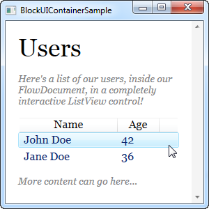
As you can see, including lists, images and tables are pretty easy, but in fact, you can include any WPF control inside of your FlowDocument. Using the BlockUIContainer element you get access to all controls that would otherwise only be available inside of a window. Here's an example:
<Window x:Class="WpfTutorialSamples.Rich_text_controls.BlockUIContainerSample"
        xmlns="http://schemas.microsoft.com/winfx/2006/xaml/presentation"
        xmlns:x="http://schemas.microsoft.com/winfx/2006/xaml"
        xmlns:self="clr-namespace:WpfTutorialSamples.Rich_text_controls"
        Title="BlockUIContainerSample" Height="275" Width="300">
    <Window.Resources>
        <x:Array x:Key="UserArray" Type="{x:Type self:User}">
            <self:User Name="John Doe" Age="42"/>
            <self:User Name="Jane Doe" Age="36"/>
        </x:Array>
    </Window.Resources>
    <Grid>
        <FlowDocumentScrollViewer>
            <FlowDocument>
                <Paragraph FontSize="36" Margin="0">Users</Paragraph>
                <Paragraph FontStyle="Italic" TextAlignment="Left" FontSize="14" Foreground="Gray">Here's a list of our users, inside our FlowDocument, in a completely interactive ListView control!</Paragraph>
                <BlockUIContainer>
                    <ListView BorderThickness="0" ItemsSource="{StaticResource UserArray}">
                        <ListView.View>
                            <GridView>
                                <GridViewColumn Header="Name" DisplayMemberBinding="{Binding Name}" Width="150" />
                                <GridViewColumn Header="Age" DisplayMemberBinding="{Binding Age}" Width="75" />
                            </GridView>
                        </ListView.View>
                    </ListView>
                </BlockUIContainer>
                <Paragraph FontStyle="Italic" TextAlignment="Left" FontSize="14" Foreground="Gray">More content can go here...</Paragraph>
            </FlowDocument>
        </FlowDocumentScrollViewer>
    </Grid>
</Window>
Now we have a FlowDocument with a ListView inside of it, and as you can see from the screenshot, the ListView works just like it normally would, including selections etc. Pretty cool!
Summary
By using the techniques described in the two examples of this article, pretty much anything is possible, when creating FlowDocument documents. It's excellent for presenting visual information to the end-user, as seen in many of the expensive reporting suites.