The community is working on translating this tutorial into Swedish, but it seems that no one has started the translation process for this article yet. If you can help us, then please click "More info".
WPF TabControl: Tab positions
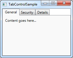
The tabs of a TabControl is usually placed on top of the control, which is also how it will look by default when using the WPF TabControl:

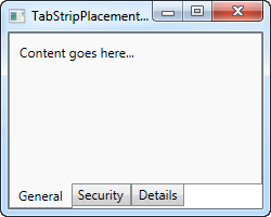
However, using the TabStripPlacement property, we can very easily change this:
<Window x:Class="WpfTutorialSamples.Misc_controls.TabStripPlacementSample"
        xmlns="http://schemas.microsoft.com/winfx/2006/xaml/presentation"
        xmlns:x="http://schemas.microsoft.com/winfx/2006/xaml"
        Title="TabStripPlacementSample" Height="200" Width="250">
    <Grid>
        <TabControl TabStripPlacement="Bottom">
            <TabItem Header="General">
                <Label Content="Content goes here..." />
            </TabItem>
            <TabItem Header="Security" />
            <TabItem Header="Details" />
        </TabControl>
    </Grid>
</Window>
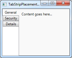
The TabStripPlacement can be set to Top, Bottom, Left and Right. However, if we set it to Left or Right, we get a result like this:

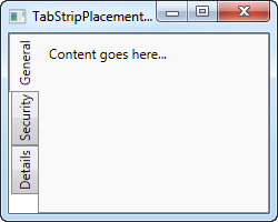
I personally would expect that the tabs to be rotated when placed on one of the sides, so that the tab text becomes vertical instead of horizontal, but the WPF TabControl doesn't do this. Fortunately, we can accomplish this behavior with a small hack:
<Window x:Class="WpfTutorialSamples.Misc_controls.TabStripPlacementSample"
        xmlns="http://schemas.microsoft.com/winfx/2006/xaml/presentation"
        xmlns:x="http://schemas.microsoft.com/winfx/2006/xaml"
        Title="TabStripPlacementSample" Height="200" Width="250" UseLayoutRounding="True">
    <Grid>
        <TabControl TabStripPlacement="Left">
            <TabControl.Resources>
                <Style TargetType="{x:Type TabItem}">
                    <Setter Property="HeaderTemplate">
                        <Setter.Value>
                            <DataTemplate>
                                <ContentPresenter Content="{TemplateBinding Content}">
                                    <ContentPresenter.LayoutTransform>
                                        <RotateTransform Angle="270" />
                                    </ContentPresenter.LayoutTransform>
                                </ContentPresenter>
                            </DataTemplate>
                        </Setter.Value>
                    </Setter>
                    <Setter Property="Padding" Value="3" />
                </Style>
            </TabControl.Resources>
            <TabItem Header="General">
                <Label Content="Content goes here..." />
            </TabItem>
            <TabItem Header="Security" />
            <TabItem Header="Details" />
        </TabControl>
    </Grid>
</Window>
If you haven't yet read the chapters on templates or styles, this might seem a bit confusing, but what we do is using a style targeted at the TabItem elements, where we override the HeaderTemplate and then apply a rotate transform to the tabs. For tabs placed on the left side, we rotate 270 degrees - if placed on the right, you should only rotate 90 degrees, to make it look correct.